Apartment Finder App
In March 2021, I began experimenting with UI design and became interested in UX principles. The placement of UI elements is based on research, which sparks my curiosity and inspired me to explore UX further. This led me to create my first case study on the topic of "apartment finder," as it's a common and important task that has room for improvement. I chose this topic because my friends and I have all experienced the problems associated with finding an apartment.
Challenge
Problem
Users face issues with the amount of time and effort required for tasks such as searching, browsing, signing up, and communicating with landlords during the apartment-seeking process.
Hypothesis
Considering these issues, I aim to develop a tool that simplifies the search process with user-friendly features, informative search results, and direct communication with landlords. By doing so, users can easily, quickly, and safely find their desired apartments.
Research
Competitive analysis
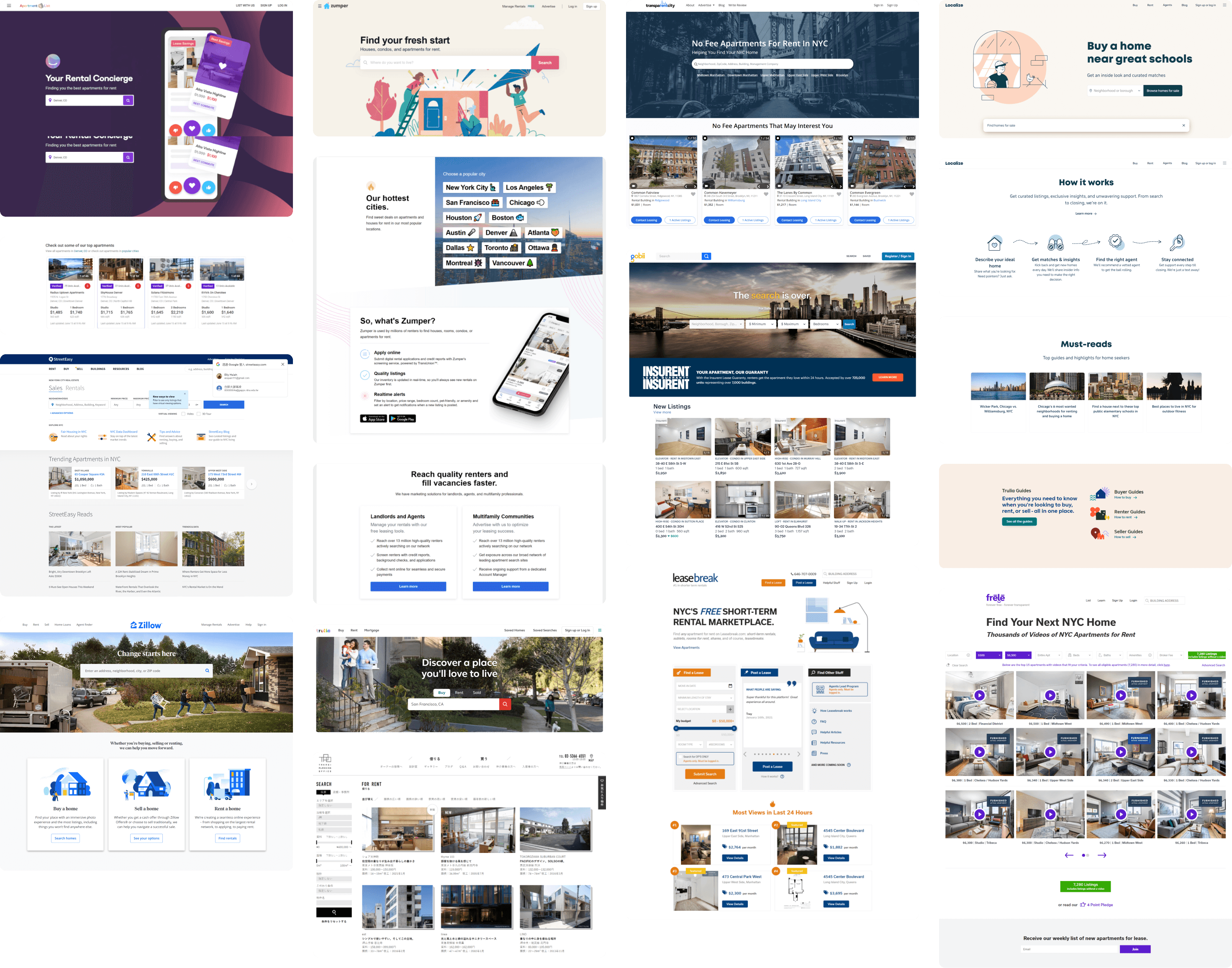
To identify potential areas for improvement, I conducted a competitive analysis of 11 prominent apartment rental websites before beginning the design phase. By taking screenshots and noting common features, I was able to observe how competitors solve similar problems. By interacting with the websites, I also evaluated potential areas for improvement and feature changes.
System story
Based on the insights I got from competitive analysis, I've created a system story to form the early requirements of the project.
What?
Apartment finder app,
Who?
For individual person
Why?
To help them find the type of apartment they like easily, quickly, and safely
How?
By providing a great search, browse experience, direct message feature, and validation process.
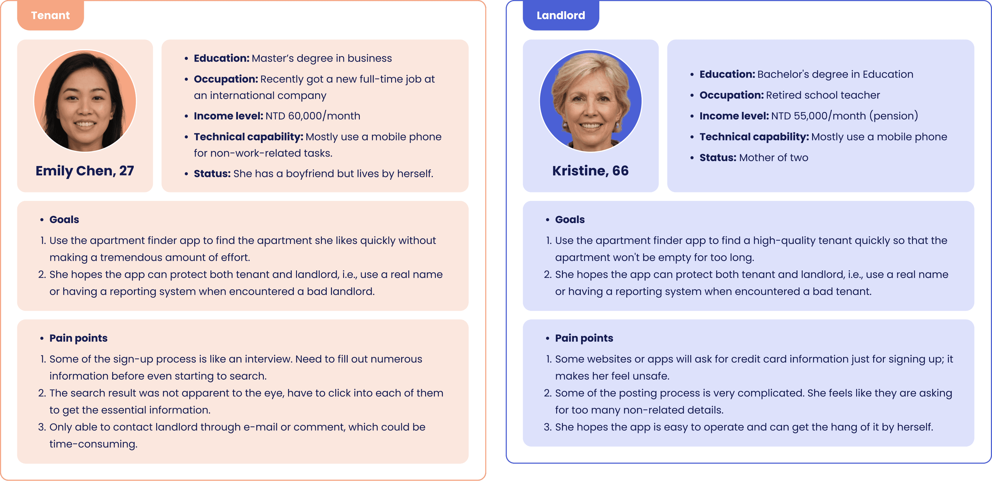
Personas
With a defined user story, I've captured different frustrations and goals for both tenant and landlord. The personas helped me ensure every feature and function I design was done with the user in mind.
Working Backwards
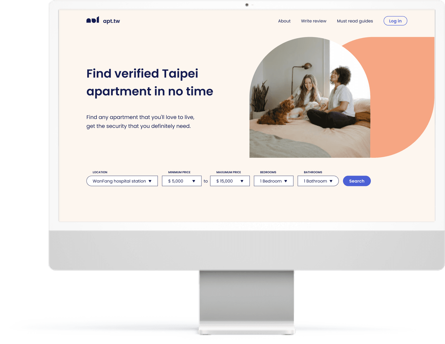
It's time to put research into action! To ensure a user-centric approach and validate defined problems and hypotheses, I adopted the "working backward" method by first creating a landing page. This approach involves starting a project with the user's wants, needs, or problems and then providing a solution through the product, service, or experience.
By creating a landing page first, I was able to identify the necessary features to solve user problems, anticipate potential challenges, and define the end goal. This approach reduces the risk of launching a product without an audience.
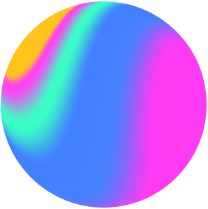
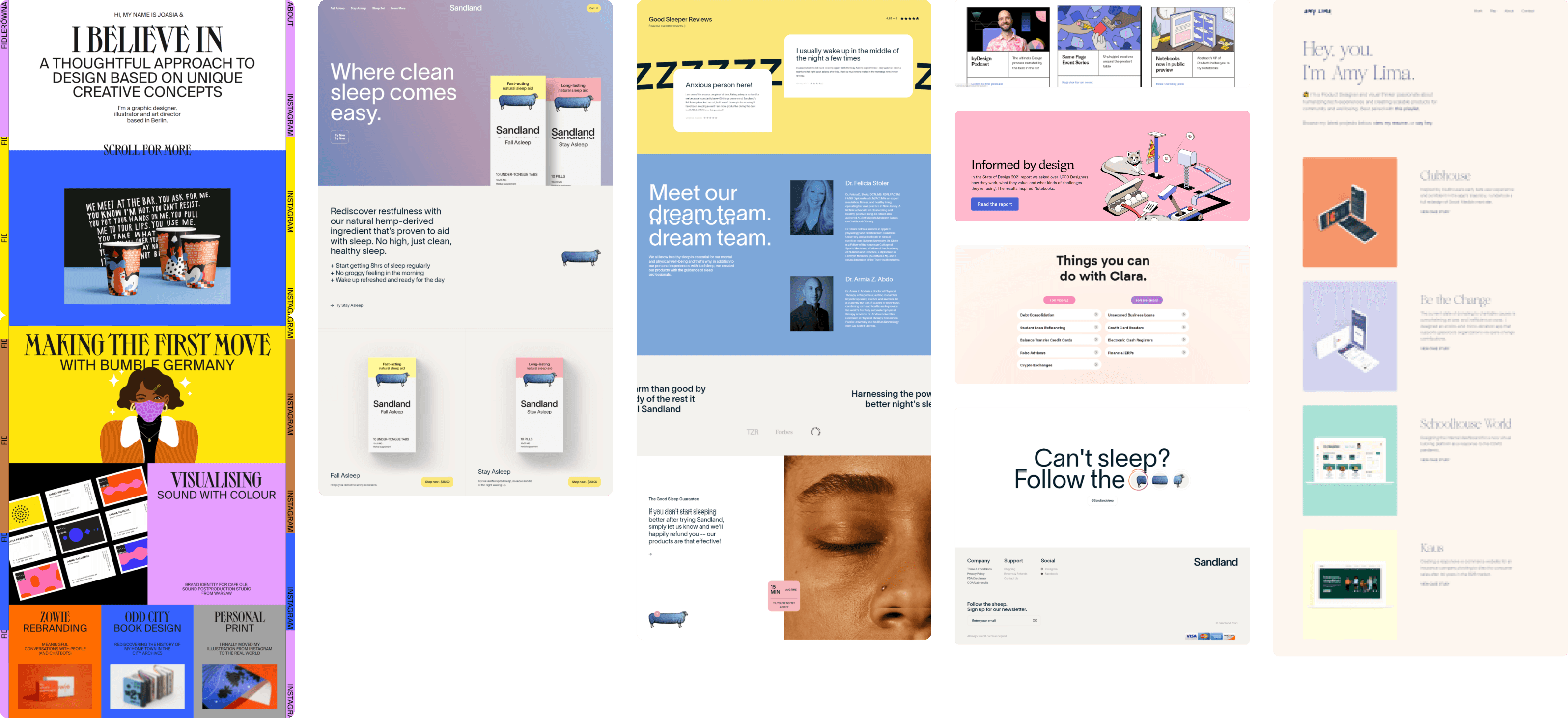
Moodboard
To guide and inspire the design direction and brand atmosphere, I created a mood board as a first step.
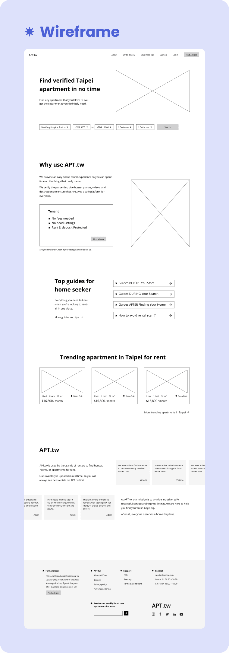
Sketch on paper / figma design
Secondly, I sketched out several ideas on paper. Sketching helped me visualize the basic concept of how the app is going to work and explore different options quickly.
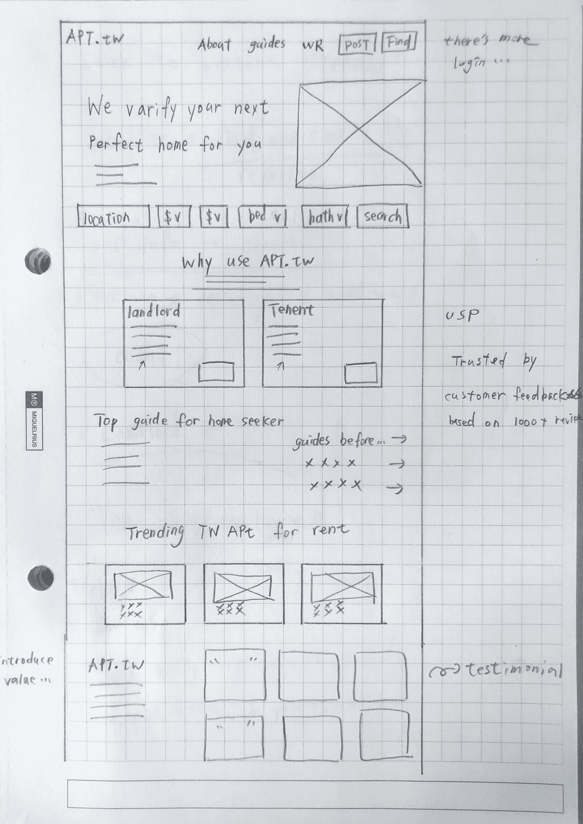
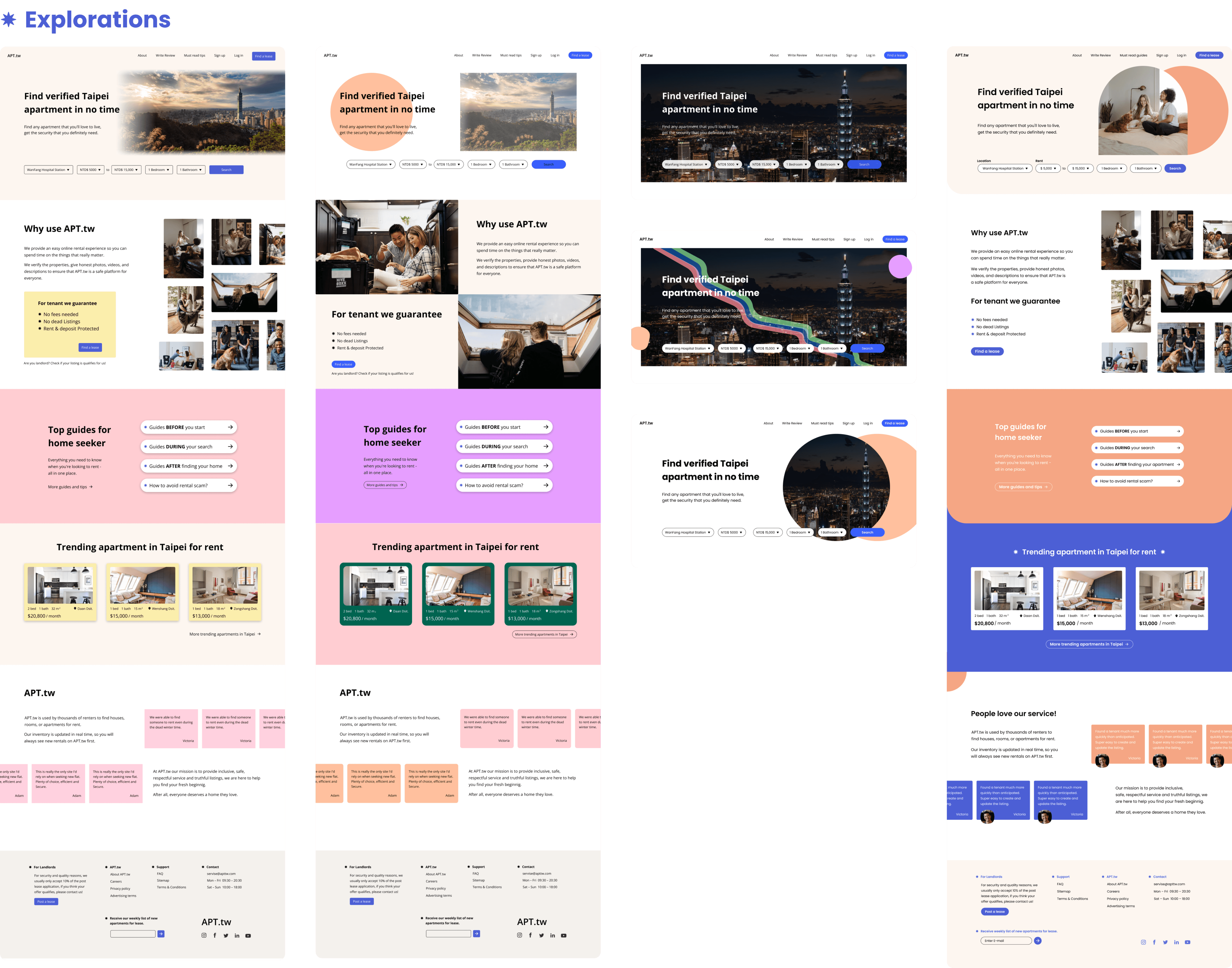
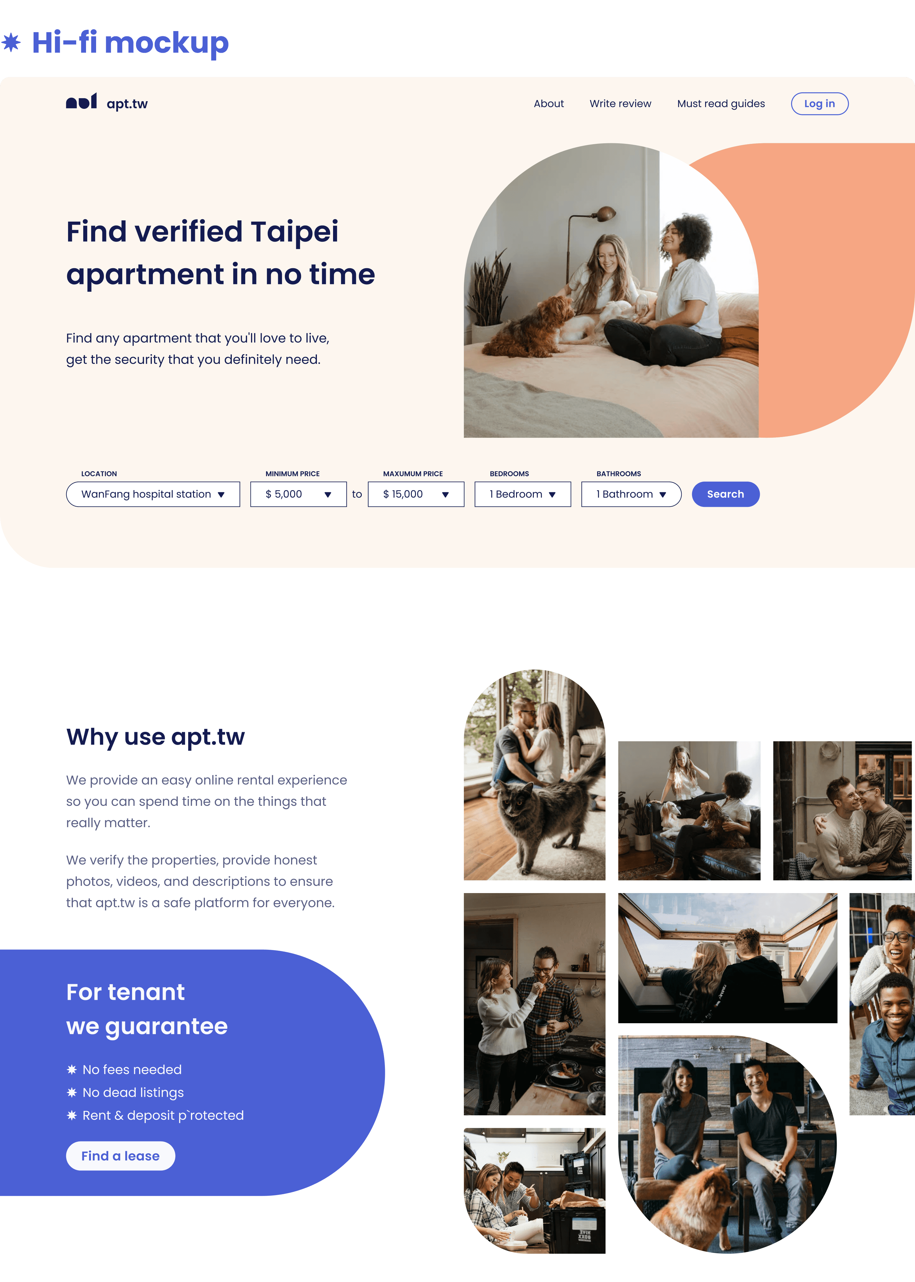
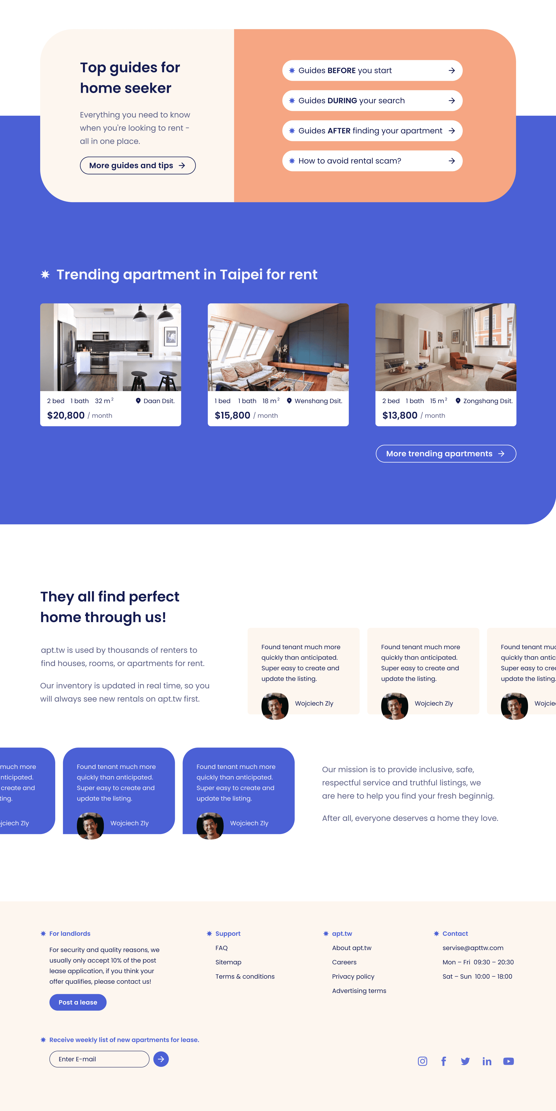
Next, I digitalized the paper sketches into wireframes using Figma to refine the design and layout. This step allowed me to determine the necessary functionality and content, such as the search feature, signup/login, product values, rental guides, and testimonials. After several iterations on the wireframes, I developed a high-fidelity (hi-fi) mockup for the landing page by adding content, photos, colors, and typography.
During this stage, I explored various options for color combinations and photo placement. The final hi-fi mockup looked different from the wireframe as some solutions did not work as intended. I refined some graphics, spacing, and UI layout to improve usability and aesthetics.
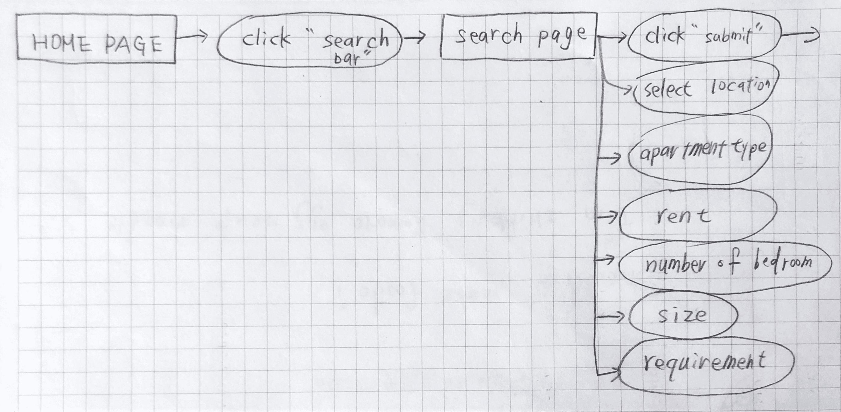
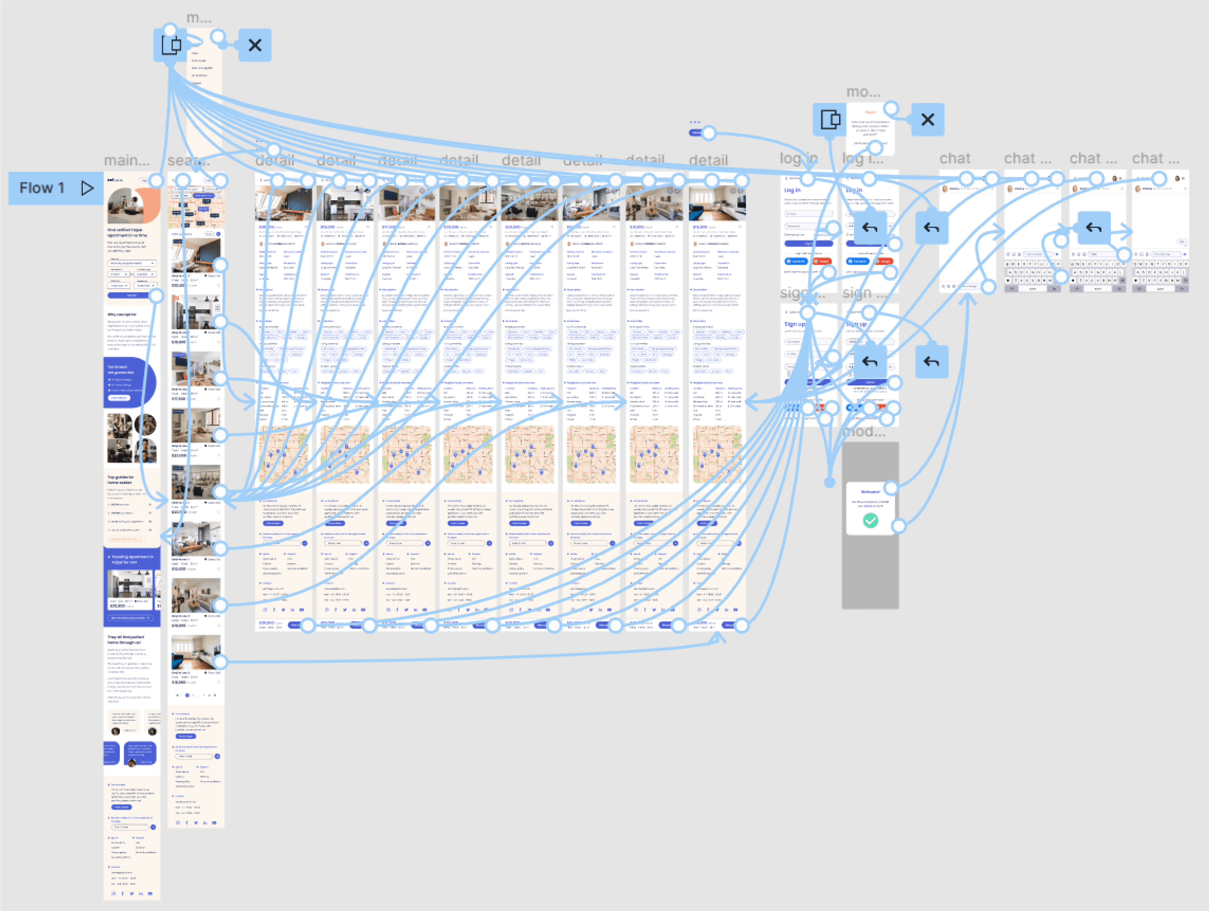
Task Flow & User Flow
Task flow
To design additional functionality such as search, browse, signup/login, and contacting landlords, I created task flow and user flows to help users complete their tasks efficiently. First, I sketched the task flow on paper, then transferred it to draw.io to organize it more effectively. These flows were based on the research findings and the landing page.
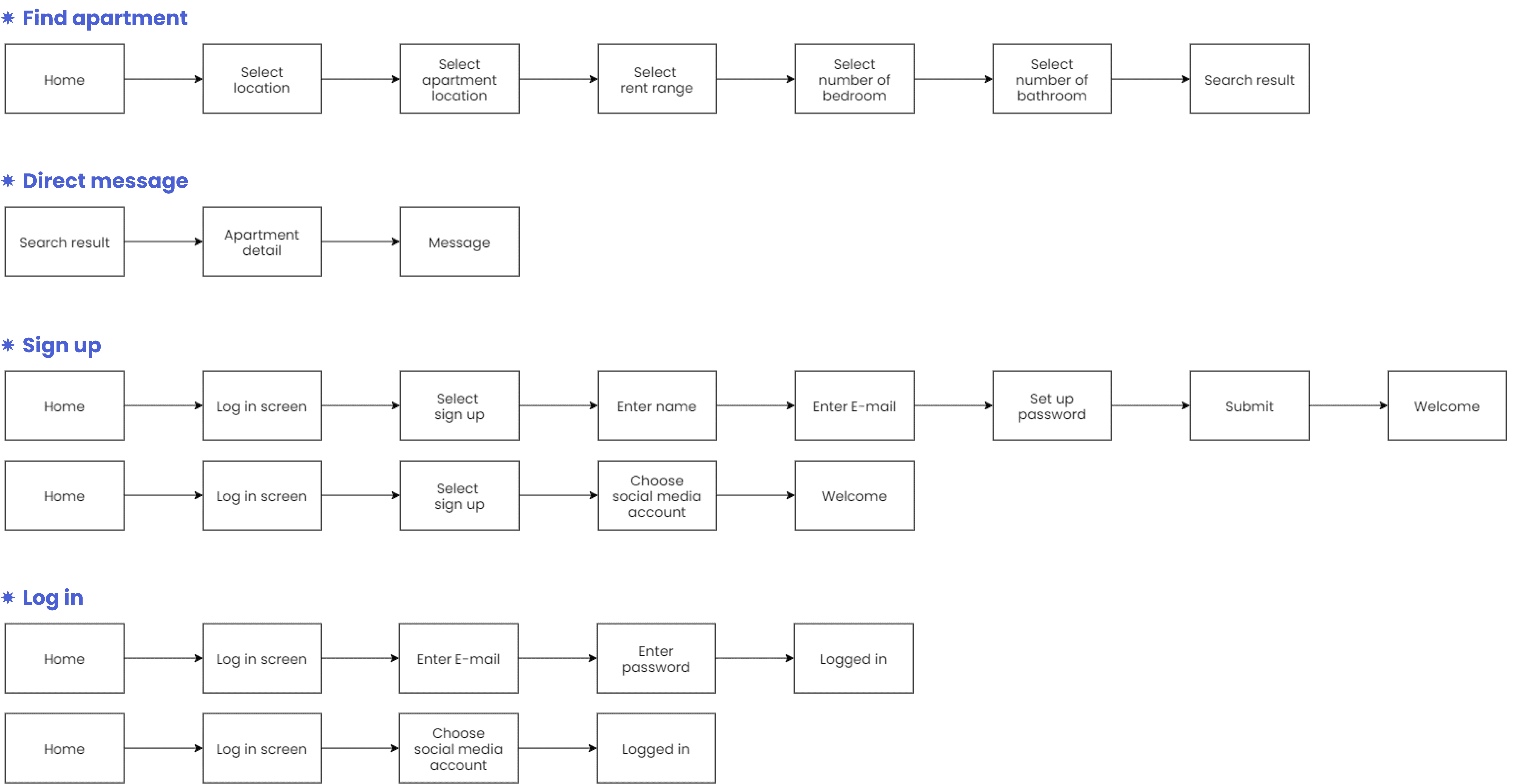
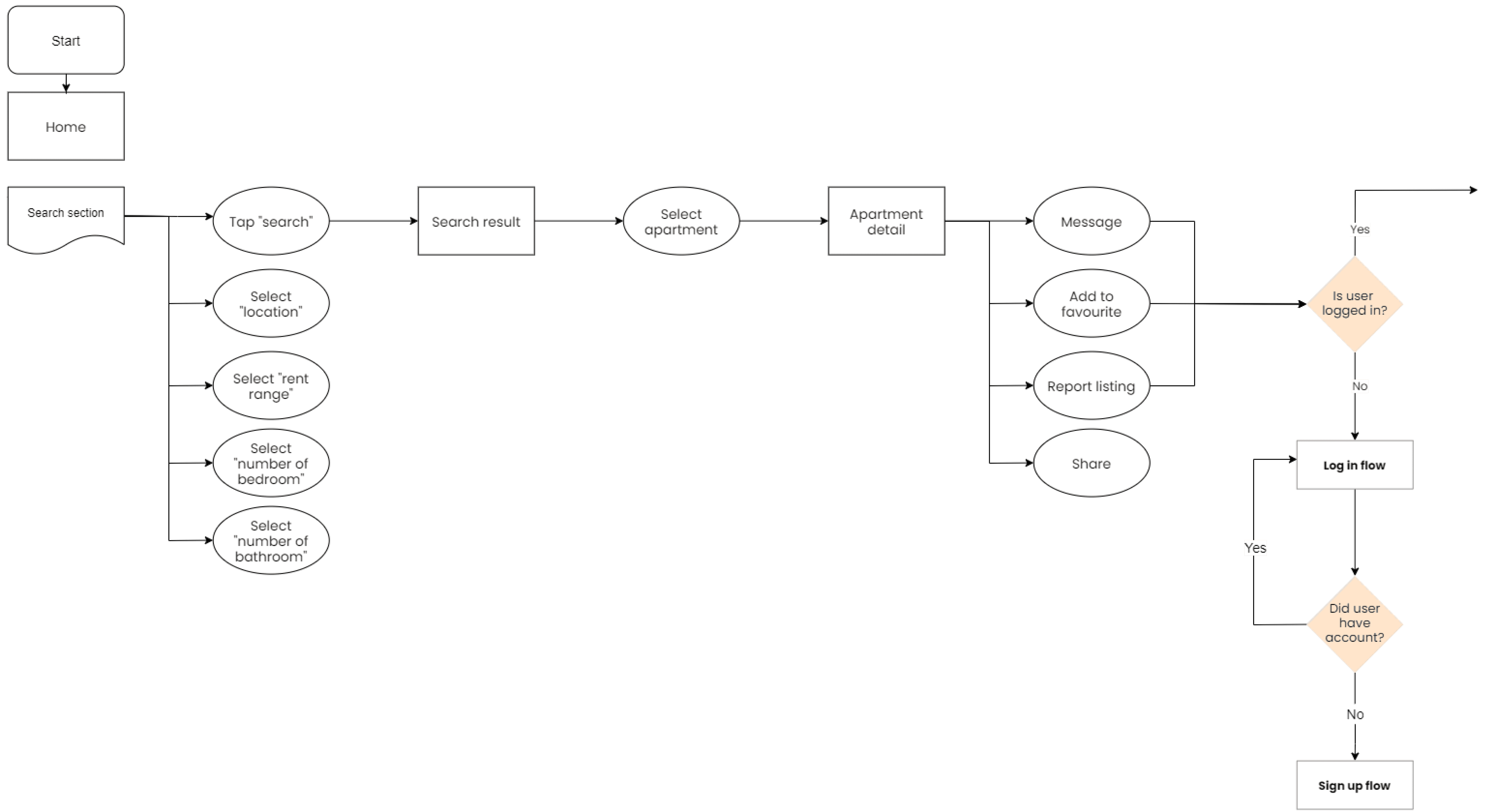
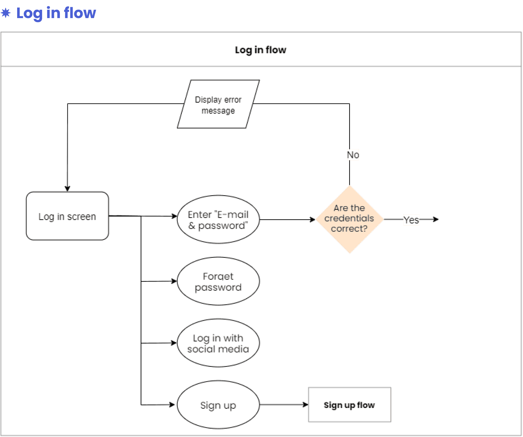
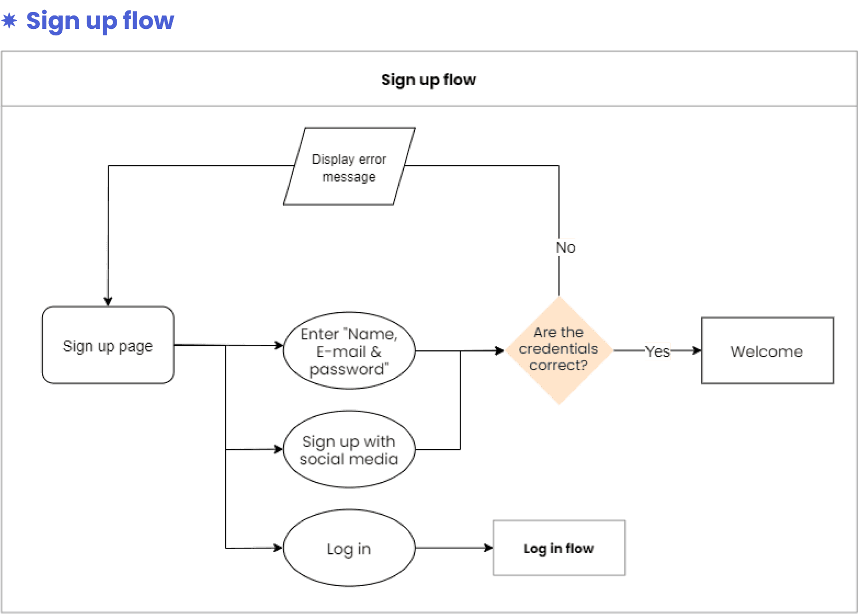
User flow
After mapping out the task flow, I created the user flow using draw.io. The user flow included decision points to ensure a smooth navigation experience. To make the flow easier to follow, I separated the signup and login process into their own flow.
Style guide
To achieve a consistent and cohesive style for apt.tw, I created a style guide. I started with a basic style guide and added new elements along the way, including the following elements:
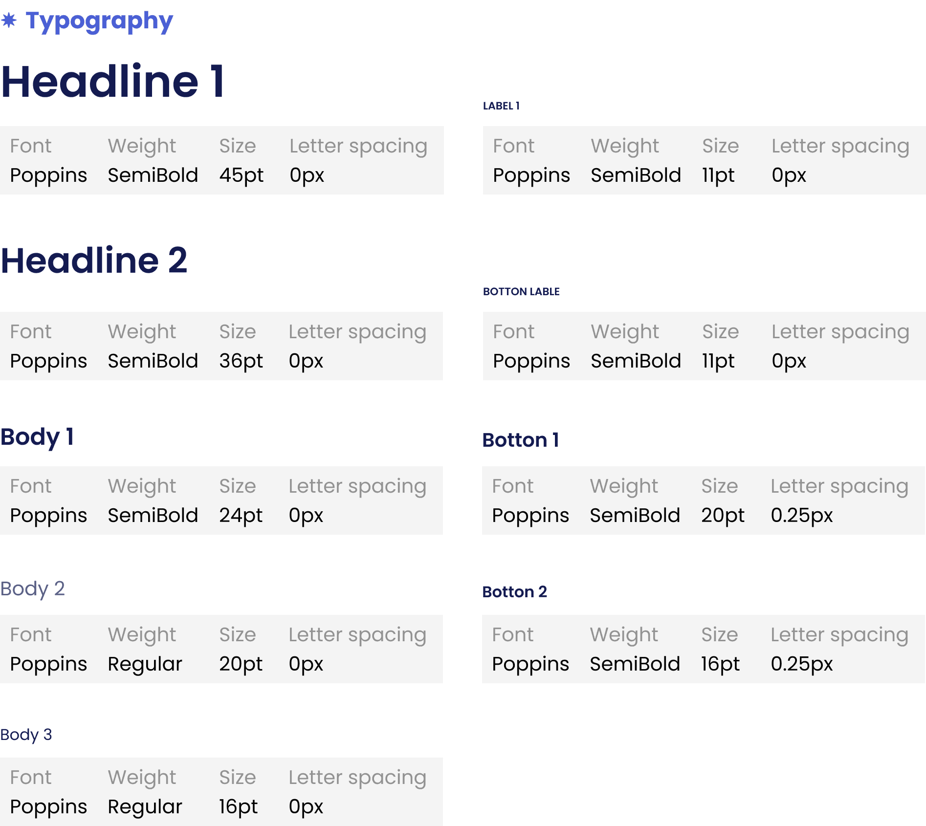
Typography
Poppins is a geometric sans-serif typeface with a fairly high x-height, making it suitable for both headings and body text to improve readability. Poppins also helps to state a clean and minimal feeling without compromising legibility.
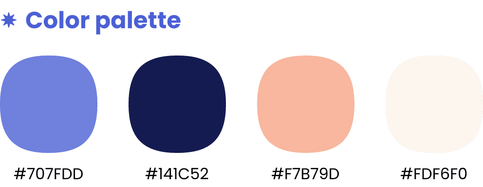
Colors
The lower contrast and saturation of blue, orange, and light beige create a youthful, cheerful, and calming atmosphere, which also conveys reliability. This color palette makes apt.tw approachable, even for first-time users.
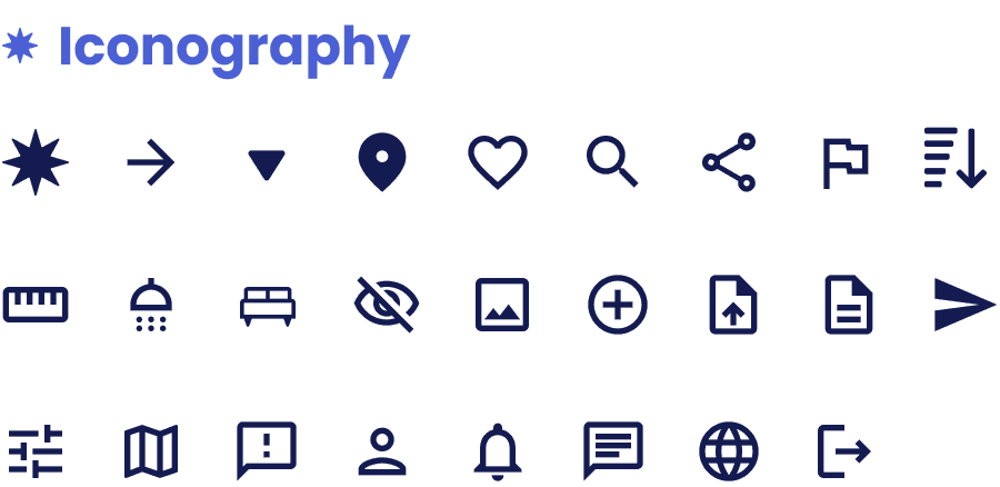
Iconography
I chose to use Google Material Design icons for apt.tw, as they are widely used across UIs and familiar to users.
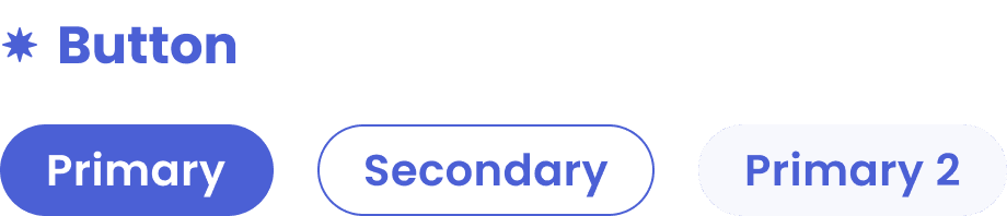
Buttons
To make buttons useful, clickable, and easy to find, I followed these guidelines:
- I made sure the text on the buttons is straightforward.
- I used contrasting colors for the button, text, and background.
- I gave them a size and padding that is easy for users to click.
- I made buttons with larger corner radious to create a more "friendly" feeling.
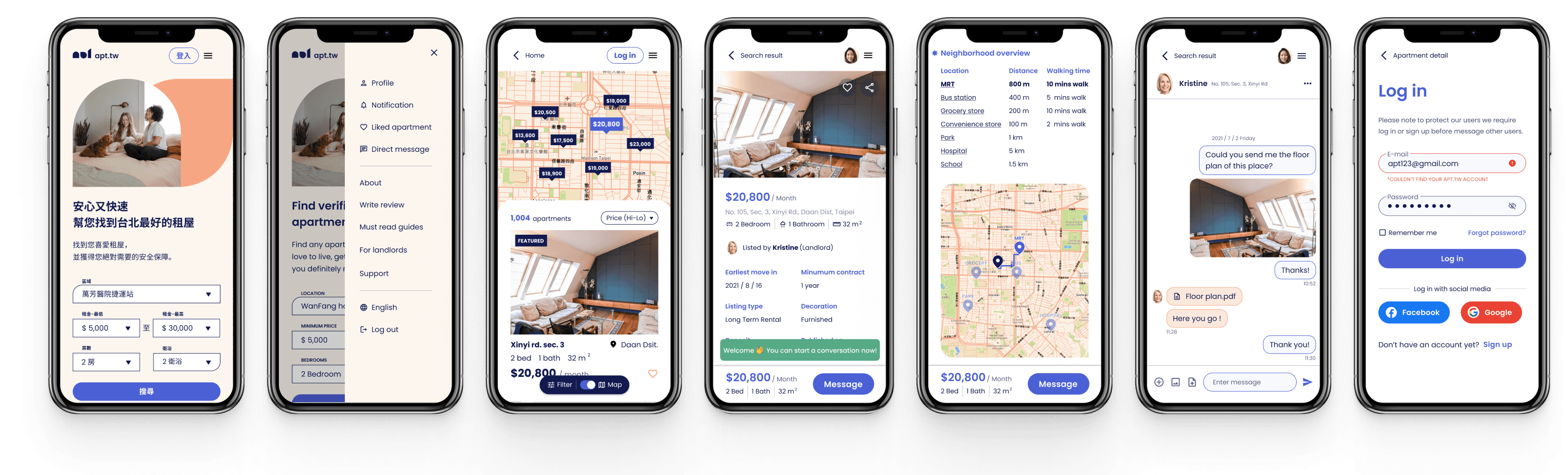
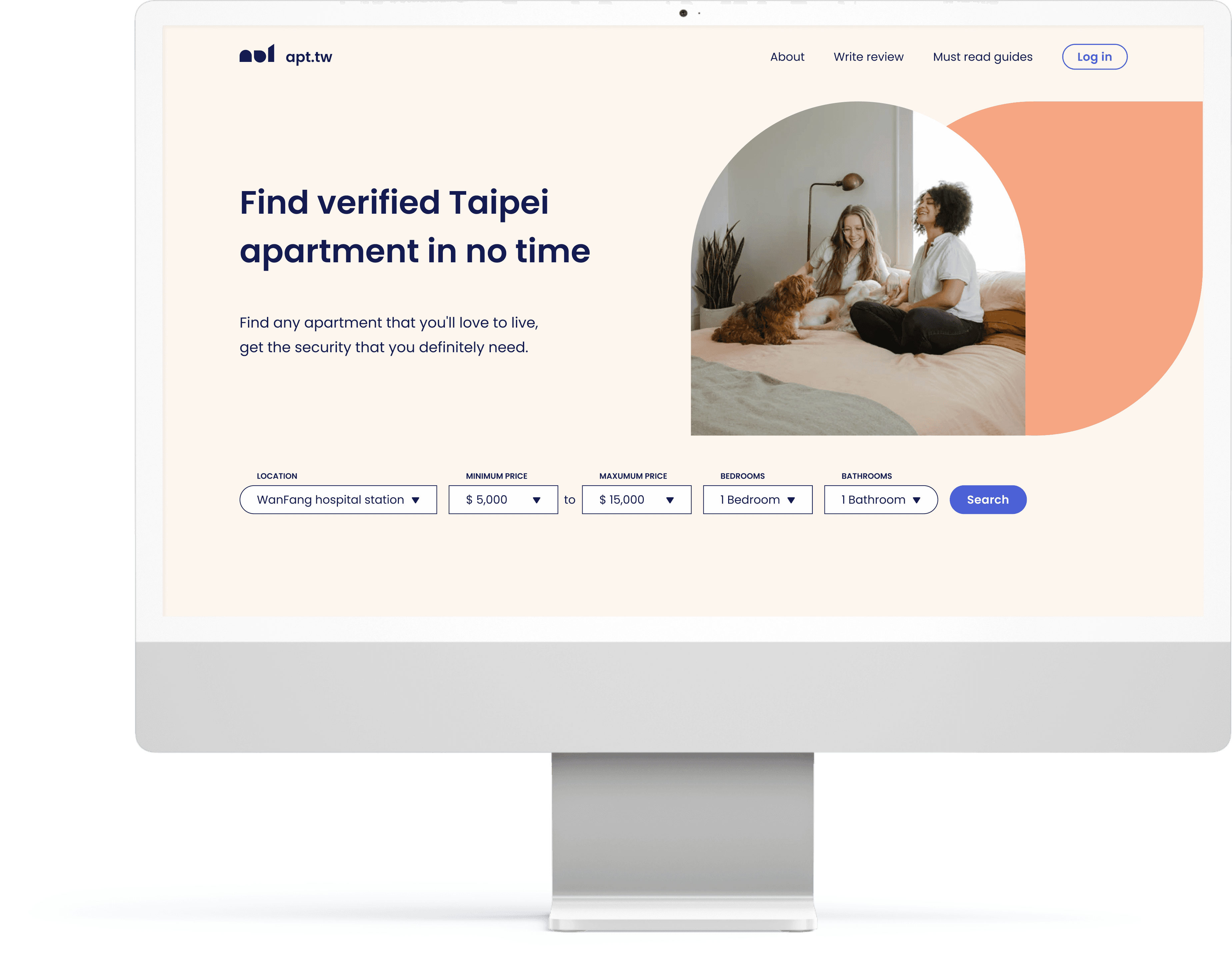
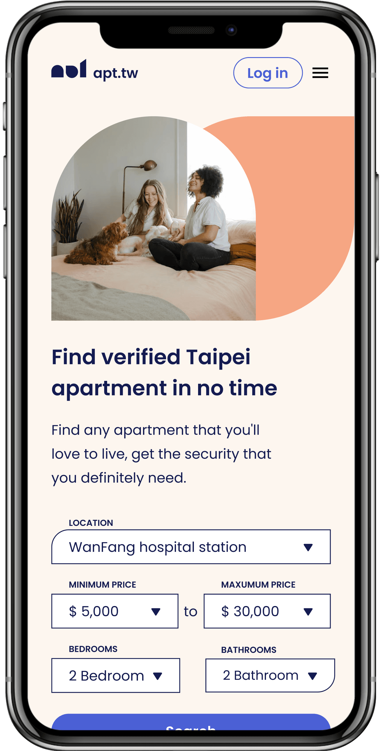
Desktop & Mobile Interface
To create the user interface, I follow a similar process as the landing page, starting with sketches, then wireframing, and refining in Figma.
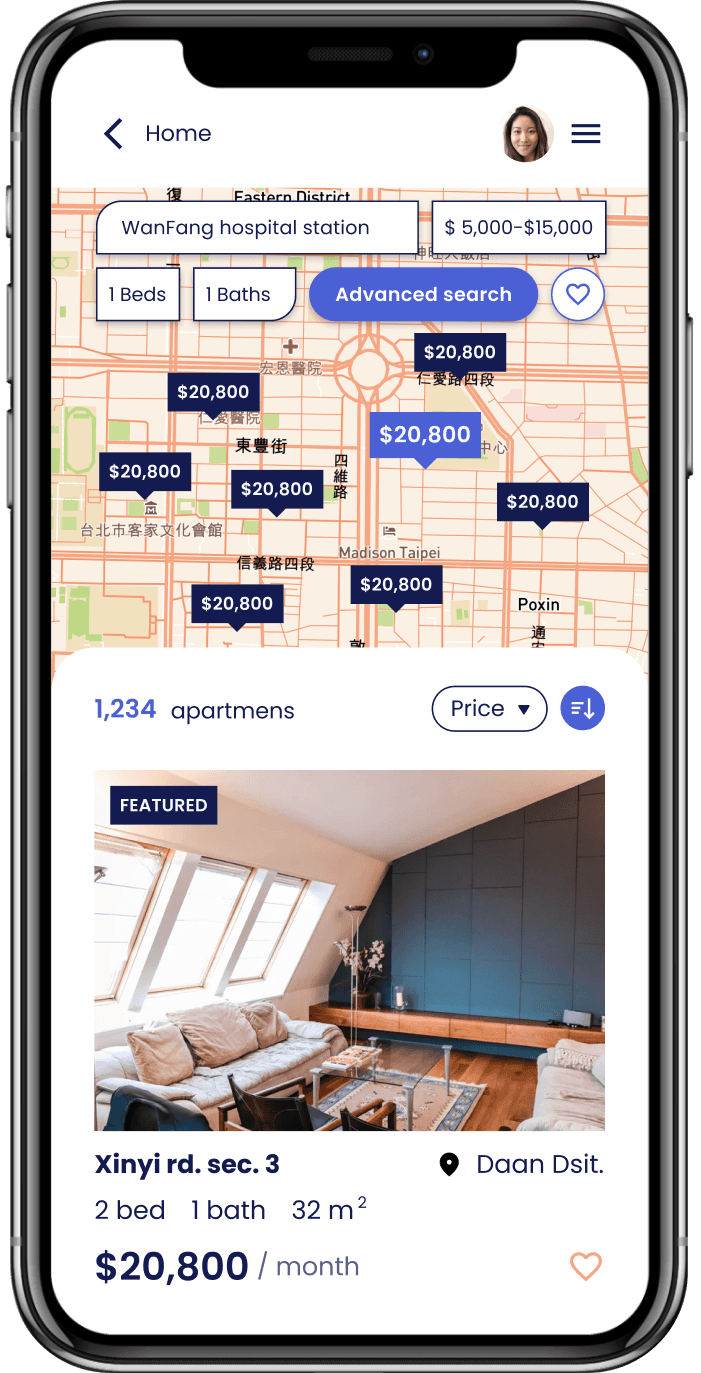
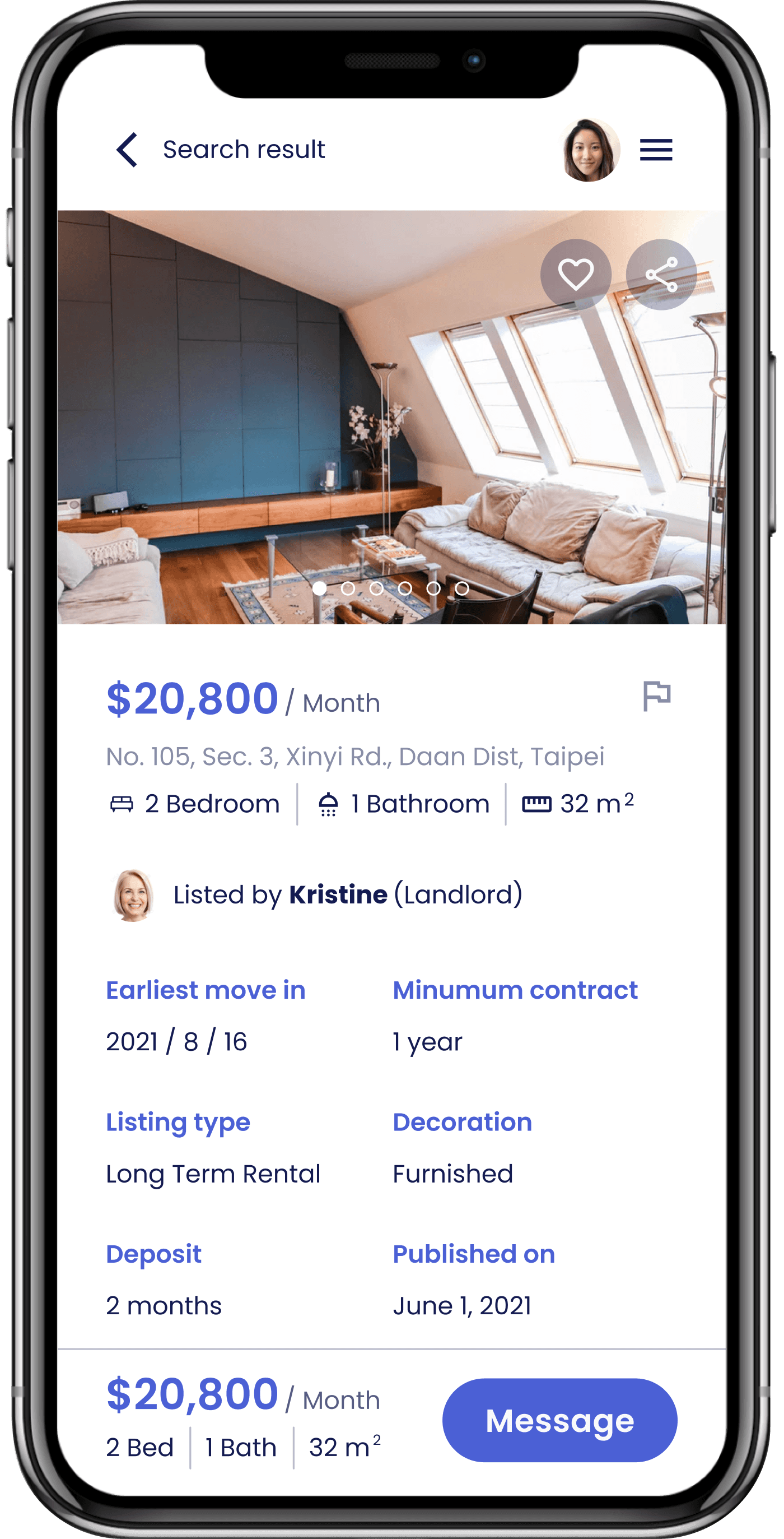
I also make a mobile version of the interface. While desktop has advantages such as larger screens and better suited for longer tasks, mobile devices provide flexibility and portability for users on the go. Mobile devices also offer a more real-time experience, making it easier to reply to messages and take/send photos and videos. Leveraging the benefits of each environment can be a big win.
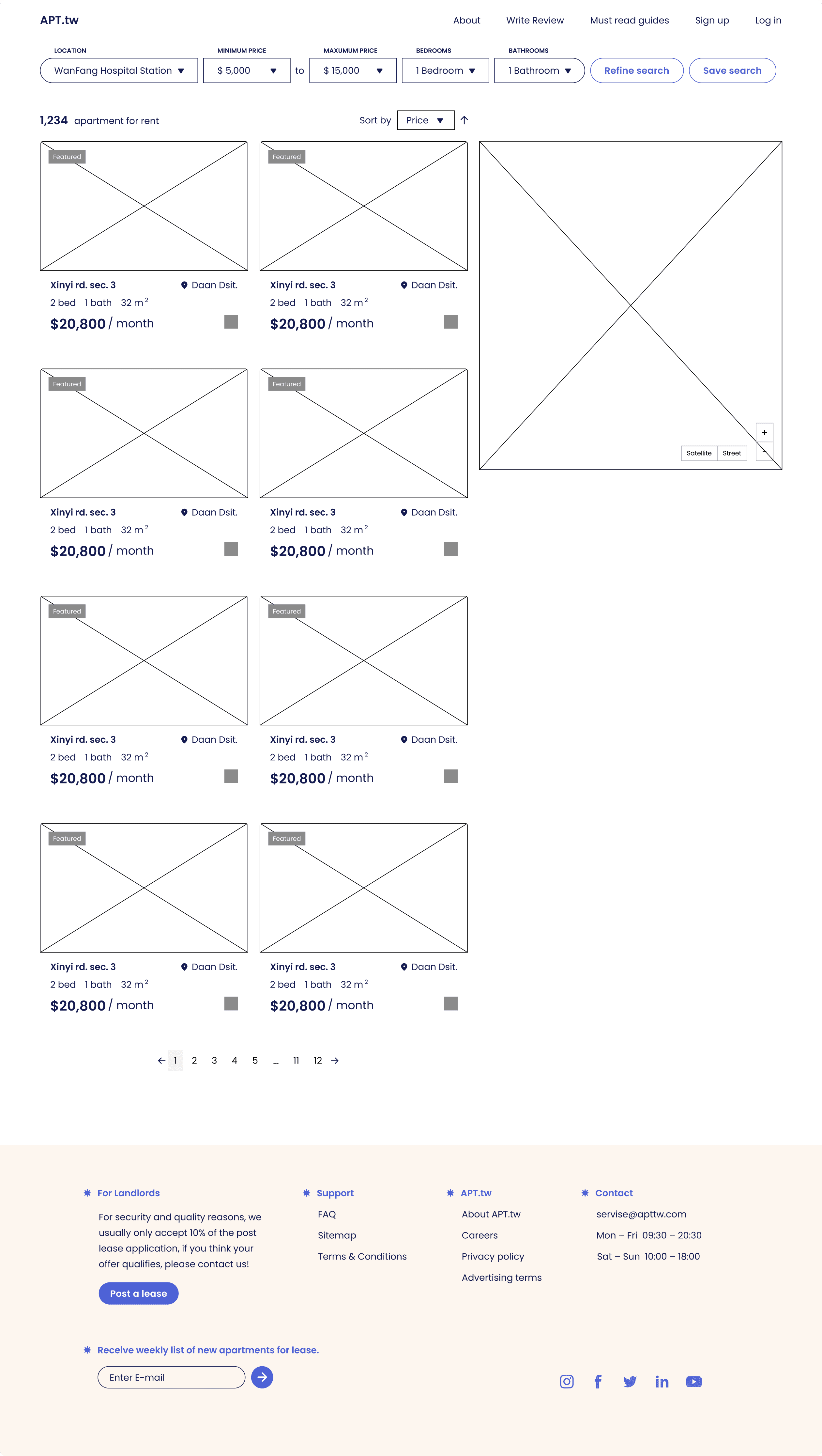
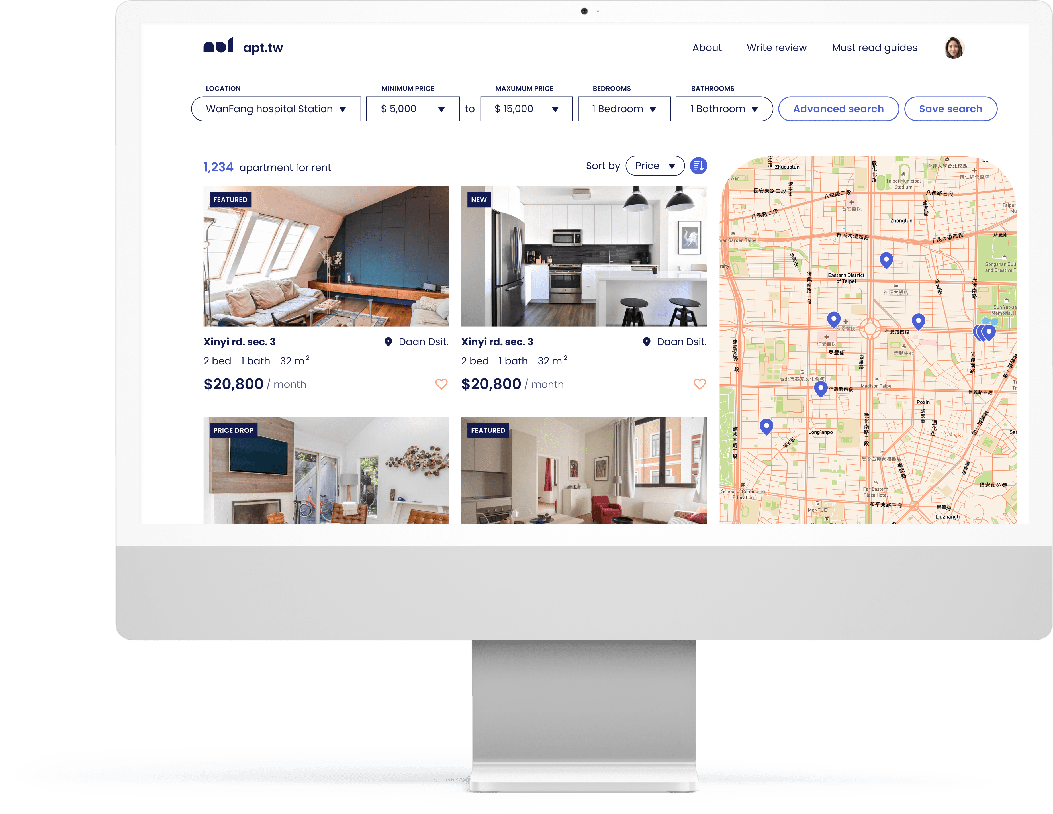
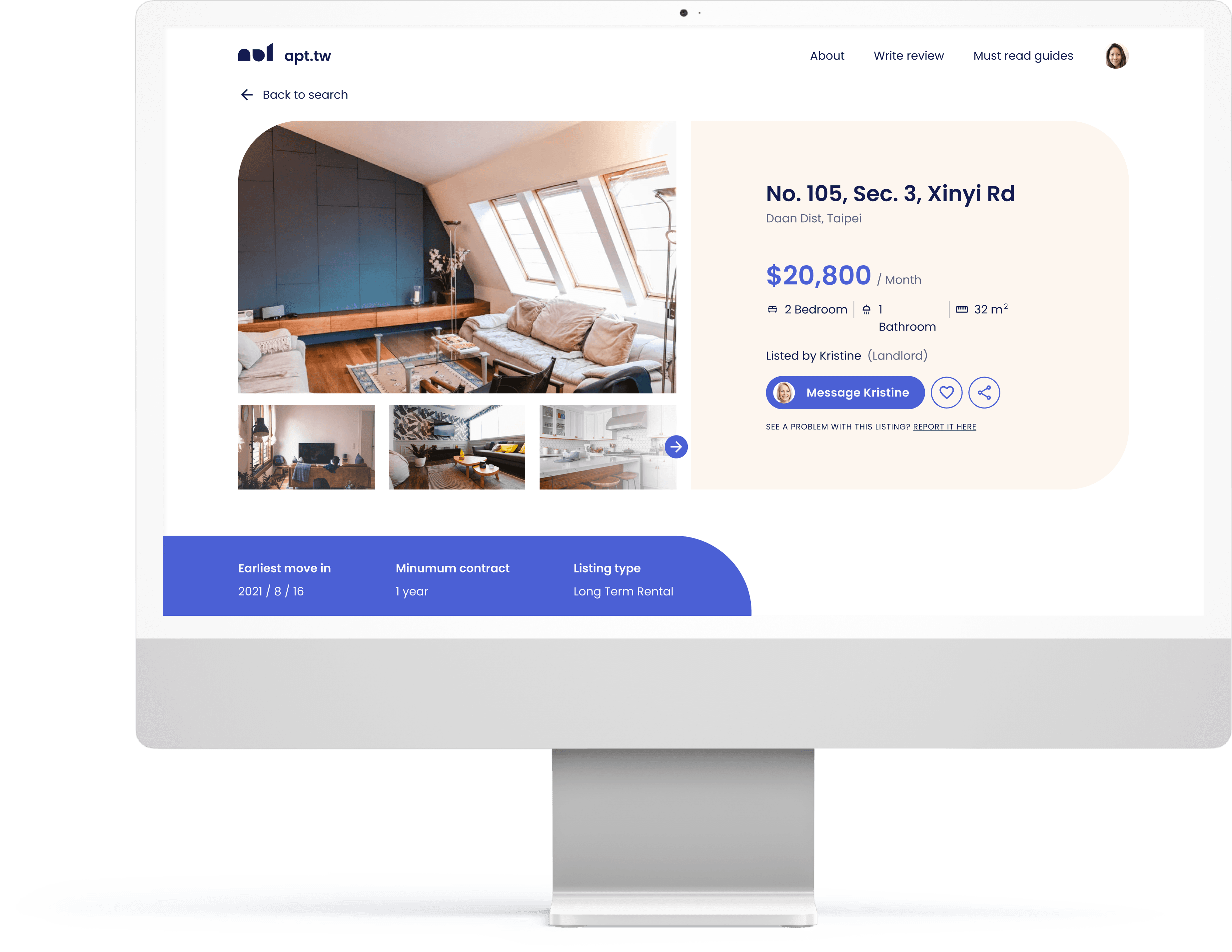
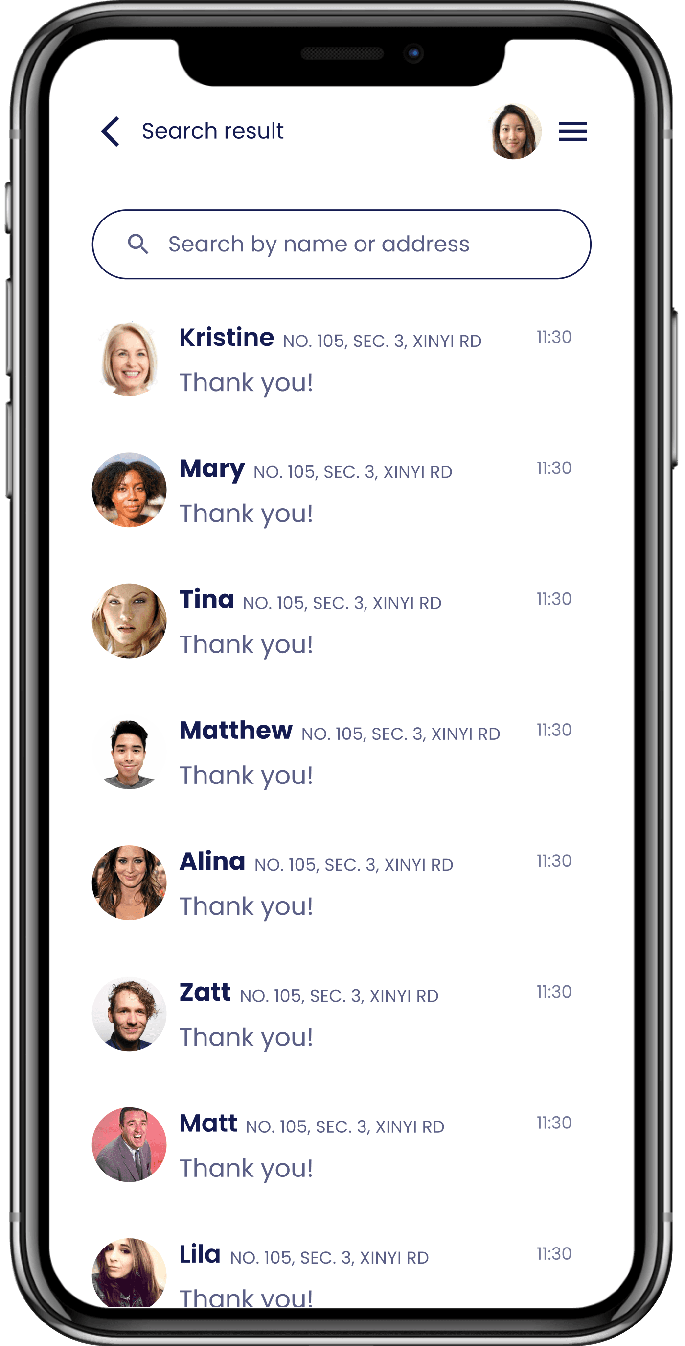
Search & Browse
To lessen users' cognitive load, I structured the search and browse experience to be informative yet uncluttered.
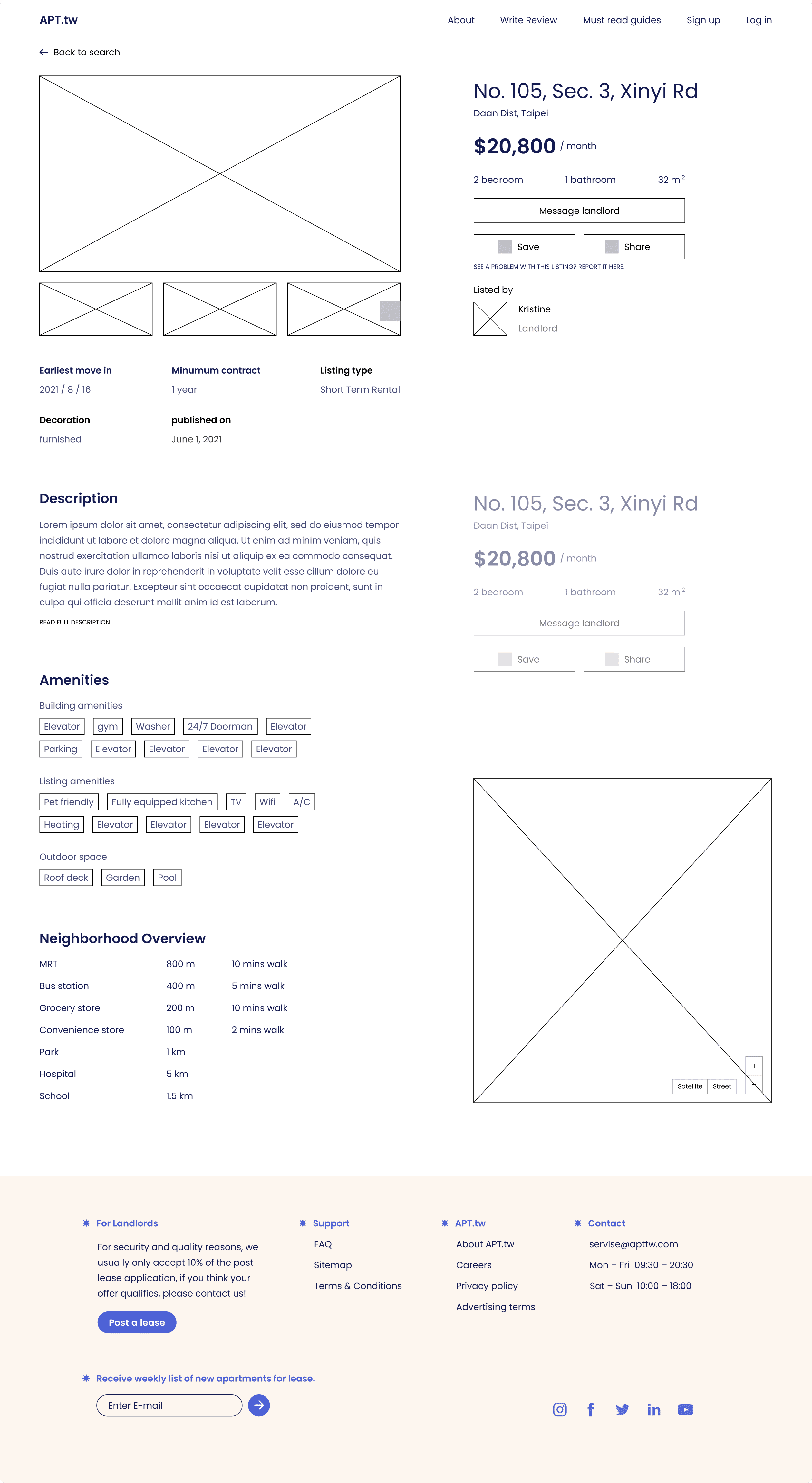
Search begins with a few criteria, and users can use "advanced search" to refine their search further. Search results show essential information such as photos, features, and location, with a clear visual hierarchy to make the information more scannable. I introduced iconography (like bed and ruler icons) to improve scannability and convey meaning quickly. Descriptive information, including apartment description, amenities, and neighborhood overview, is also included since users' decisions rely on these factors.
To increase visibility, I placed the call-to-action button, "Message," at the bottom of the screen. This approach lets users tap on it whenever they're ready.
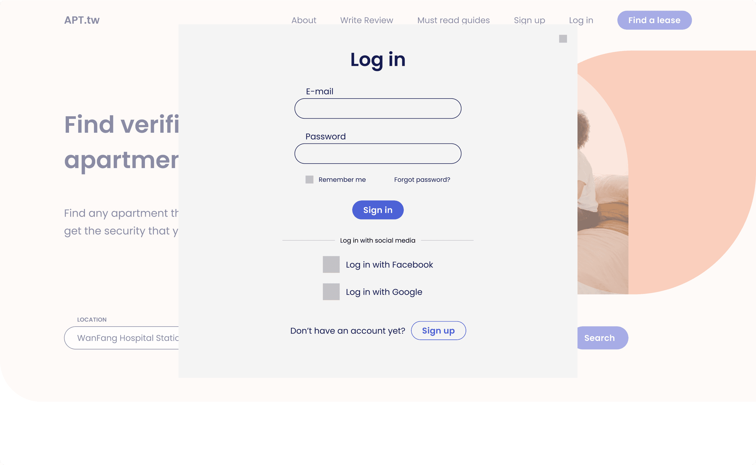
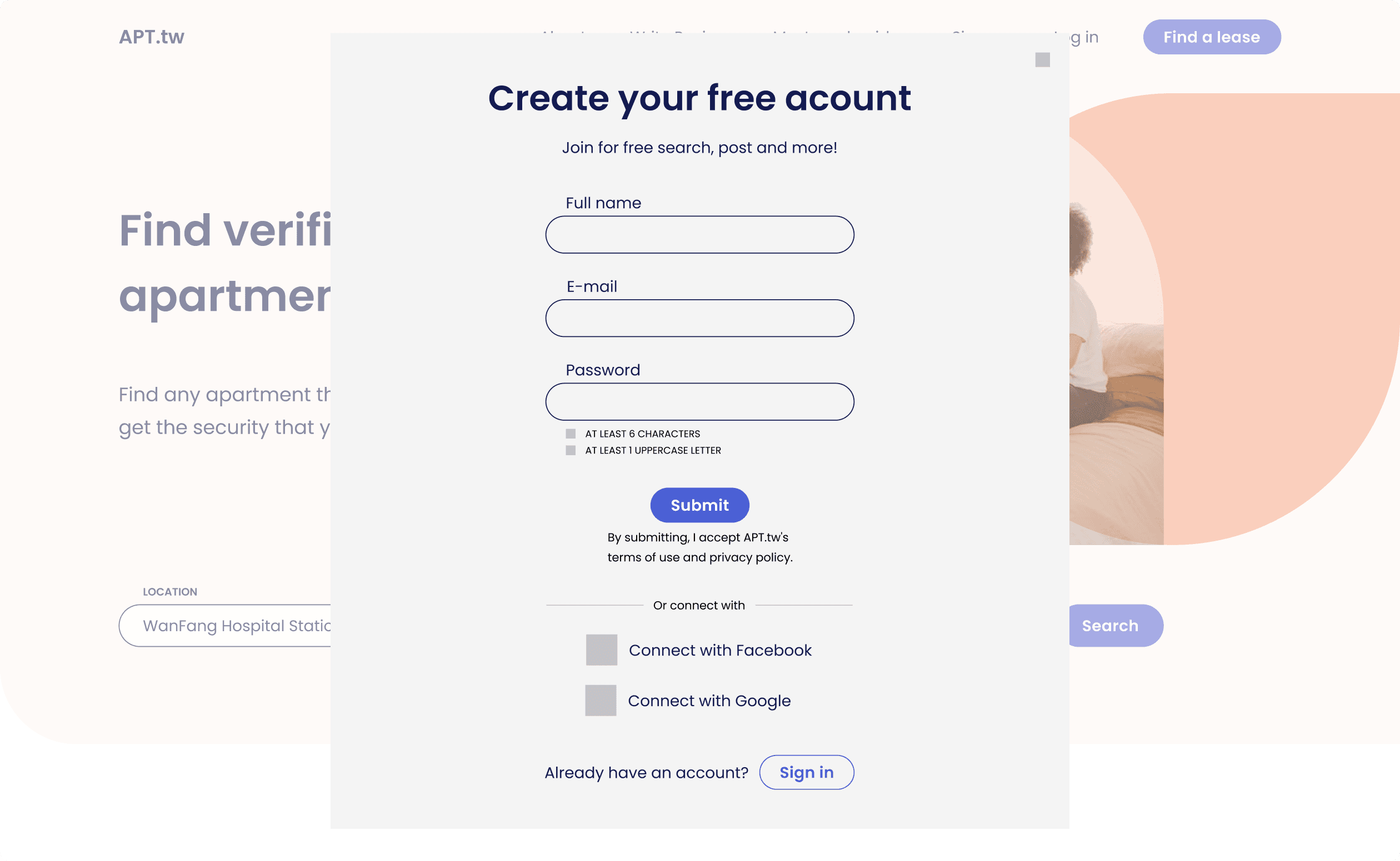
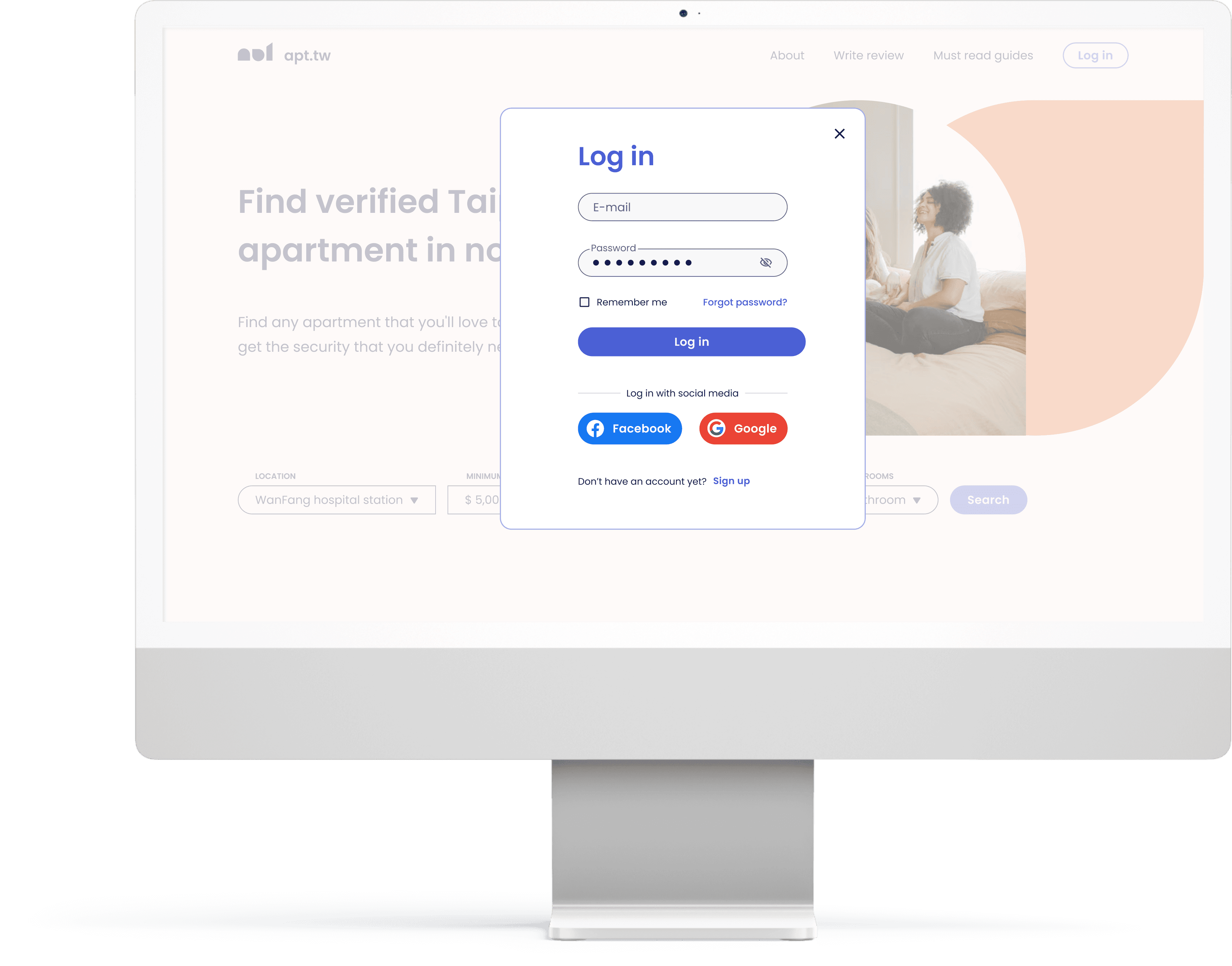
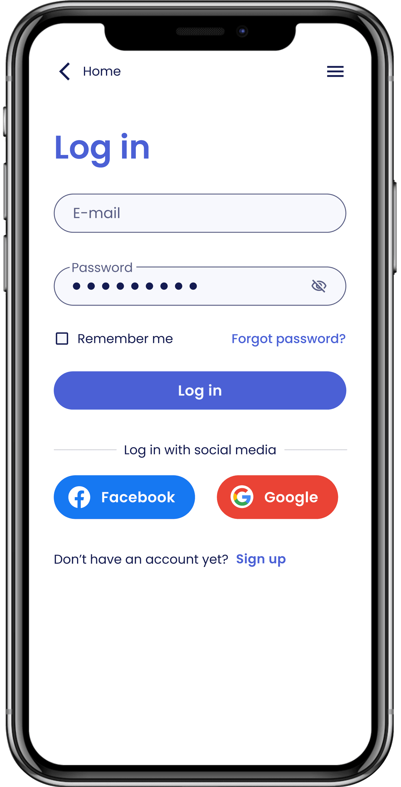
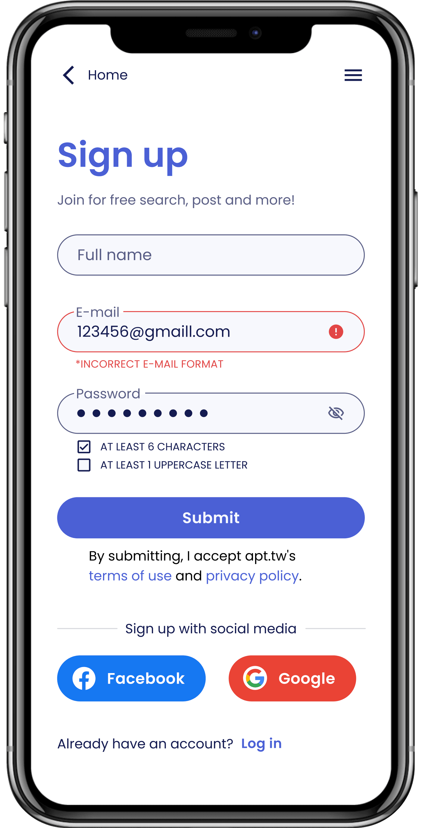
Sign up & log in
To streamline the signup and login process, I minimized the required steps and inputs. The process was visually organized through a clear hierarchy, with separate screens for signup and login. The labels and inputs were positioned top-to-bottom to ensures readability. Additionally, users can also sign up and log in using their social media accounts. This familiar and convenient option eliminates the need for creating a new account and remembering yet another password.
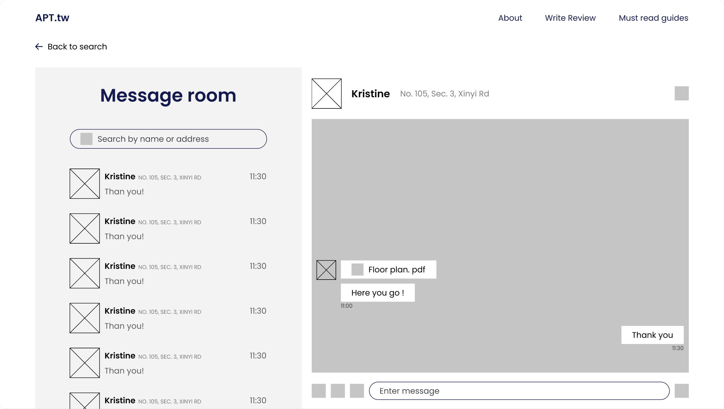
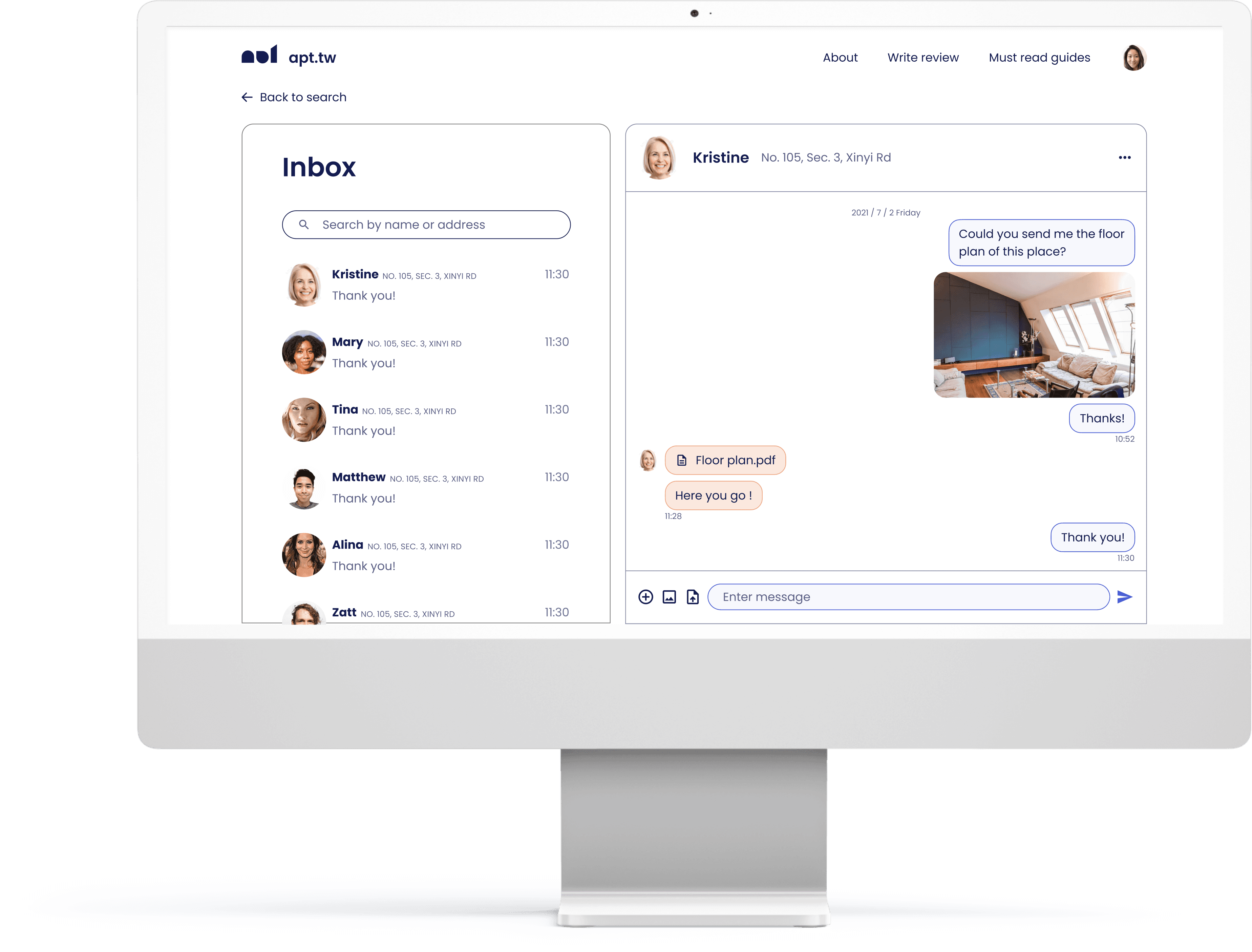
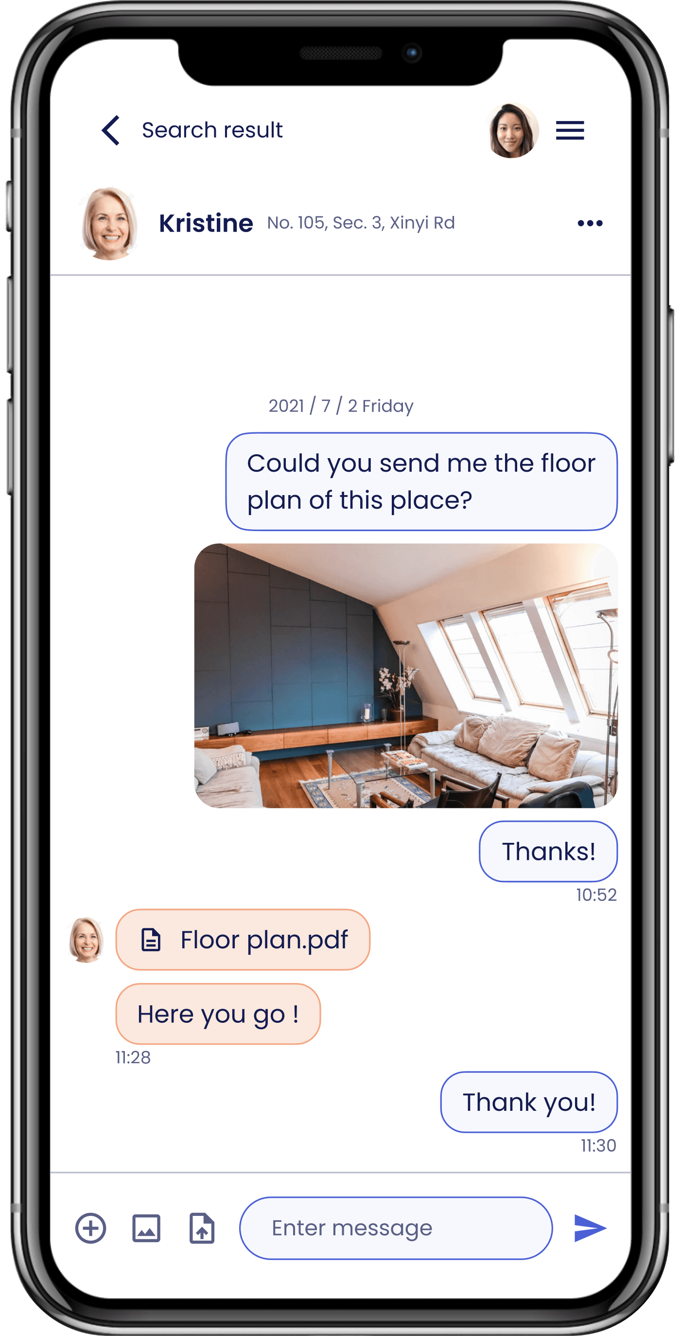
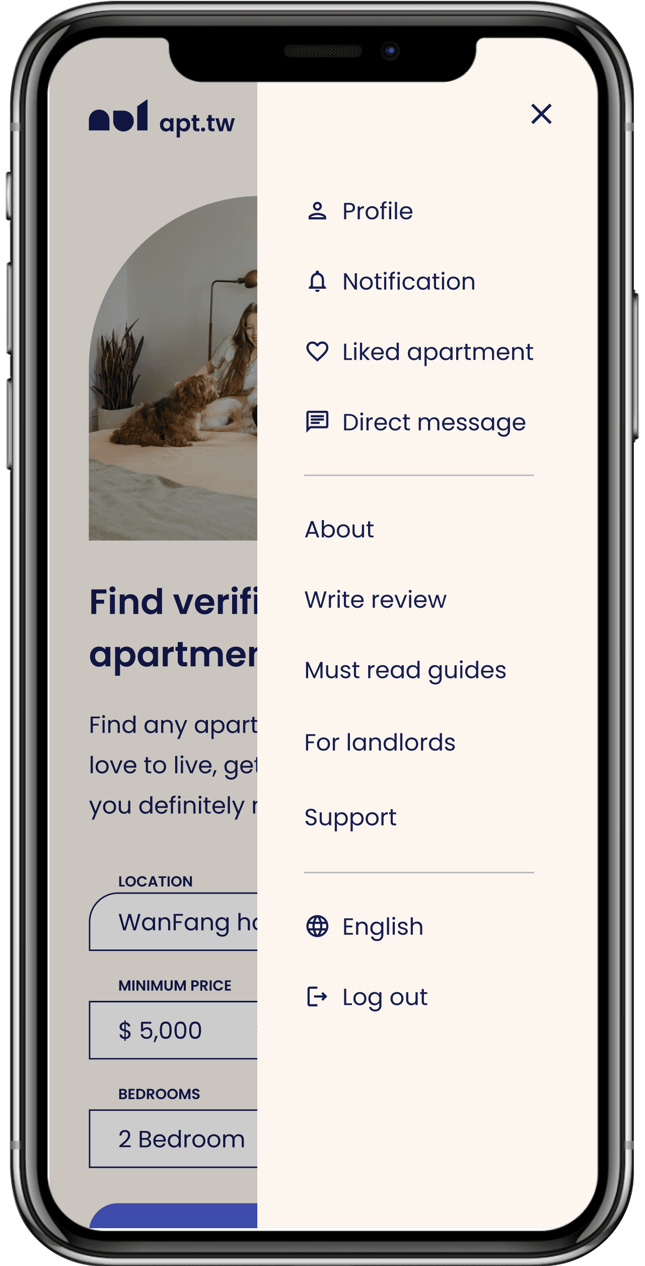
Direct message
According to CTIA – The Wireless Association, the average person takes 90 minutes to respond to an email, but only 90 seconds to respond to a text message.
The direct message function is a core feature of this product, and it is crucial that users find it intuitive and easy to use. The main goal is to keep the interface clean and organized, with a focus on allowing users to easily access old conversations. Additionally, features such as sending photos, videos, and documents are included to enable more efficient communication.
The direct message function allows tenants and landlords to communicate without revealing personal data, offering users a more private, secure, and personalized experience.
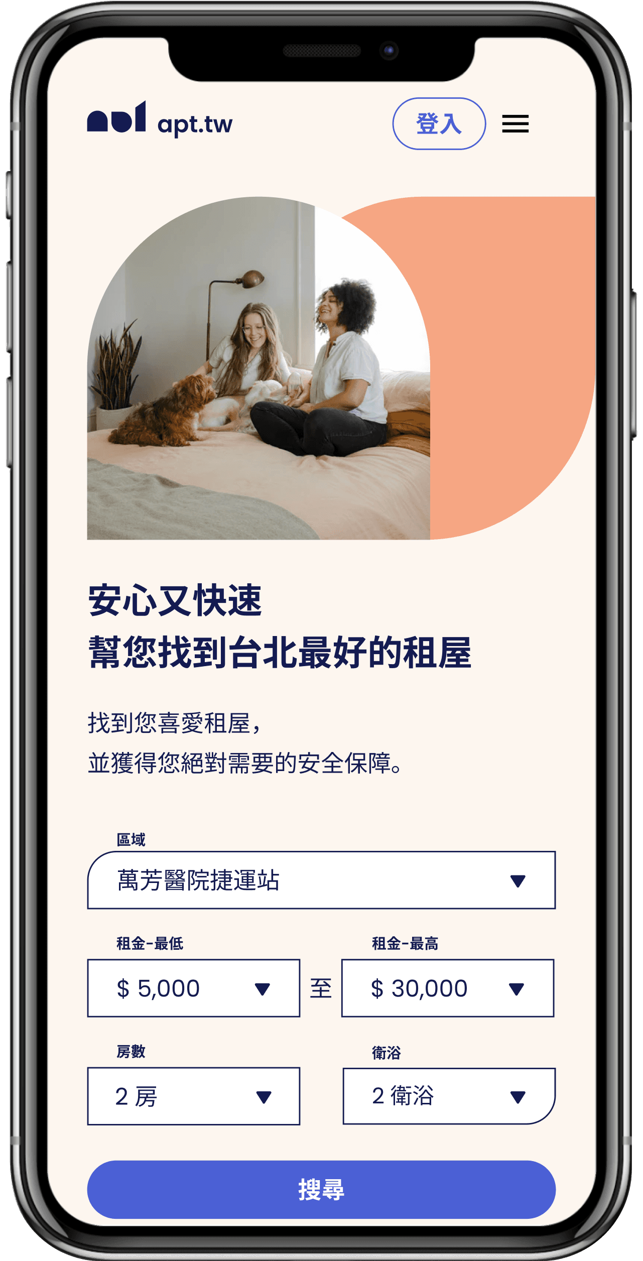
Language
Although this service is based in Taiwan, I aimed to make the app inclusive and usable for all people, regardless of their language preferences. To achieve this goal, I designed the app to be available in both Traditional Chinese and English, recognizing that many people are new to the environment and may still be learning the local language.
Prototype
After all the research and design, let's bring it to life!
I used Figma to create an interactive Hi-fi prototype, which represents the product closest to the final design in terms of UI components, colors, layouts, and functionalities. Hi-fi prototype allows me to examine usability issues in detail and fix them at an earlier stage.
Try the prototype here! (English version)
Try the prototype here! (Chinese version)
Usability Testing and Iterations
Read second part here "How I’ve self-tought and exectued Usability Testing?"
How I’ve self-taught and executed Usability Testing?
Walk you through my approach from learning "what is usability testing?" to iterate the design
Read More
More case studies and writings

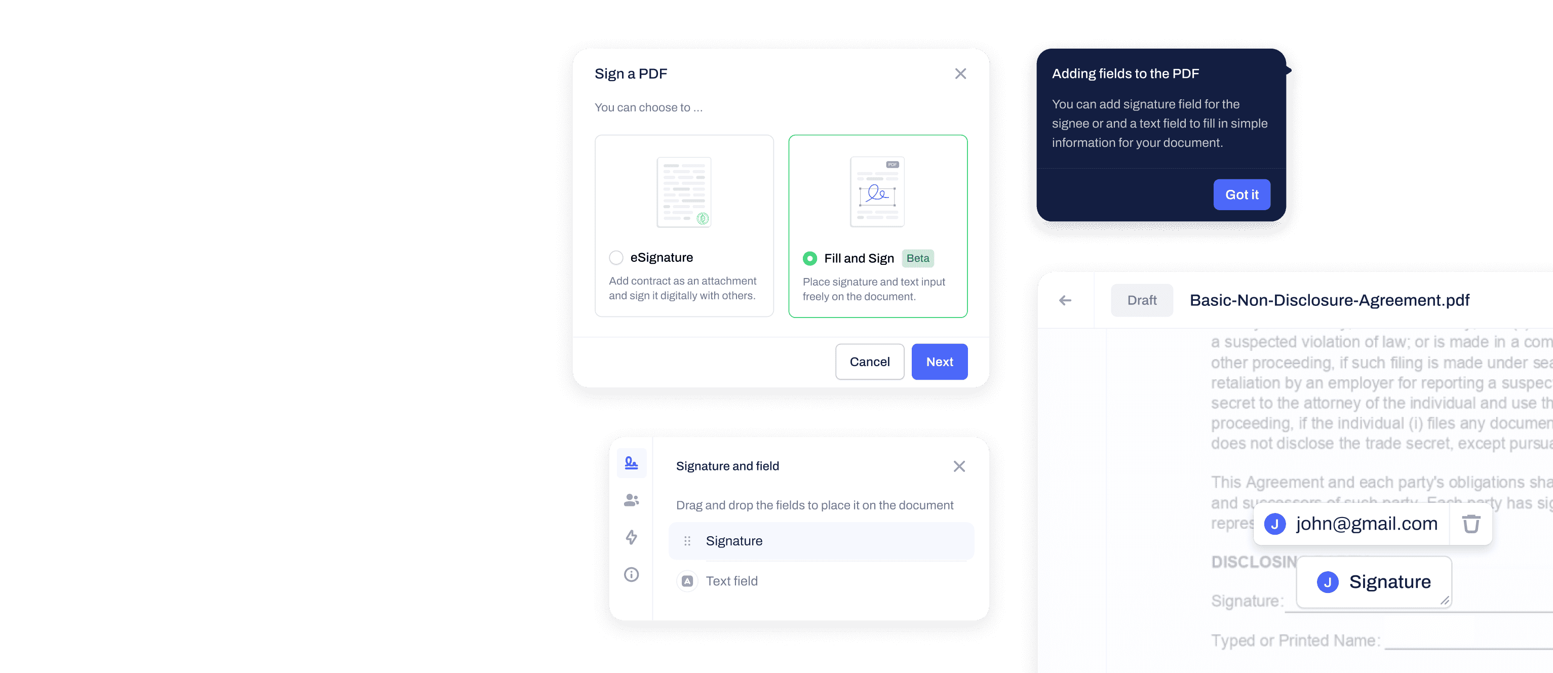
Contractbook・PDF Signing
Help users to have more freedom of signature placement and improve the general flow when interacting with PDFs
Read More

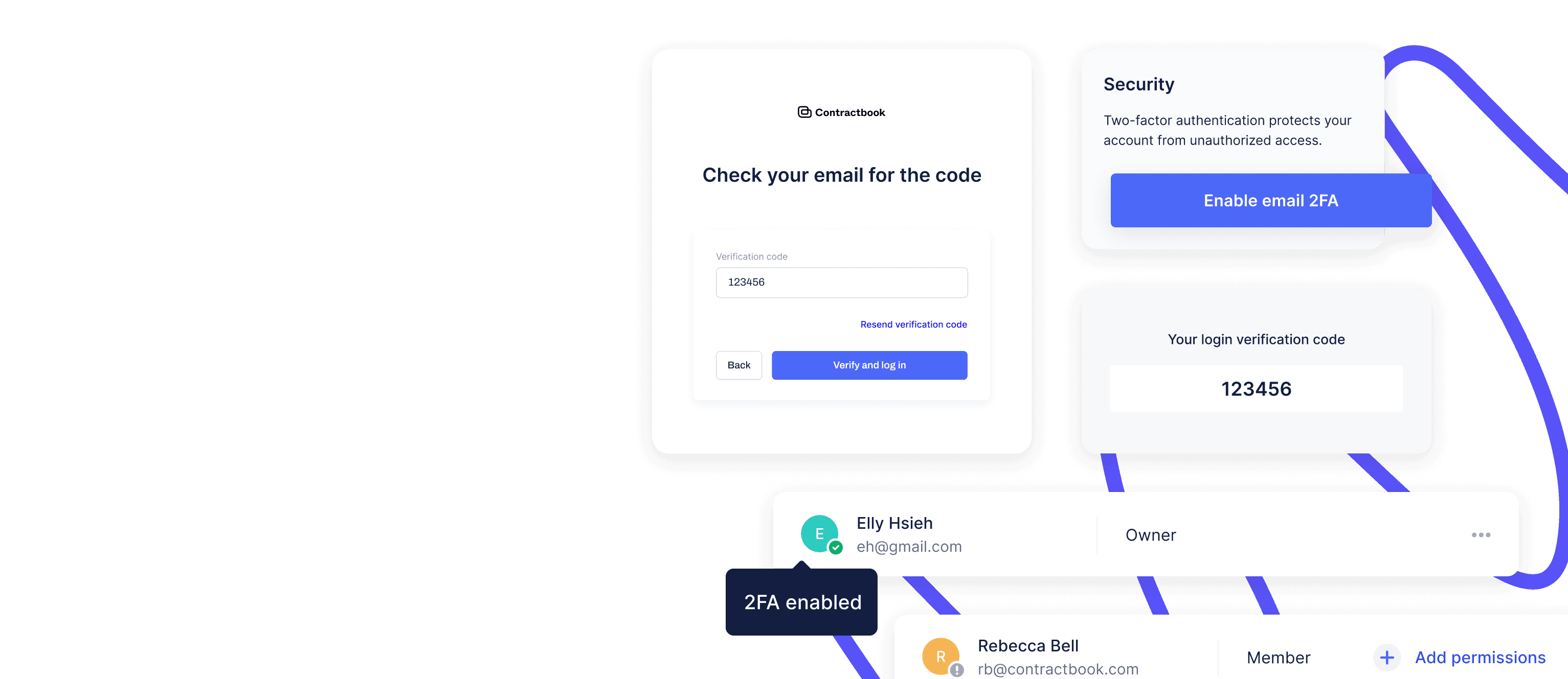
Contractbook・Two-Factor Authentication
Implement 2FA to enhance user’s account security without sacrificing UX
Read More
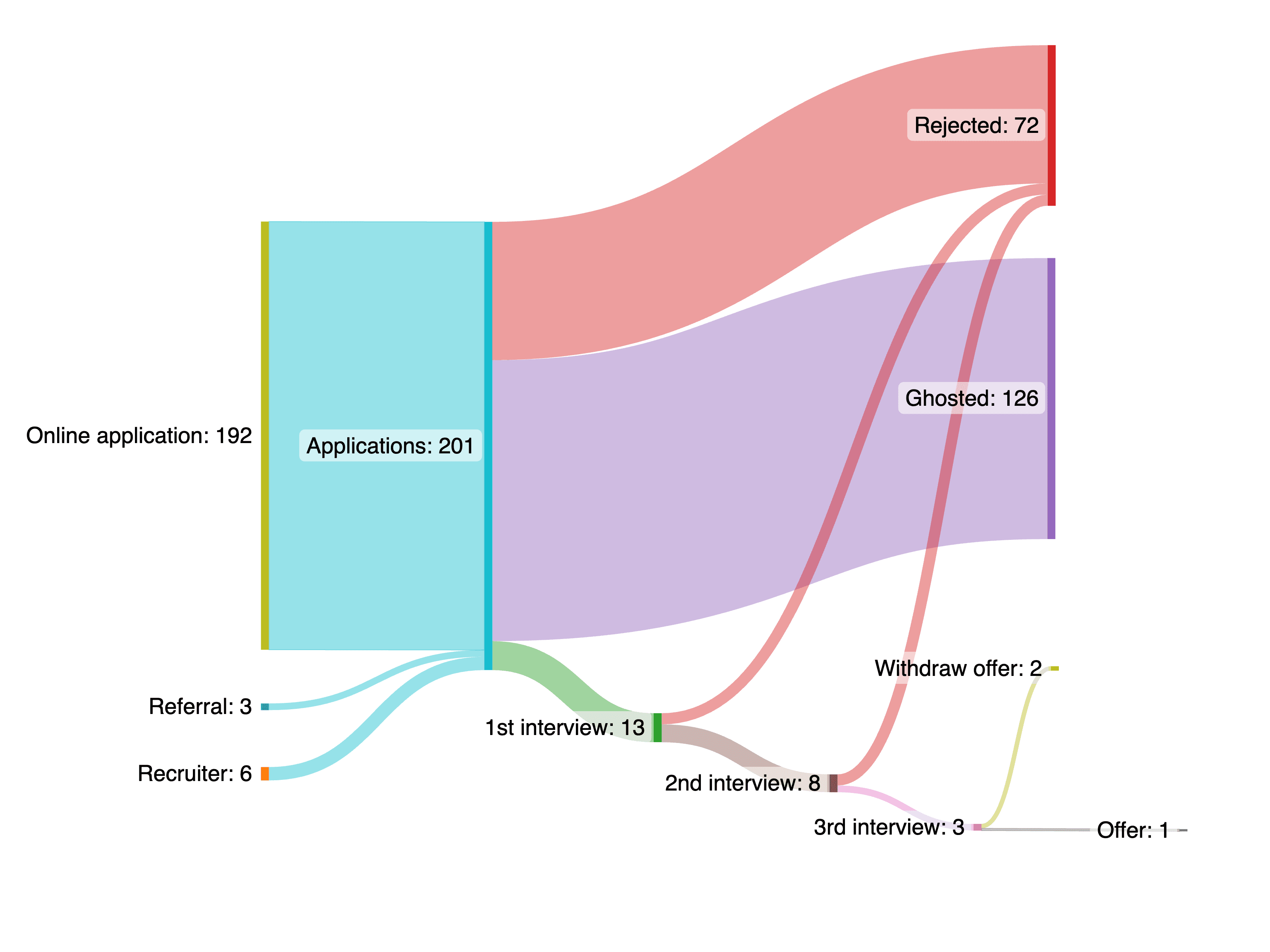
My 6-Month Tech Job Hunt Journey
Before the memories of those struggles fade away, I want to share some valuable lessons I've learned.
Read More
Say hi
ellyhsieh.work@gmail.com