
PDF Signing
I led the product design process for a three-month project to improve the PDF signing experience on Contractbook. The aim of this project was to help users handle all contracts in one place by providing them with more freedom of signature placement and improving the general flow when interacting with PDFs.
The Challenge
Contractbook is an end-to-end, cloud-based contract management software that enables small and medium-sized businesses to manage their contract lifecycle in a fully automated flow.
As part of a crucial team formed to bridge the gap between our competitors, I led the design process for this project to improve the PDF signing experience.
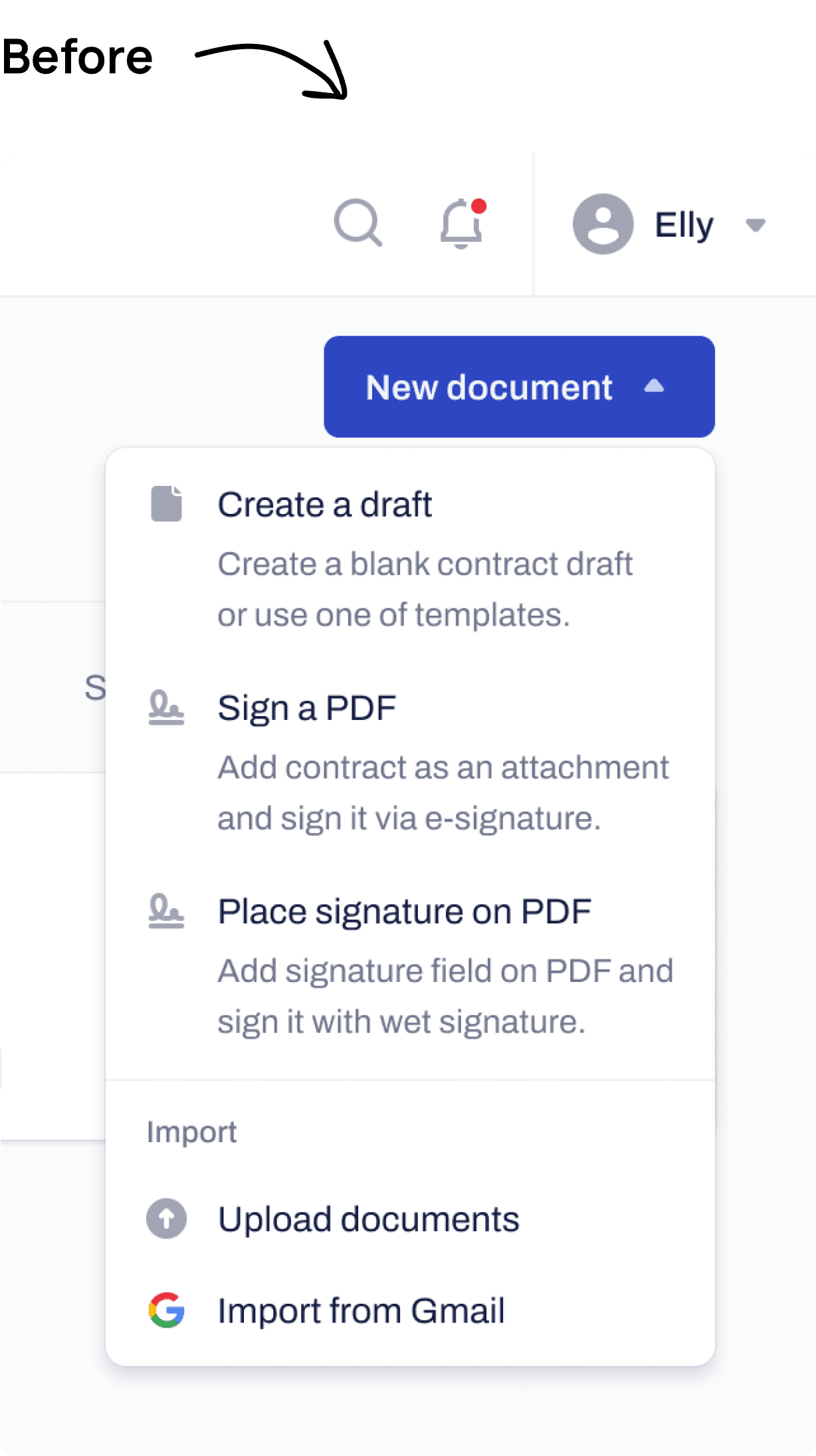
Initially, Contractbook's 'Sign a PDF' feature had limited functionality, allowing users to upload a PDF but not specify where the signature should be placed. As a result, the signature would appear at the end of the document instead of in a designated signature field.
Due to these limitations, many of our users were still paying for other eSignature tools to deal with PDFs, which posed a significant churn risk for us. Therefore, our design questions were, 'How might we help Contractbook users sign on the dotted line?' and 'How might we help Contractbook users fill out simple information on PDFs?'
Current solution!
Current solution (Not able to sign on the dotted line)
Defining the Problem
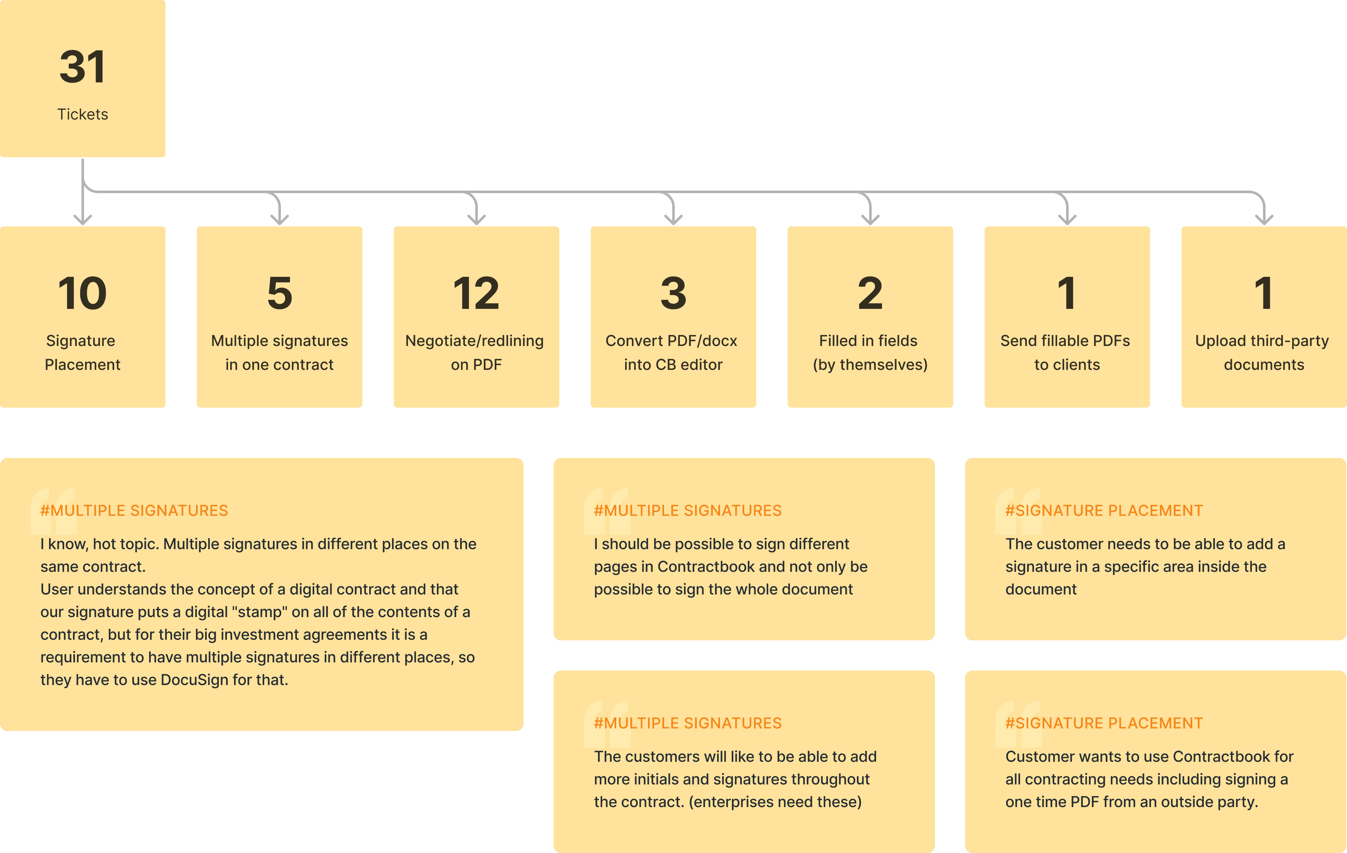
HubSpot service ticket analysis
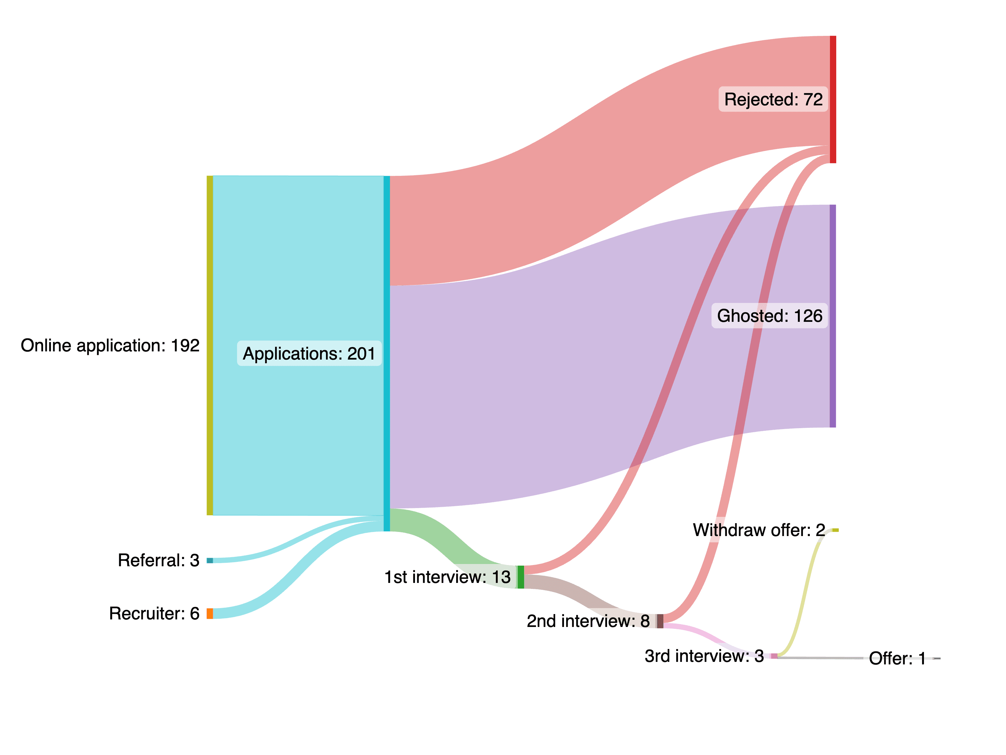
First, I began by analyzing the HubSpot service tickets. Some of the problems and findings we identified from the analysis are:
- We received 31 tickets regarding the PDF signing topic, and most of them are considered lost, meaning we lost the deals.
- 10 tickets were about not being able to place the signature freely on the document.
- 5 tickets were about not being able to place multiple signatures or initials on the documents.
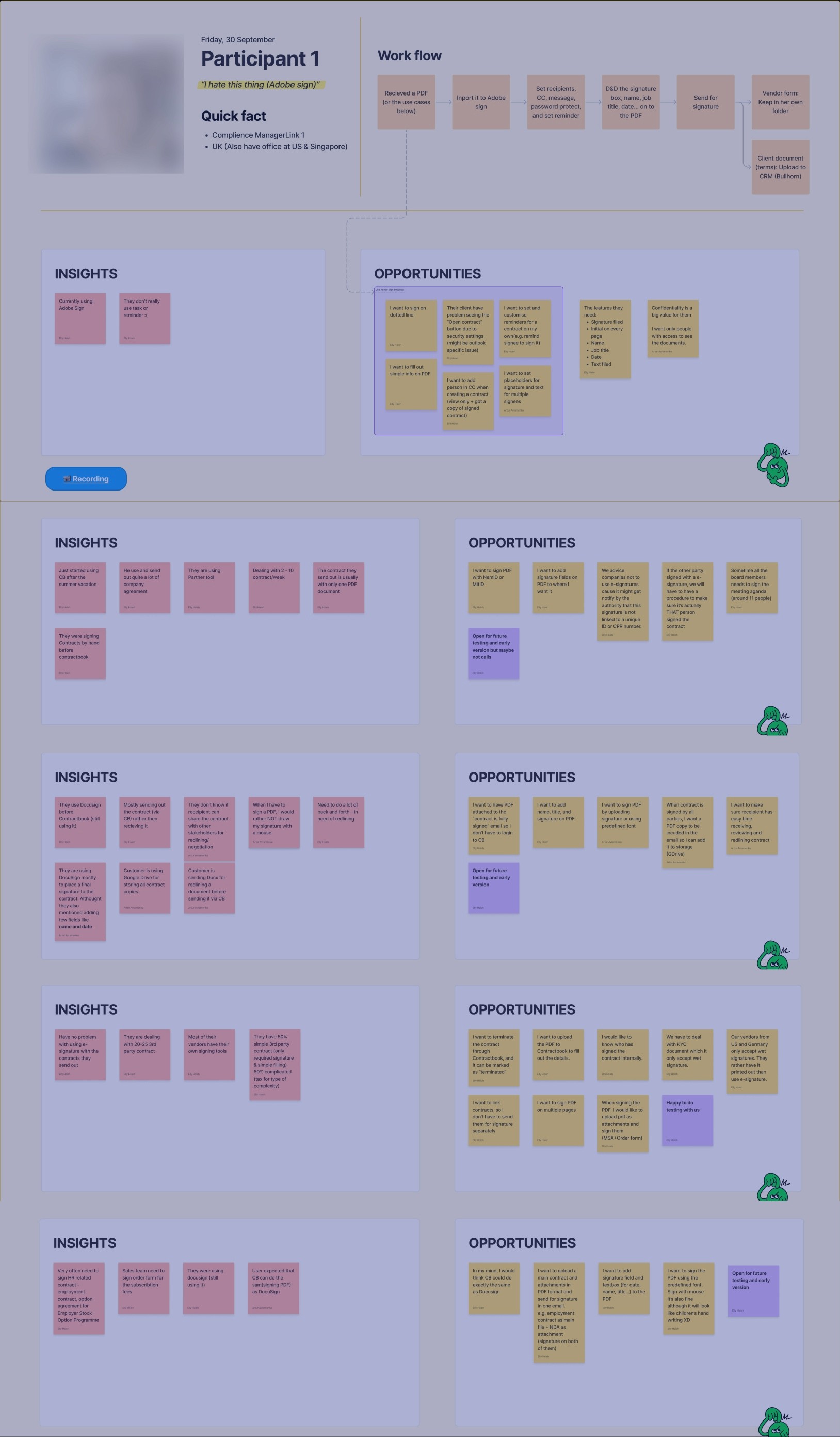
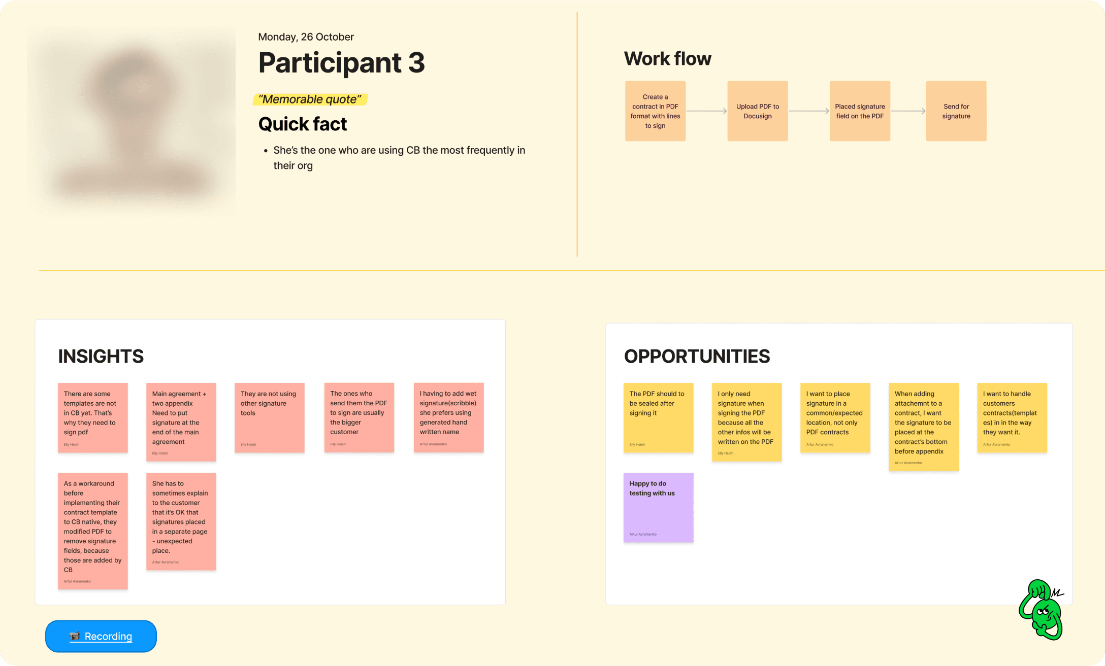
Recruiting and talking to users
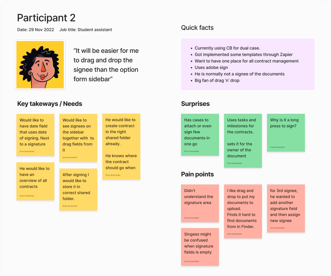
To address the loss of deals resulting from the lack of a PDF signing feature, we knew we needed to connect with real users to better understand their needs and pain points and to identify opportunities for improvement. Initially, we invited users who had provided feedback related to PDF signing through our Customer Success managers but received few responses. As an alternative, we set up a feedback invitation using Pendo, targeted at users who had used the 'Sign a PDF' feature at least once. Ultimately, we conducted 10 interviews.
Some of the opportunities we identified from the interviews are:
- I want to place a wet signature and/or initials anywhere on the contract.
- I want to assign the signature field to a specific signee.
- I want to fill in simple information inside the PDF, e.g., name, job title, date.
- I want to use one tool for all my contracts.
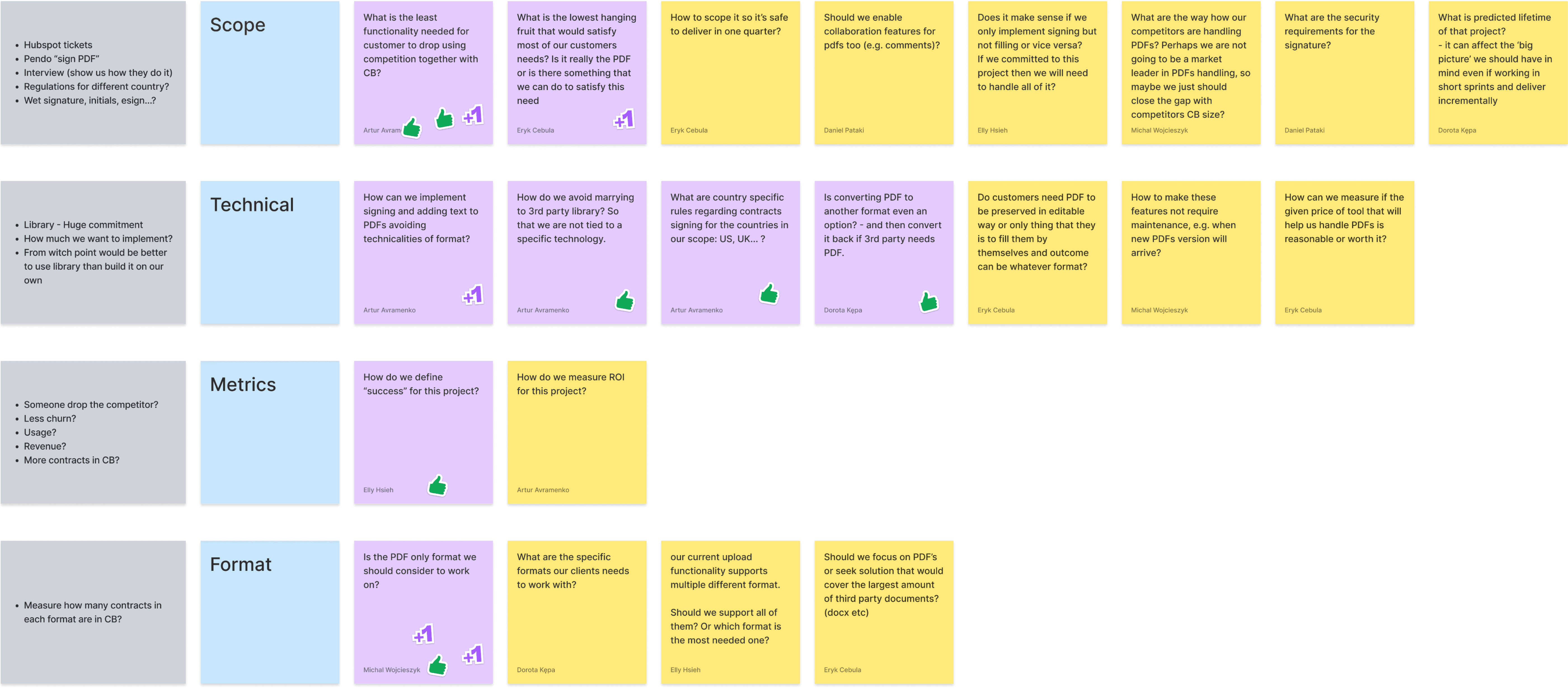
Workshop #1 - goal setting
To better understand our users needs and align our efforts, I led two workshops with my team of seven. The first workshop focused on defining our long-term goals and potential obstacles. This helped to keep everyone moving in the same direction and turn the goals into actionable items.
The goals we agreed on after the workshop are:
- Help users sign on the dotted line.
- Help users fill out simple information on PDFs.
Workshop #2 - user journey mapping
The second workshop I facilitated was a User Journey Mapping session. This helps to visualize a user's end-to-end experience with the feature we were building, as well as to help us narrow down a broad challenge to a more specific scope for the first iteration.
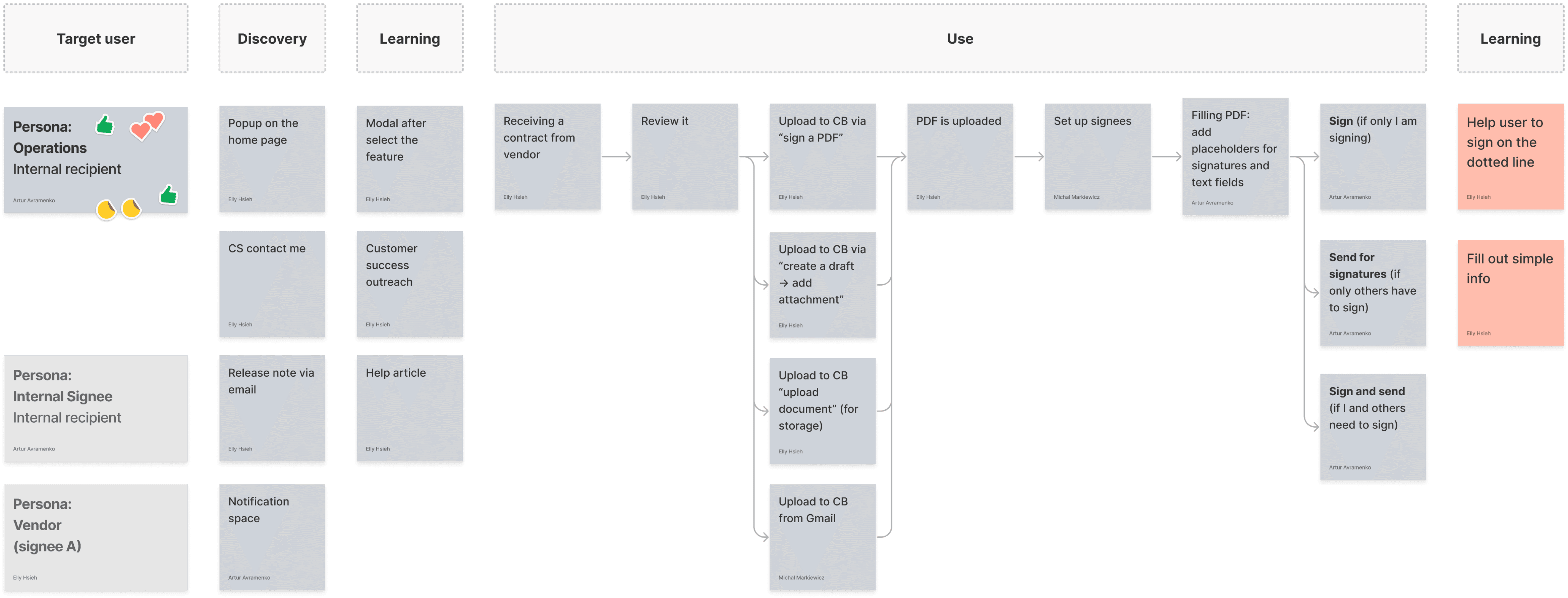
Design audit
To streamline the PDF signing feature and ensure its efficiency, I conducted an audit of the current feature, identifying and eliminating unnecessary functions. These workshops and audits allowed us to create a user journey map, information architecture, and clear project scope, which provided guidance for the design process.
Competitive analysis
Before diving into the design, I conducted a competitive analysis of other PDF signing tools. My goal was to gather insights on features, value propositions, user flow, layout, and tone and language.
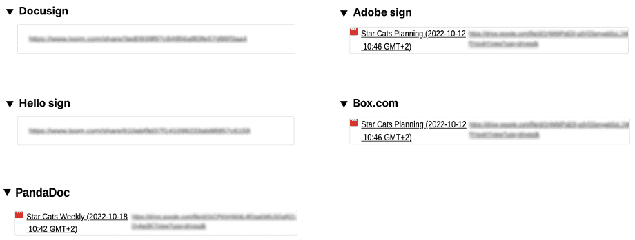
Left: Plan and of the competitive analysis; Top right: Recording of the competitors; Bottom right: Screenshots of the competitor
Early Ideation
After establishing a solid foundation, I started designing the PDF signing interface. My primary goal was to create a user-centric interface that would guide users through the process of adding signees and sending PDFs out for signatures.
Design Review & Iterate
I organized a design review with five other designers to gather feedback on the prototype before showing it to users. This review helped me gather new ideas, engage in discussions, and obtain a fresh perspective on the problems, scope, research findings, and design decisions. It also served as a sanity check to ensure that my design aligned with our design system and patterns.
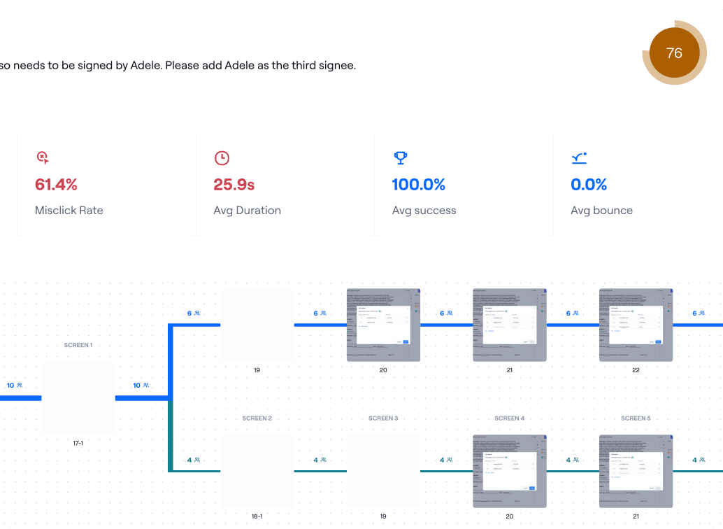
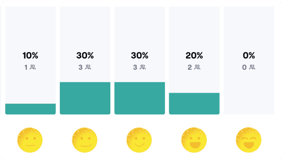
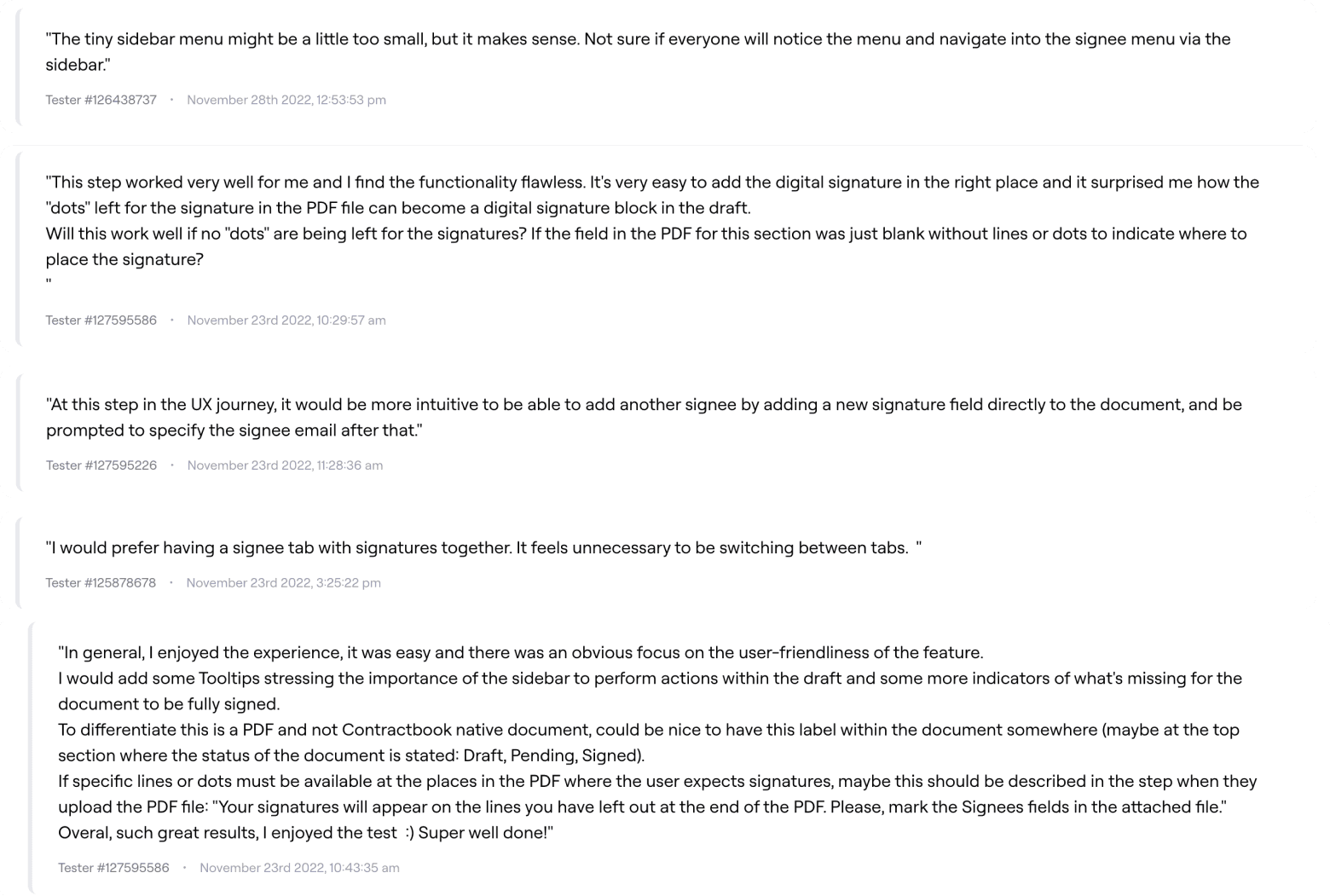
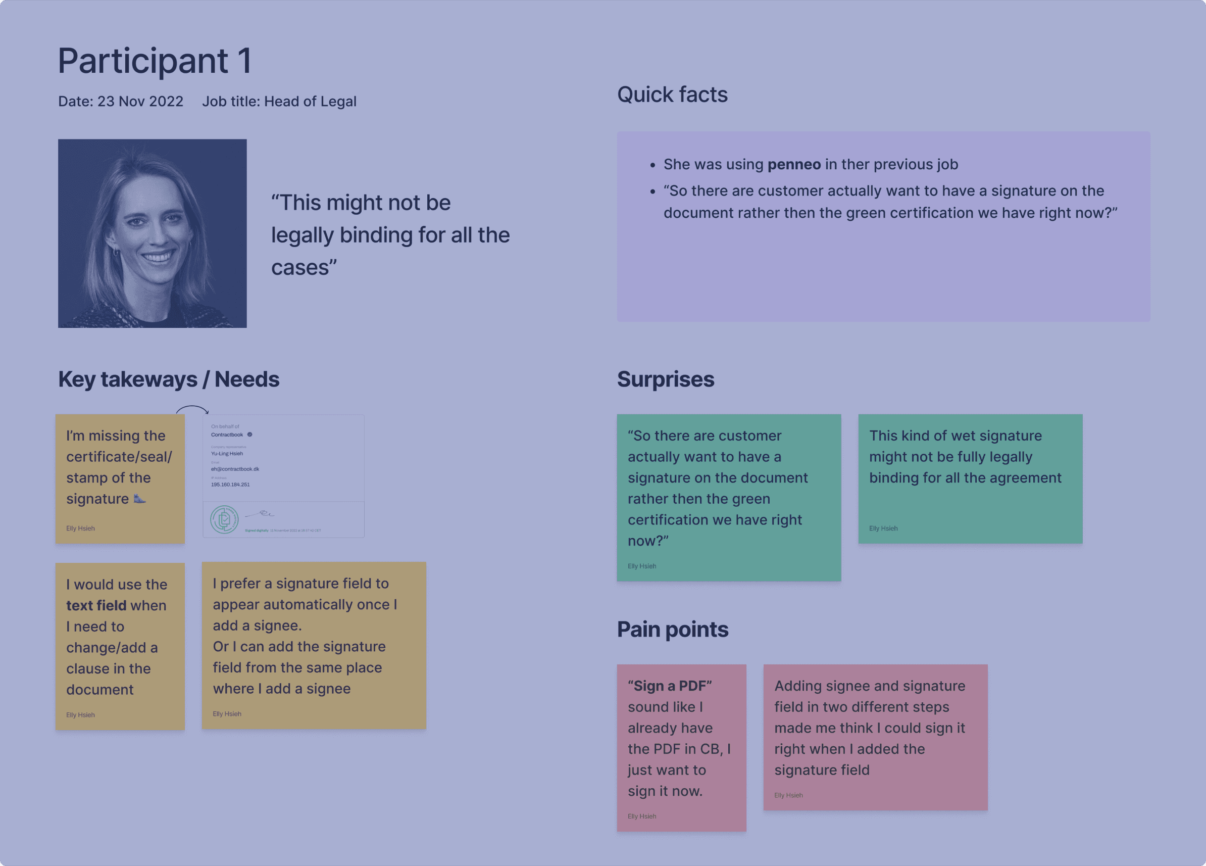
Usability Testing
To test usability, I created a prototype, testing script, and scenarios to conduct an unmoderated usability test with ten internal team members who were unfamiliar with the project. I also conducted two moderated usability testing calls with our current users to gather feedback on how they interacted with the product and to identify any issues.
Challenges and Compromises
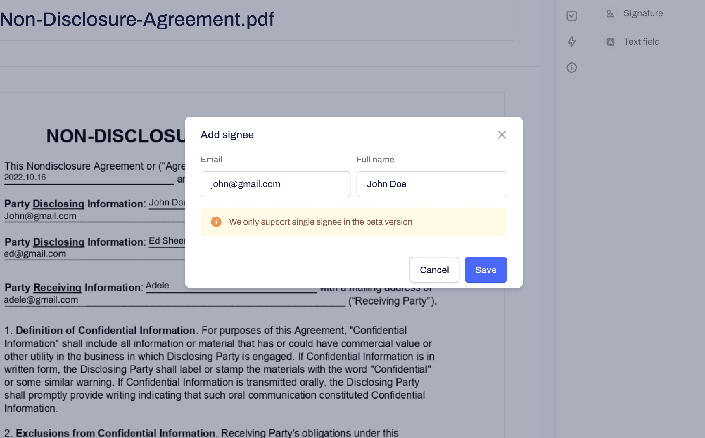
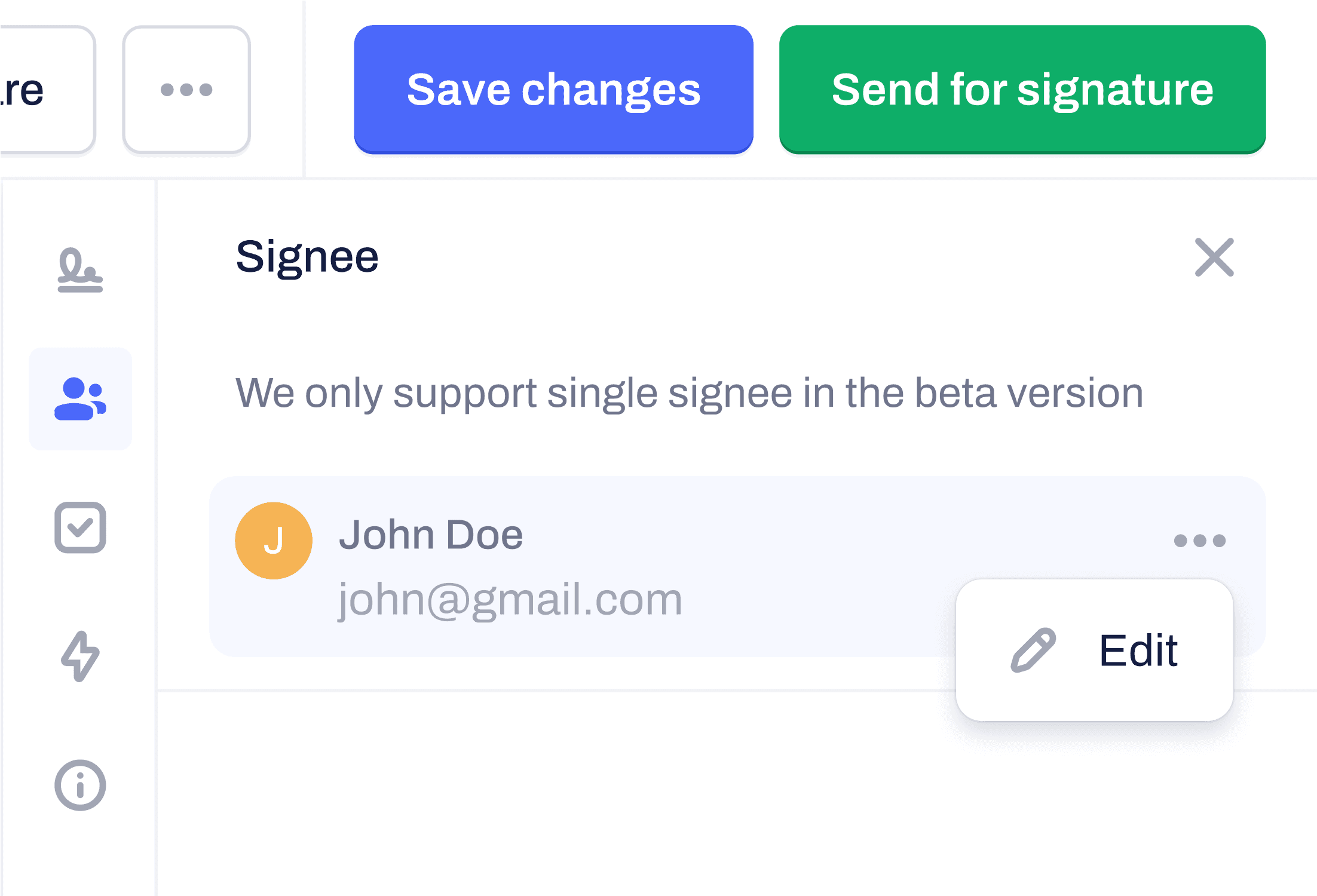
During testing, the engineers informed me that their initial estimation of implementation time may have been too optimistic. To deliver minimal value to users, we decided to change the MVP to handle only a single signee. Although not the optimal choice, it was the best option to launch within the original time frame, avoid prolonging development, and get feedback early on.
While the MVP only handles a single signee, I continued testing the flow for multiple signees, which would bring the most value to users and the company. I conducted an overview of the design and potential usability issues to ensure the best possible user experience.
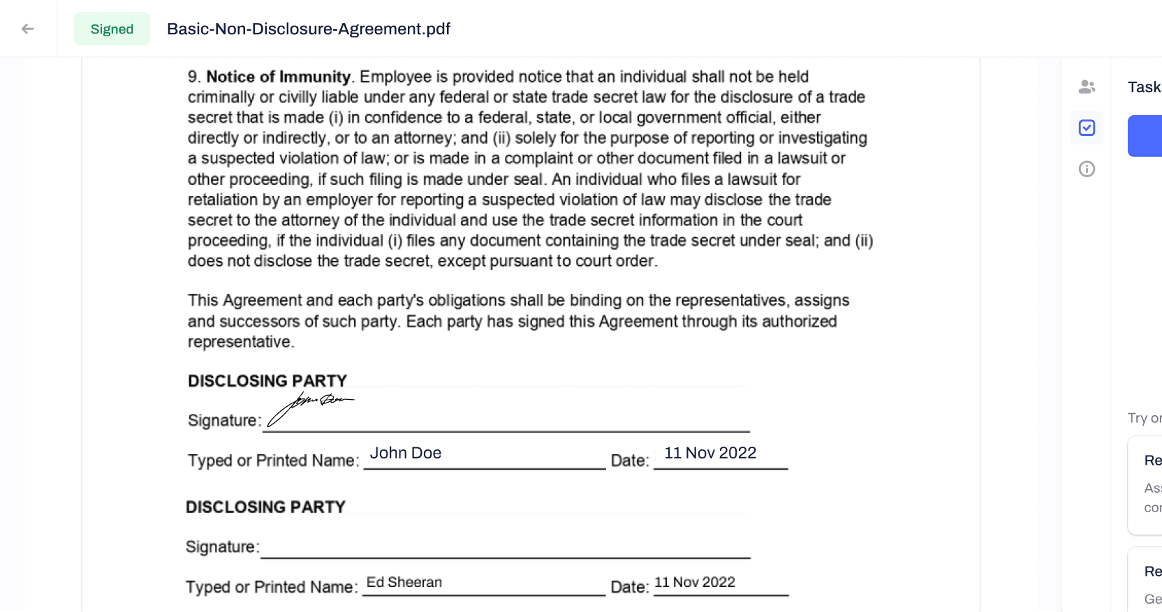
UX Improvements - Single Signee Flow
The single signee flow was built during the testing sessions due to time constraints. I made some improvements based on feedback from usability testing to improve the user experience. However, I was unable to complete all the improvements before being laid off.
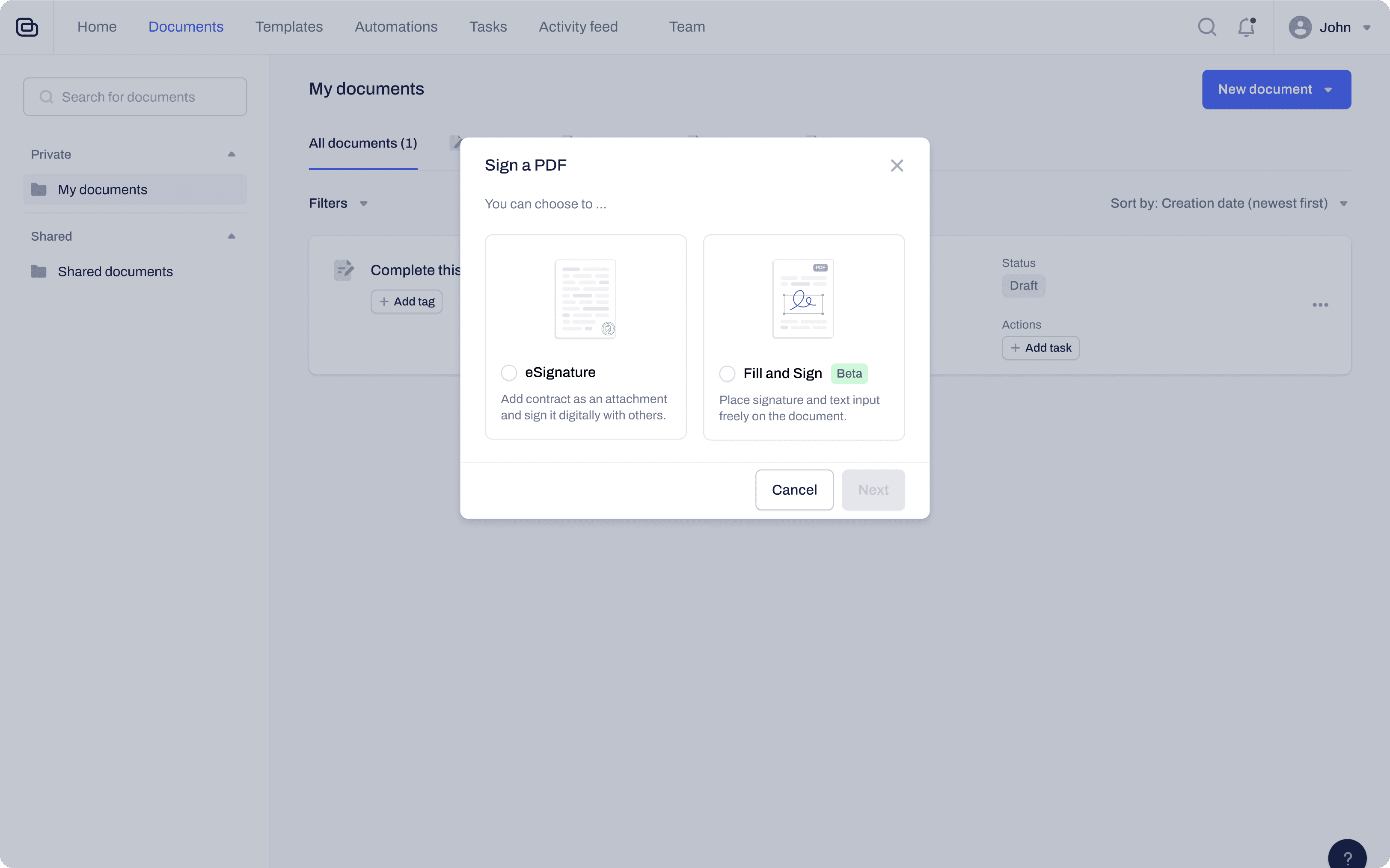
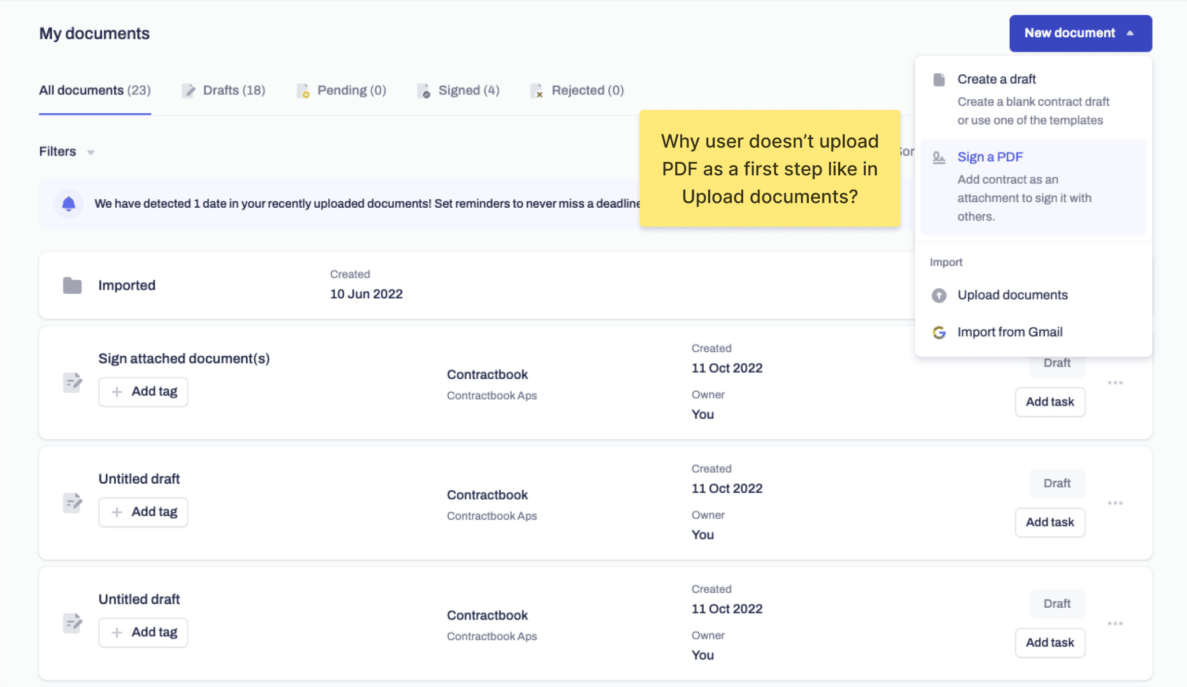
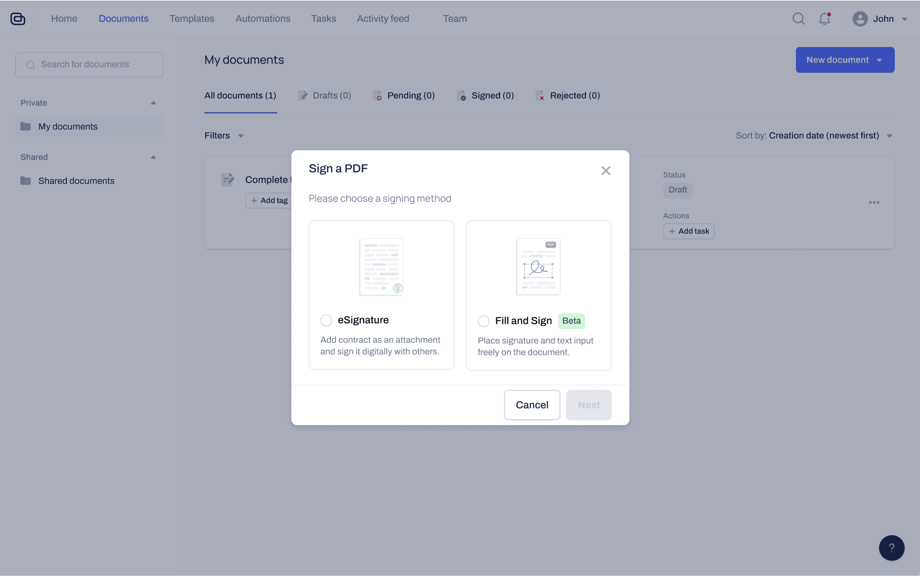
Choose signing method
We need to maintain both the original "Sign a PDF" (which places the eSignature at the end of the document) and the one I'm developing as a separate signing method until this feature is fully developed. The reasons for doing this are:
- I wanted to experiment with removing unnecessary features from the editor.
- It's easier to use a feature flag and slowly roll out these new PDF signing features to users in this way.
- This helps manage user expectations before they invest time and effort, in case this isn't what they need.
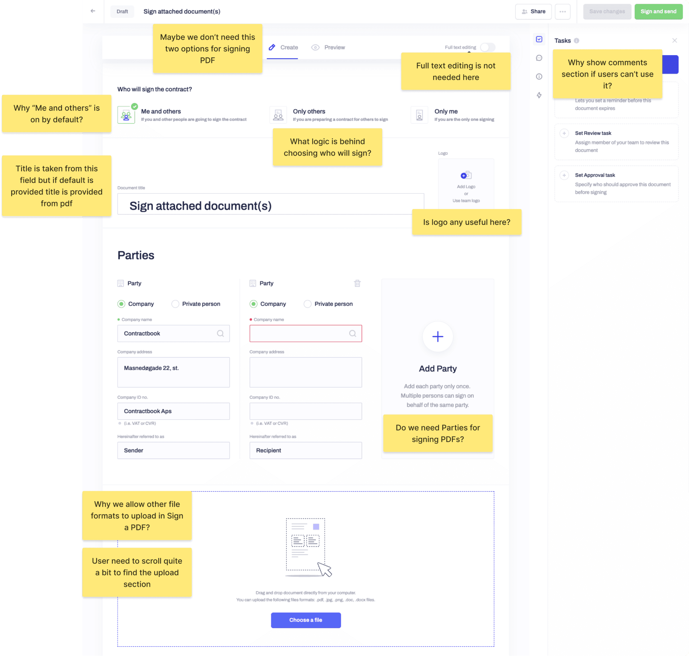
Improvements
Too many choices and options. Clunky UX for uploading the document
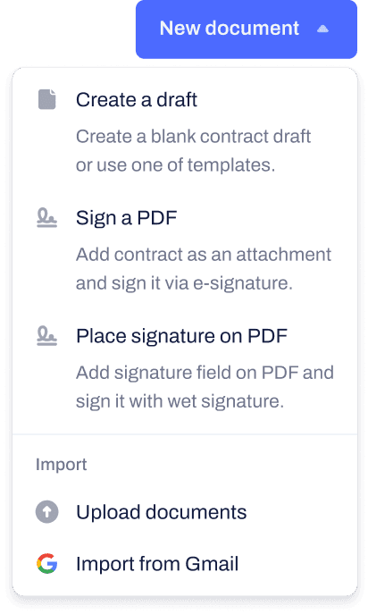
I replaced the dropdown menu for selecting signing methods with a modal to simplify the decision-making process for users. Previously, there were multiple options that all appeared to be for "uploading" or "importing" which could be confusing.
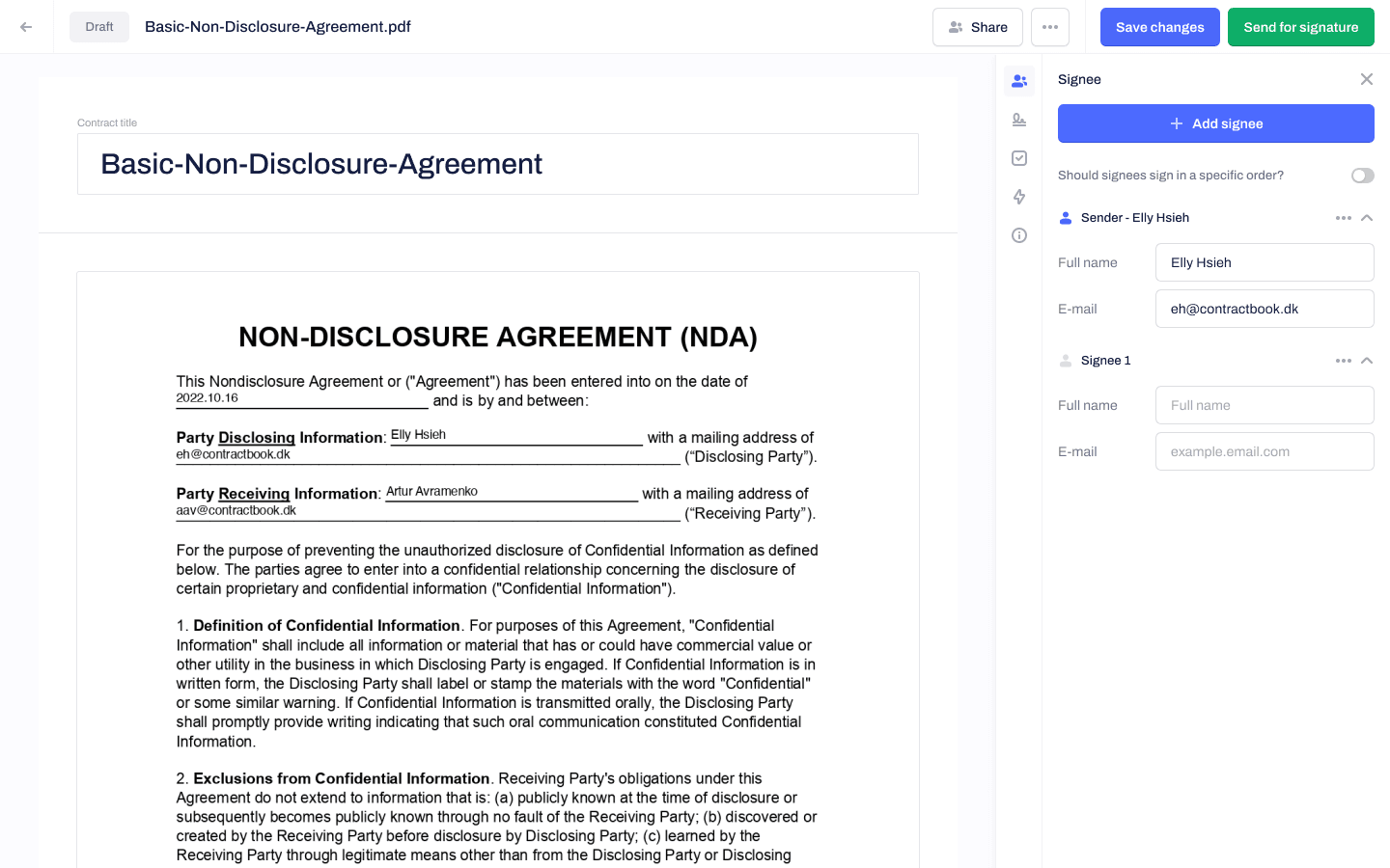
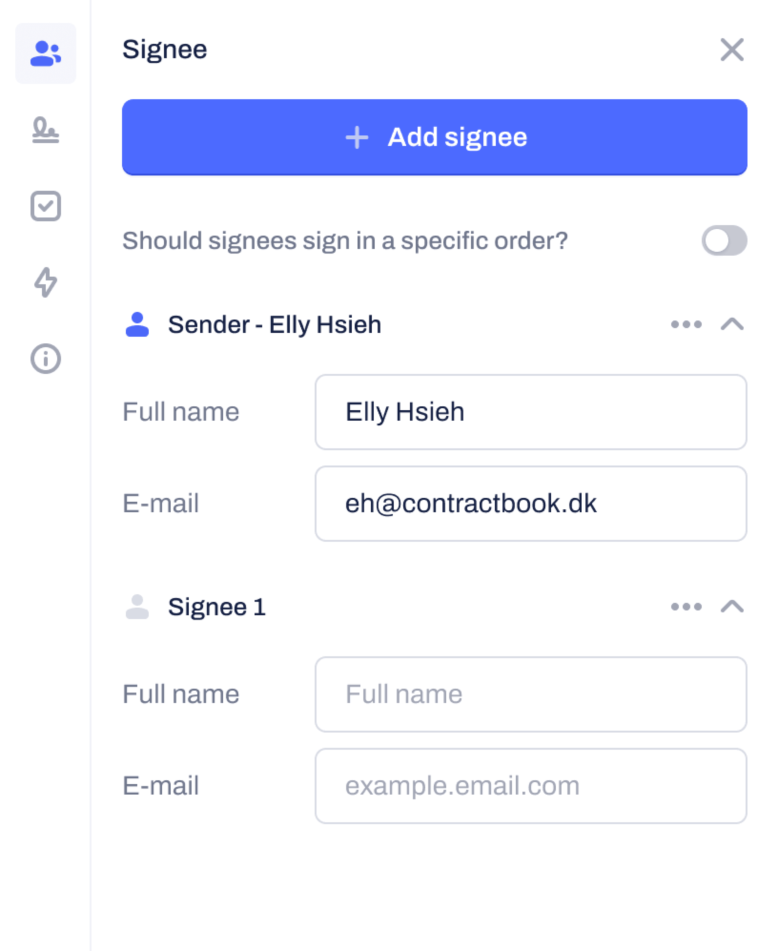
Add & edit signee
I moved the step of adding a signee to the first step after uploading the document. This helped with:
- Improved the consistency with other signature tools
- Prevented errors from occurring (e.g. the user wanting to add a signature field but there wasn't a signee added yet)
- This is logical since you usually know who you are going to sign the contract with before uploading the PDF, based on the research we did earlier.
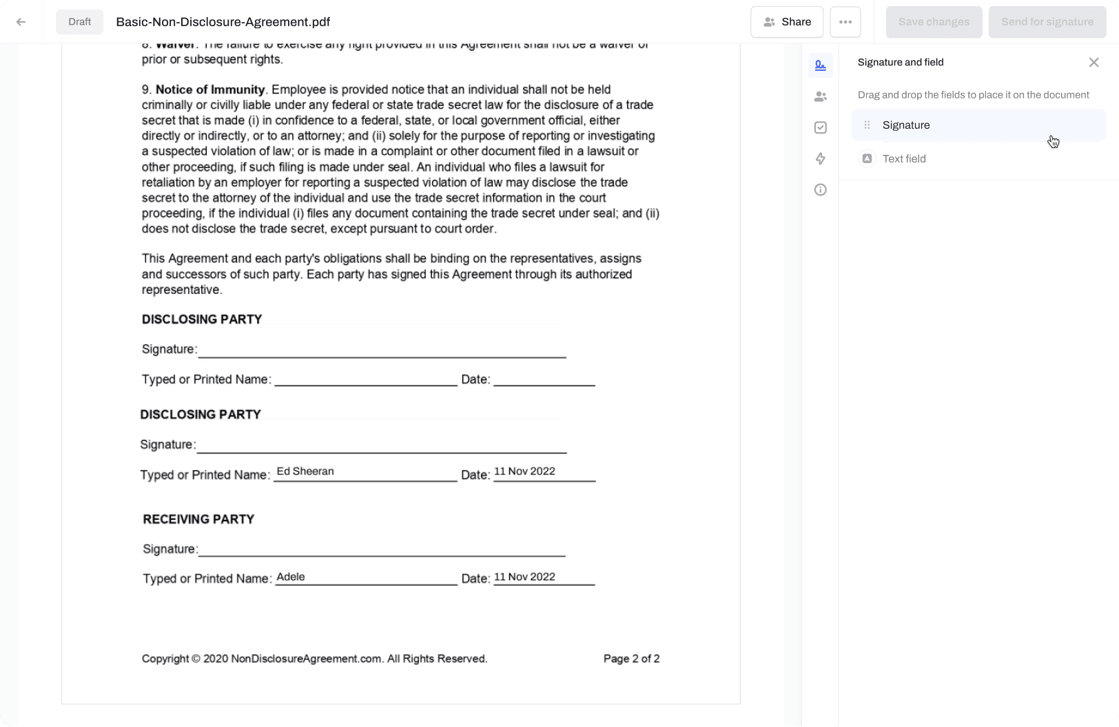
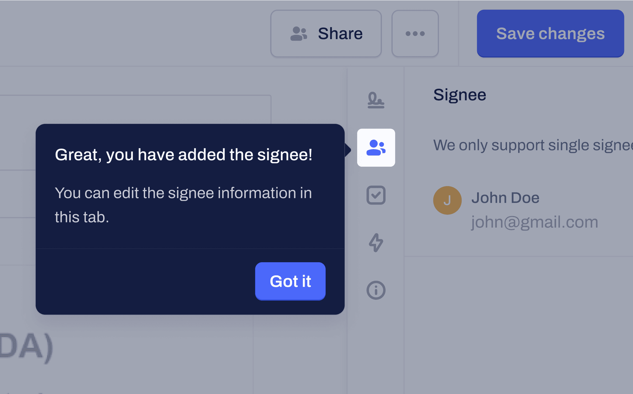
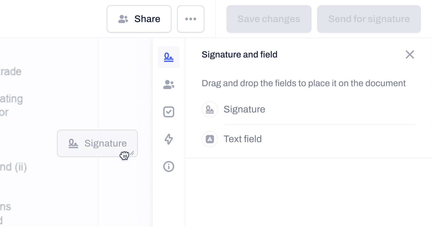
Sidebar navigation
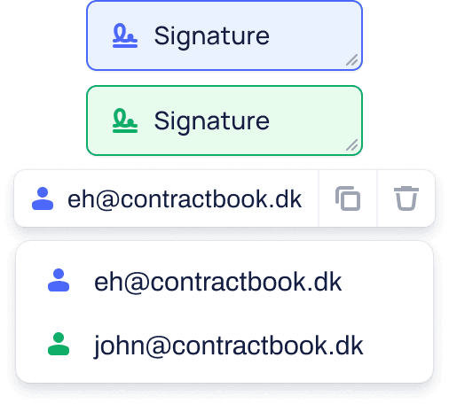
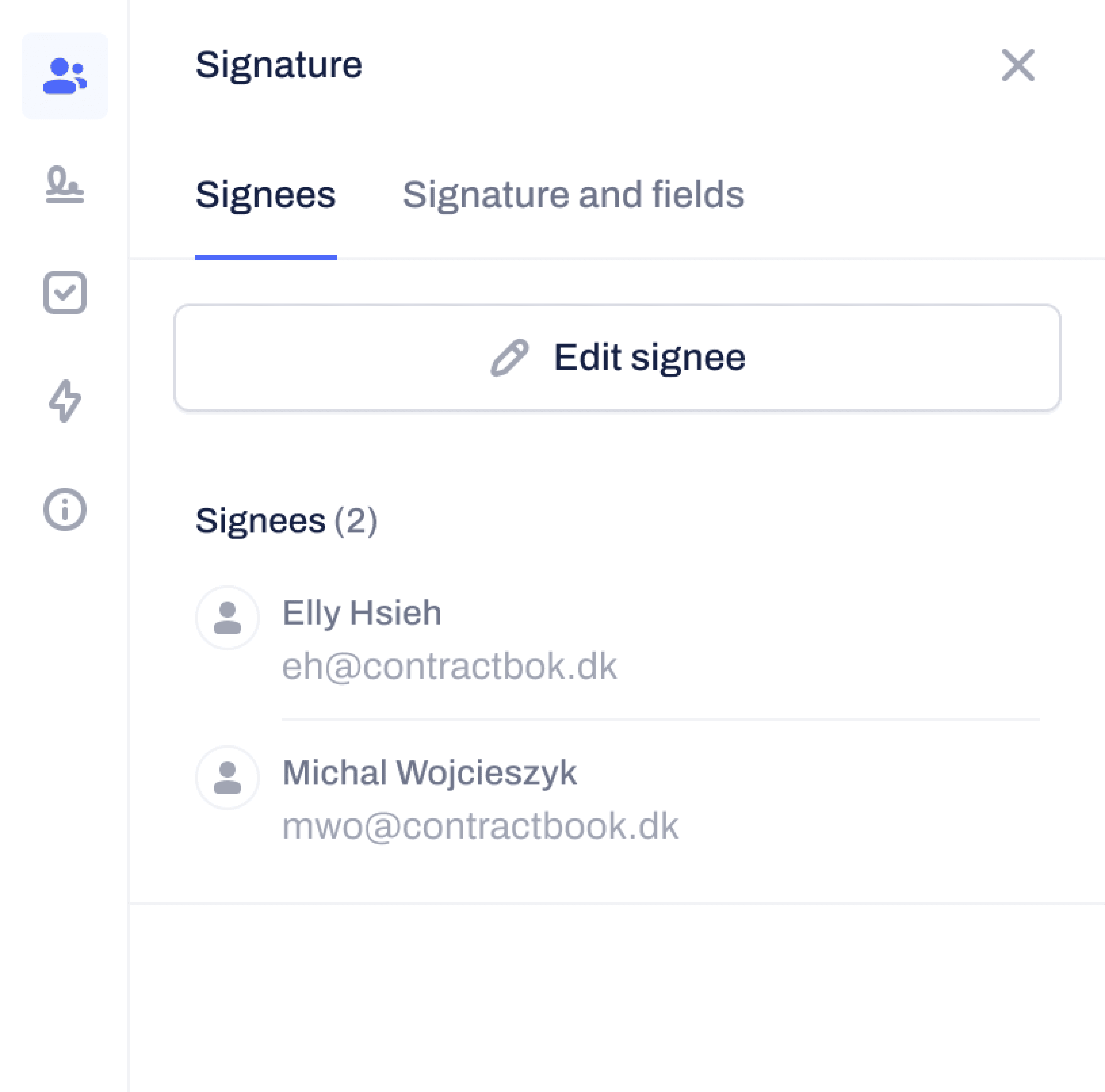
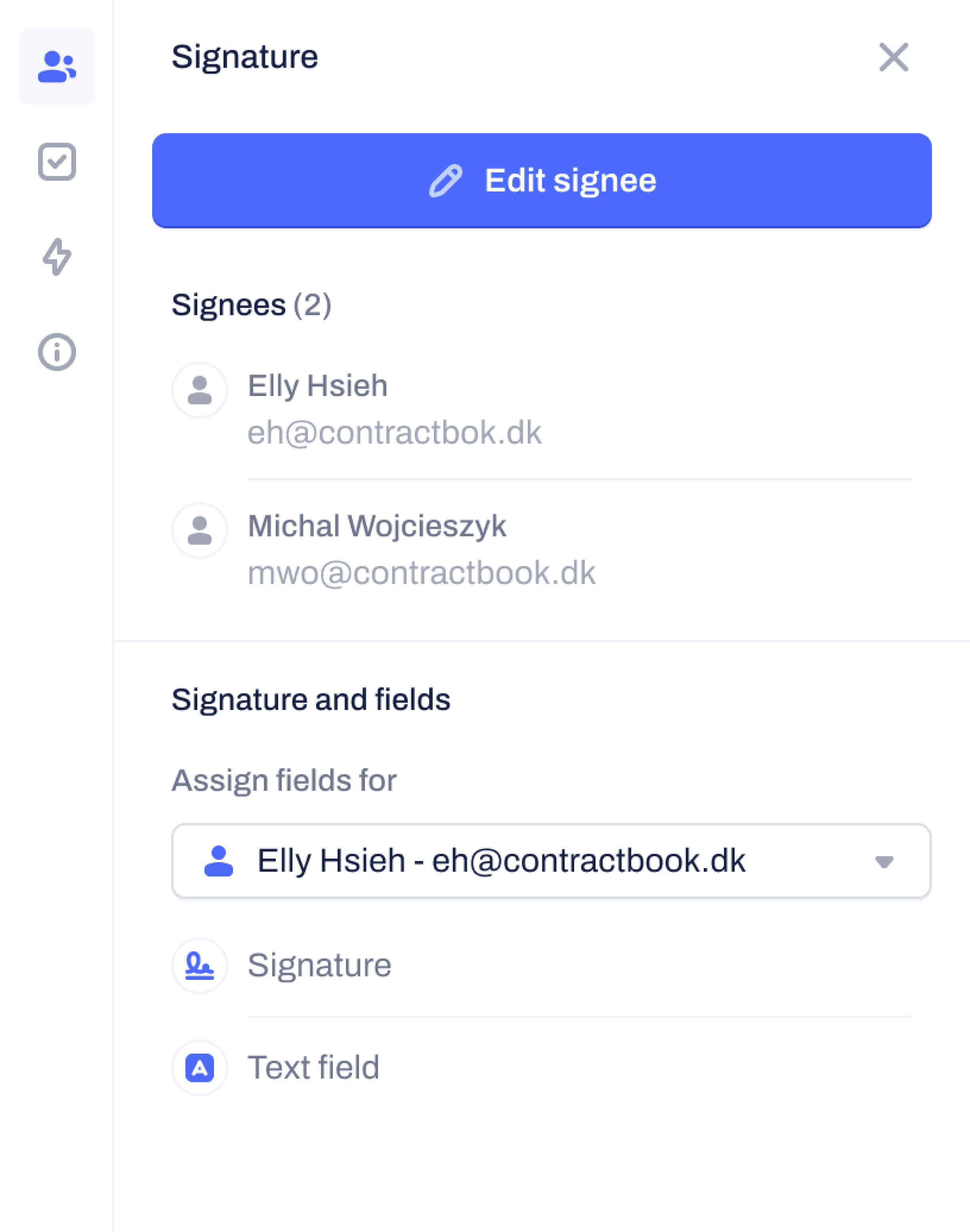
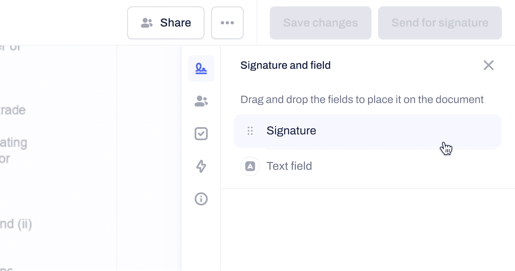
I added two tabs to the sidebar: "Signee" and "Signature and Field". The "Signee" tab is for managing the signees, while the "Signature and Field" tab is for adding signature and text fields to the document through drag and drop.
While it may seem like these two tabs could be combined, they serve different purposes. The "Signee" tab is undergoing a redesign to become a "Data Field" that will serve different purposes than signature fields or text fields. Additionally, the "Signee" and "Fields" are separate entities. While it would be convenient to be able to drag and drop a signee to add a signature field, this feature was included in the discovery phase for the next iteration.
Improvements
It takes some time to locate the "signee" panel
I had no idea how to move on from the signee panel (User couldn't find where to switch between tabs in the sidebar)
The tiny sidebar menu (icon) might be a little too small. Not sure if everyone will notice the menu and navigate into the signee menu via the sidebar
I added tooltips to guide first-time users in navigating through the different tabs required to complete their tasks. Although I would like to redesign the way we display the menu icons to increase discoverability and make them more recognizable, it was not a priority as multiple teams were working on the sidebar.
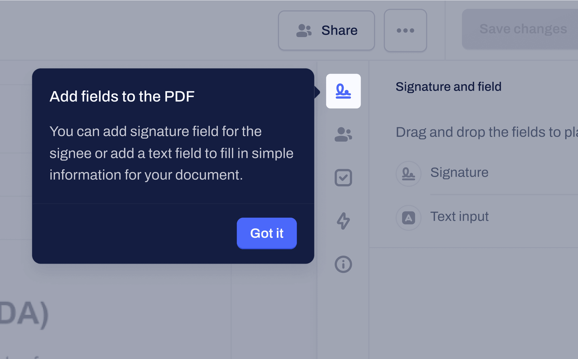
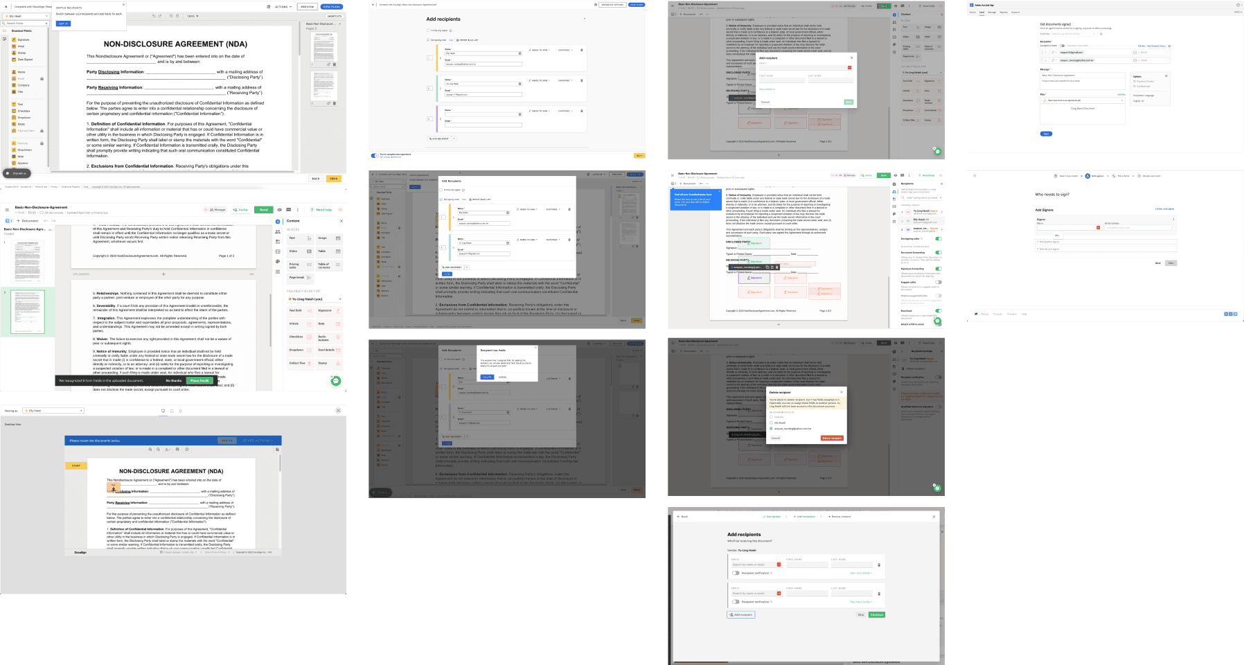
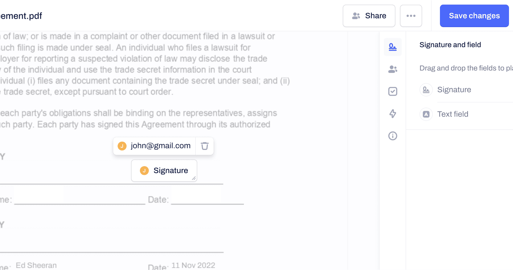
Add signature field
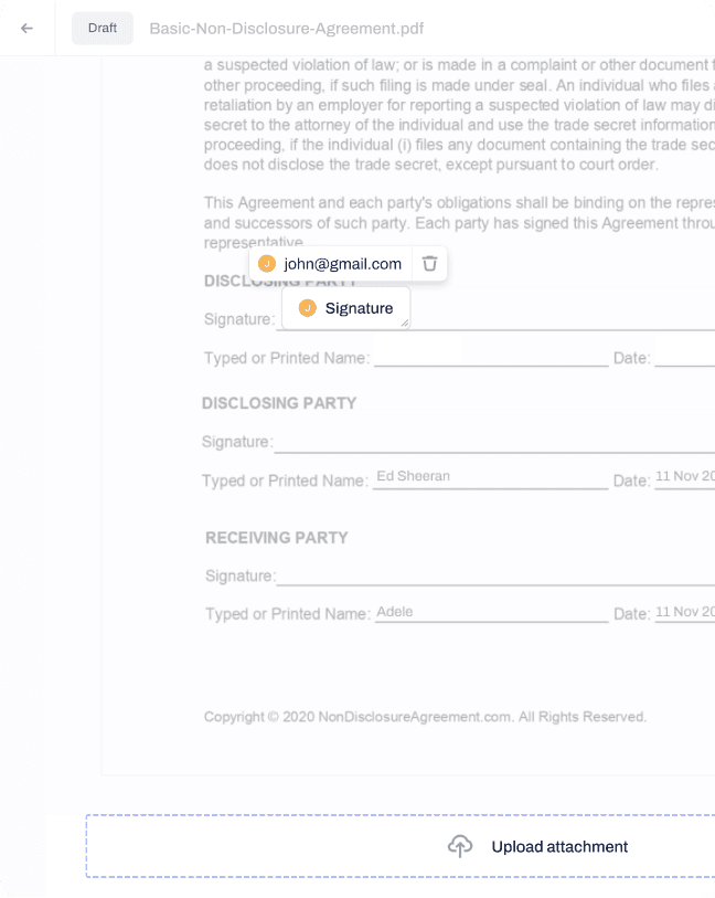
The users are able to easily reassign fields to a different signee in the multiple signee version through a dropdown menu in the contextual menu.
Top: hover on "add signature field" option; Middle: dragging signature field; Bottom: signature field added
Add text field
I followed established industry conventions for learnability and external consistency by using drag and drop to add a text field as the first "field" to implement. Text fields are flexible and can resolve almost all the use cases our users need, such as name, job title, and date, based on our research.
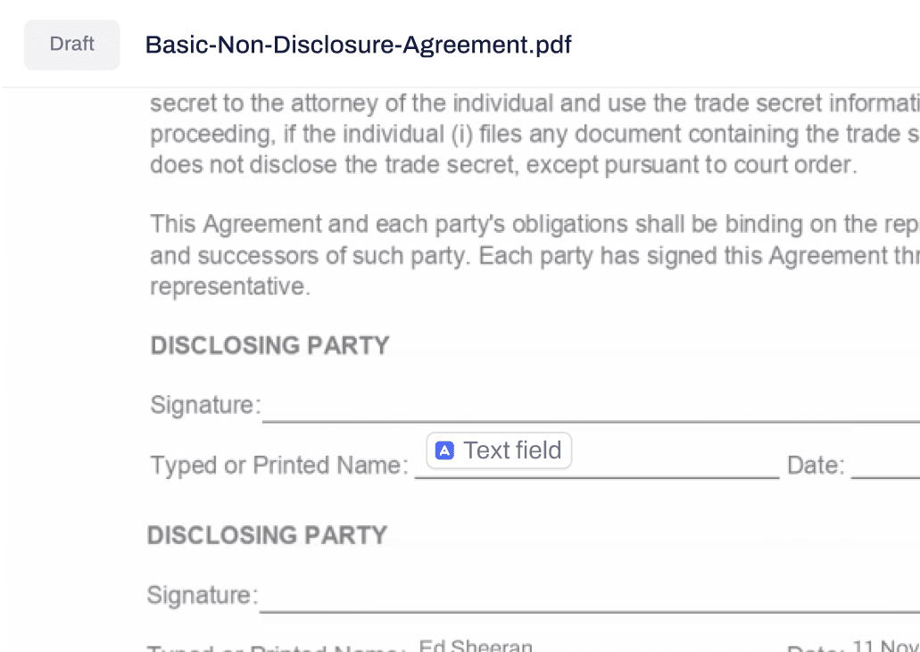


Left: text field in the document
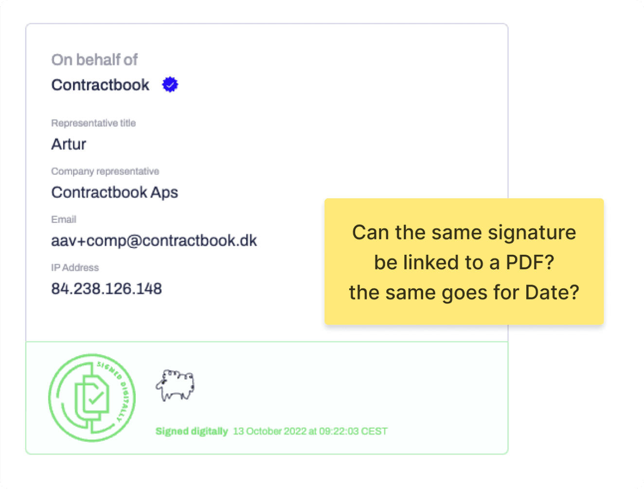
Send for signature
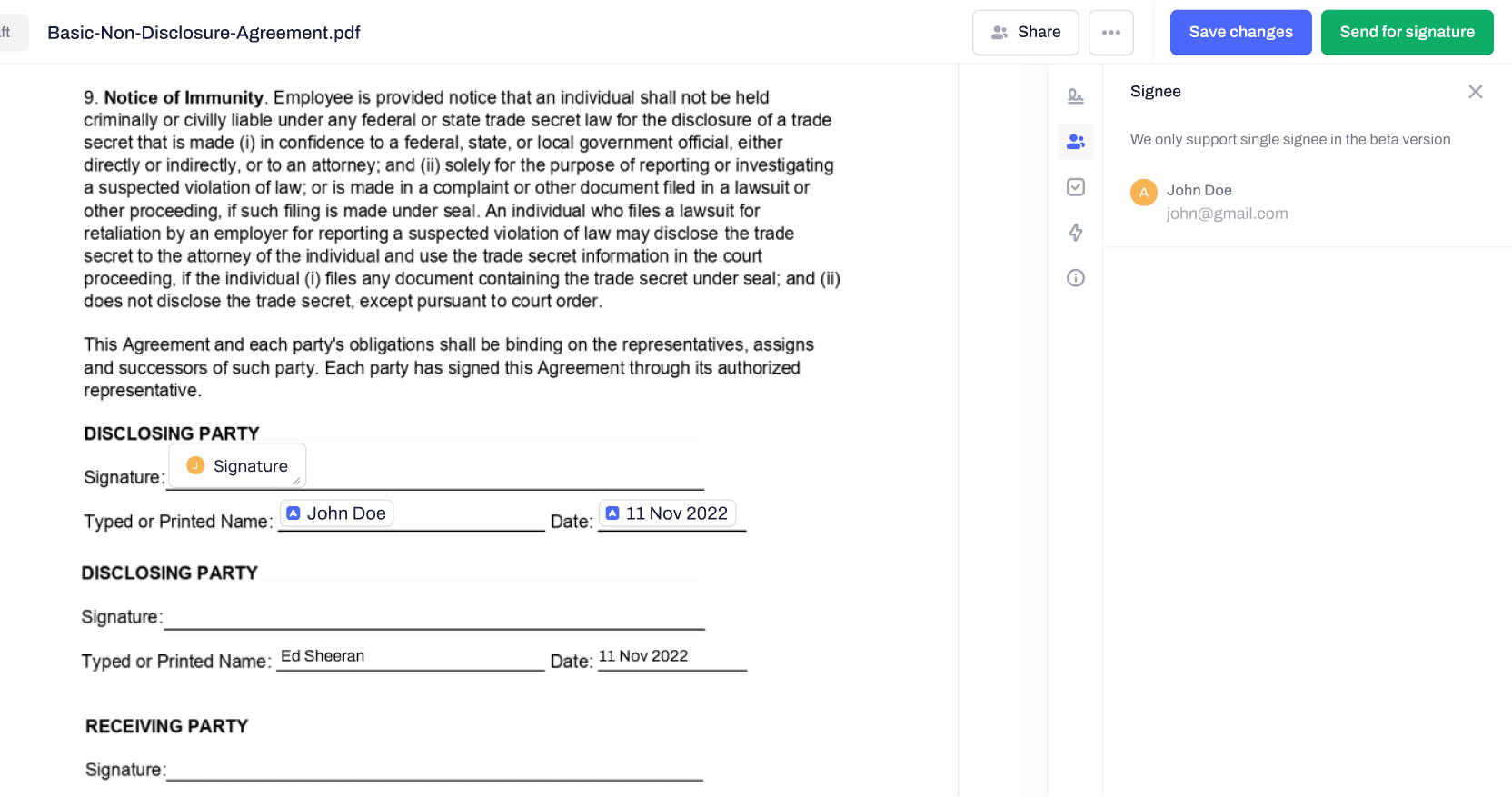
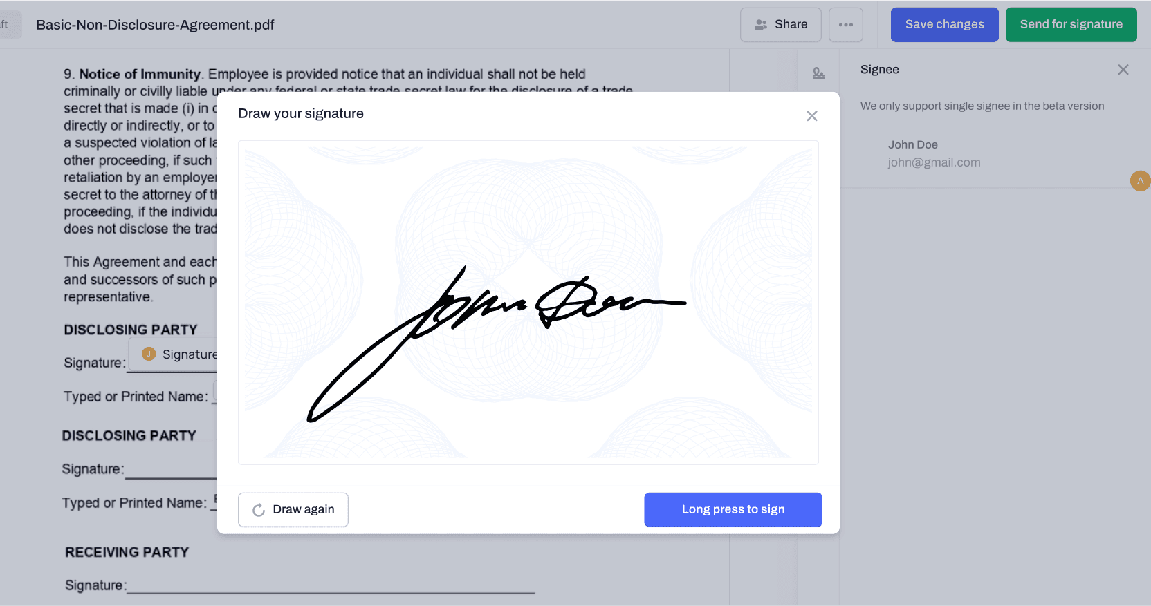
Top: all the fields are added and readt to be send; Middle: draw a signature; Bottom: signature appeared on where the signature field was placed
Further Steps
Although I was laid off before I had the chance to iterate on the design based on feedback from usability tests, I did compile a list of improvements for future reference. Some of the suggested improvements included:
Iterate before launch
- Differentiate the two types of "sign a PDF" with a better explanation.
- Clarify that this is a PDF document, not a Contractbook native document.
- Guide users through the interface, emphasizing the importance of the sidebar for performing actions.
- Explore the possibility of adding a signature field first, then prompting the user to specify the signee.
- Make the signature status more clear (signed, waiting for signature, etc.).
Research required
- Assess the needs for the signature template and signature preview.
- Assess the needs for other signature types (NemID, BankID, etc.).
- Assess the needs for other types of fields (date, checkbox, etc.).
Conclusion
My work on the PDF signing project allowed me to leverage my product design skills to identify and resolve issues, resulting in an intuitive and user-centric experience that enabled our users to complete their tasks effectively and efficiently. While I was unable to continue working on the project after its release, I am confident that my efforts have laid the groundwork for future development and highlighted the key areas for improvement.
More case studies and writings

Contractbook・Two-Factor Authentication
Implement 2FA to enhance user’s account security without sacrificing UX
Read More

How I’ve self-taught and executed Usability Testing?
Walk you through my approach from learning "what is usability testing?" to iterate the design
Read More
My 6-Month Tech Job Hunt Journey
Before the memories of those struggles fade away, I want to share some valuable lessons I've learned.
Read More
Say hi
ellyhsieh.work@gmail.com