How I’ve self-taught and executed Usability Testing?
This is the second part of the case study. See part 1 HERE. I will walk you through my approach to usability testing, from learning the basics to iterating. Before conducting any tests, I researched extensively on Medium, N/N Group, Toptal, and YouTube tutorials to gain a solid understanding of what usability testing entails and the best practices to follow.
Usability Testing
Which method I should choose?
Usability testing can take various forms, such as moderated or unmoderated, remote or in-person.
Initially, I opted for unmoderated testing as it seemed easy and required less effort. However, I realized that this approach might yield superficial insights and lacked the ability to ask follow-up questions. Therefore, I switched to moderated testing, which allowed me to obtain more in-depth feedback and enhance my skills. I'm glad I made this decision.
Planning
Objectives
Before starting the actual testing, I created a plan on Notion to outline the testing objectives, which were as follows:
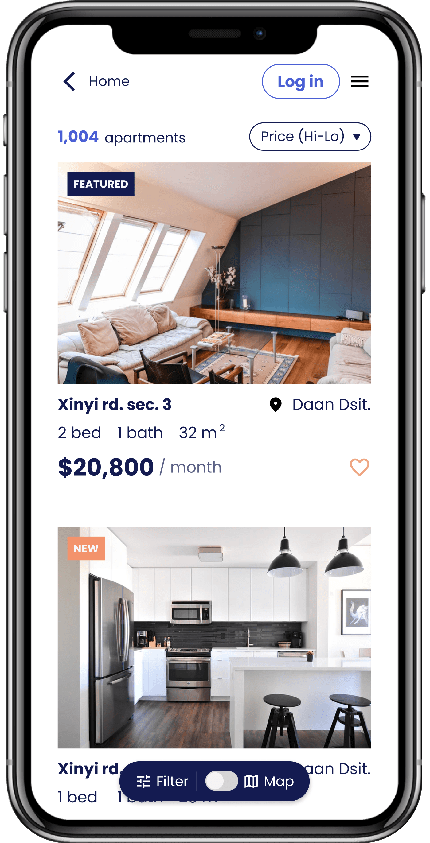
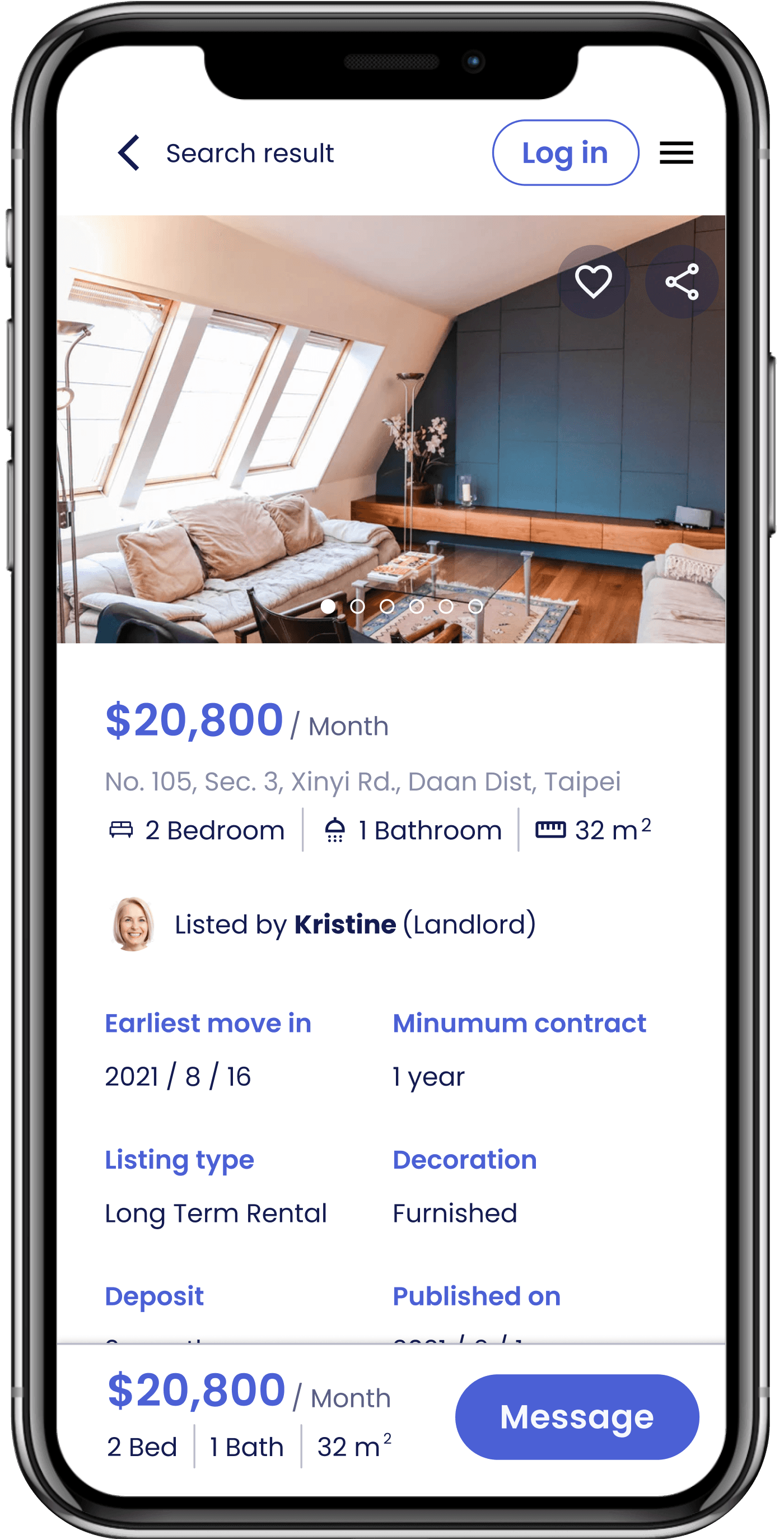
- Are users able to search for an apartment effectively, quickly and easily?
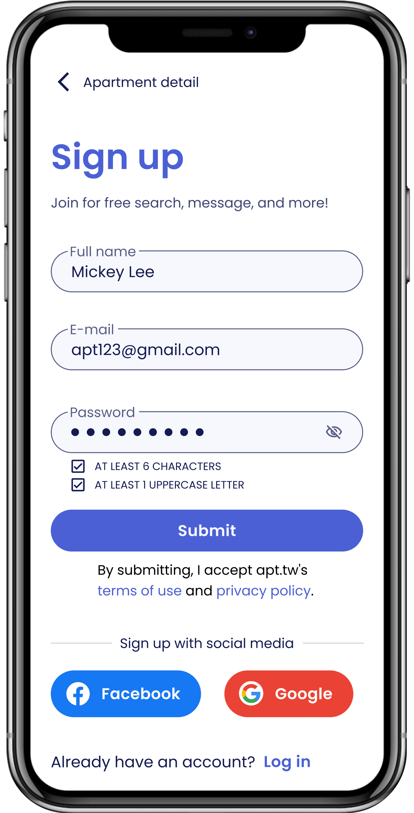
- Can users sign up easily?
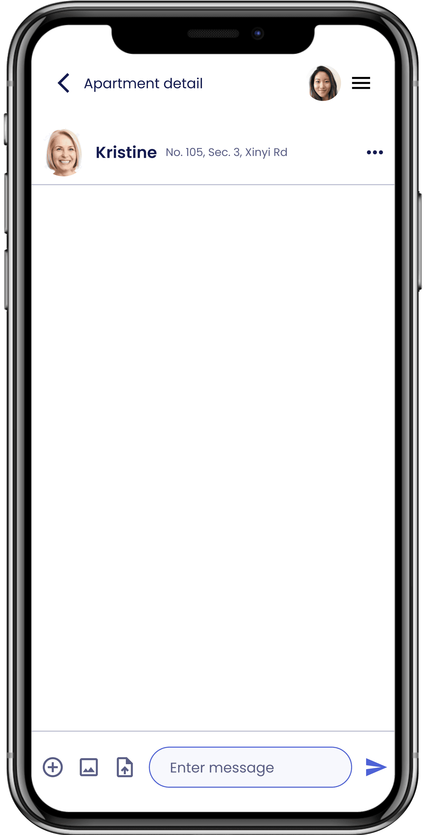
- Are users able to send a message to the landlord of the apartment they are interested in?
Remote Moderated Usability Testing
Because of Covid-19, I chose to conduct Remote Moderated Usability Testing, which allowed me to test my design with a more diverse group of participants from around the world. This method also made it easier to find participants as they could take the test at their convenience from anywhere.
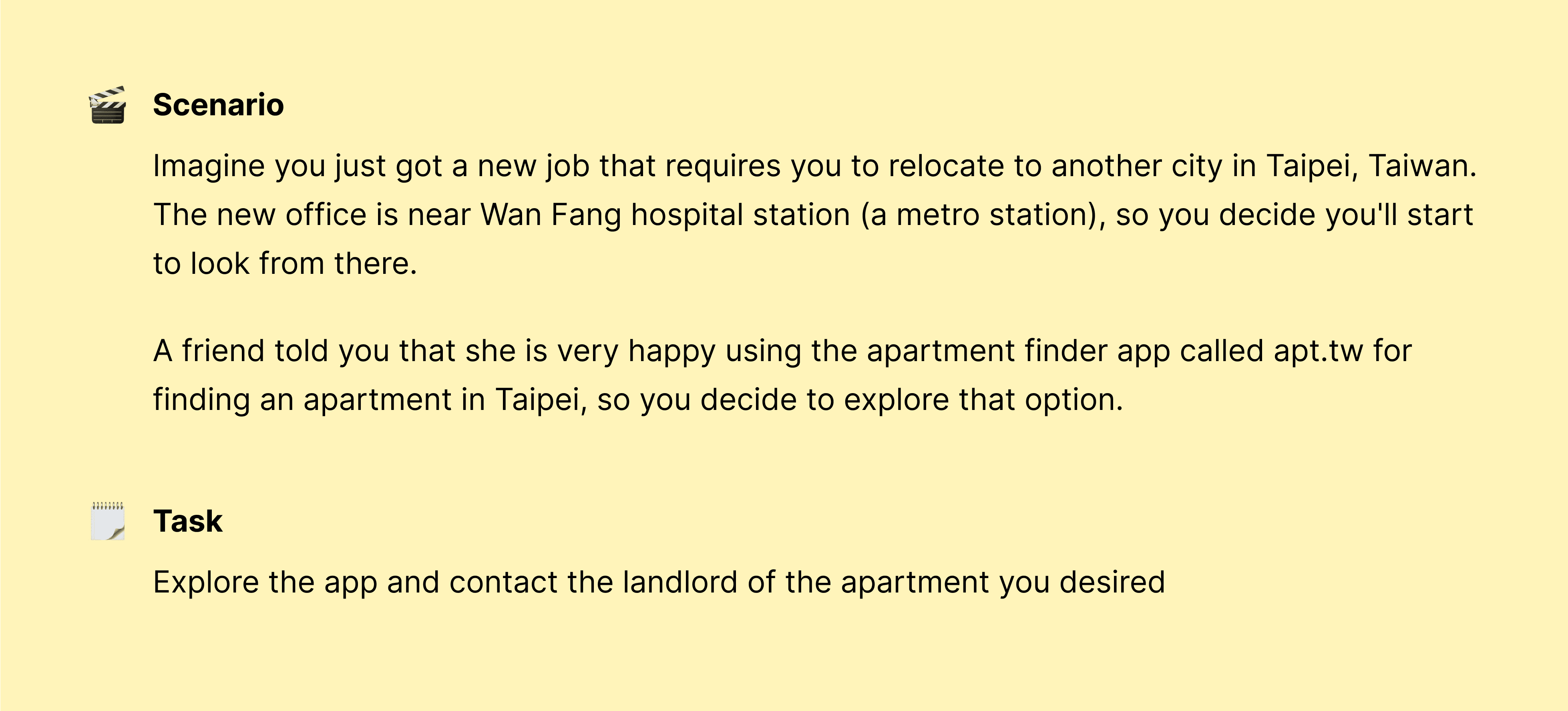
Tasks and scenarios
To reflect real user goals without influencing their path, I created tasks and scenarios that focused on search, browse, signup, and contacting landlords. These were:
Tools
After setting the scene, I prepared a usability testing script to keep the methodology consistent. It will act as a guide during the test, allowing me to facilitate the test with the same questions and tasks repeatedly. The script also helped estimate the time required for each session.
The script I prepared includes five parts: friendly welcome, contextual question, prototype introduction, scenario and tasks, and quick debrief. You can check out the full script here.
Before the formal testing, I ran through the script a few times with my mentor since this was my first time facilitating usability testing.
To collect both qualitative and quantitative data for evaluating usability, I used three tools:
Spreadsheet
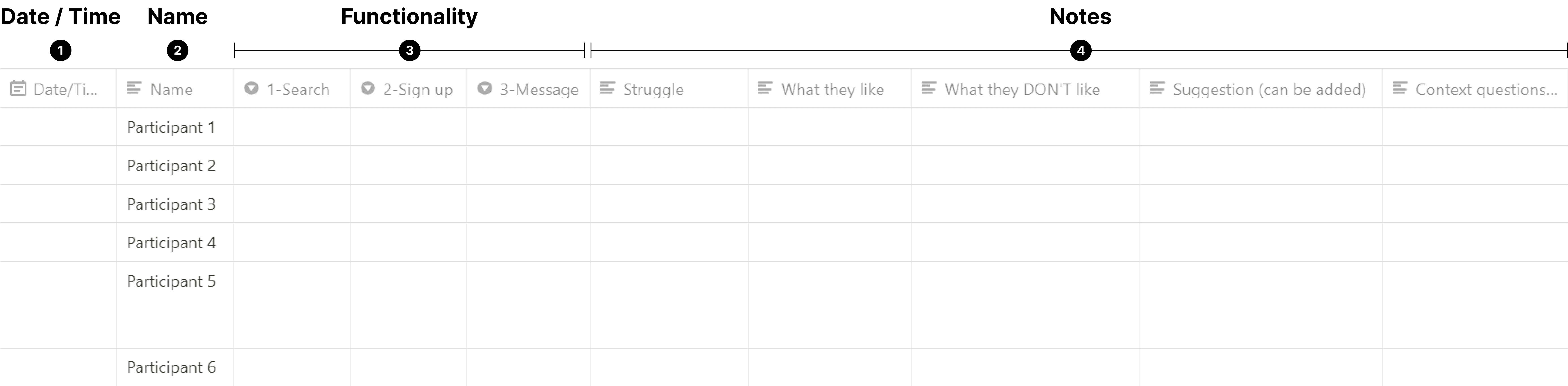
To collect qualitative data, I used a spreadsheet to track the issues encountered by users. This helped identify recurring problems and patterns and develop solutions to improve usability. The spreadsheet included:
- Date and time
- The name of the participants. (Replaced with numbers for confidentiality)
- Three functionality of the app to be tested.
- Notes for participant's actions, struggles, and comments.
Think aloud protocol
During testing, I asked participants to follow the think-aloud protocol to reveal their thoughts and potential misconceptions about the design. This provided valuable feedback for potential redesign recommendations.
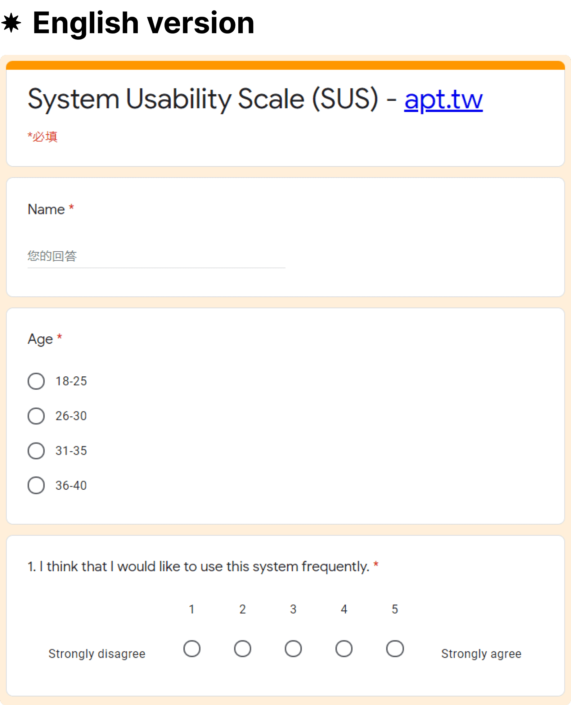
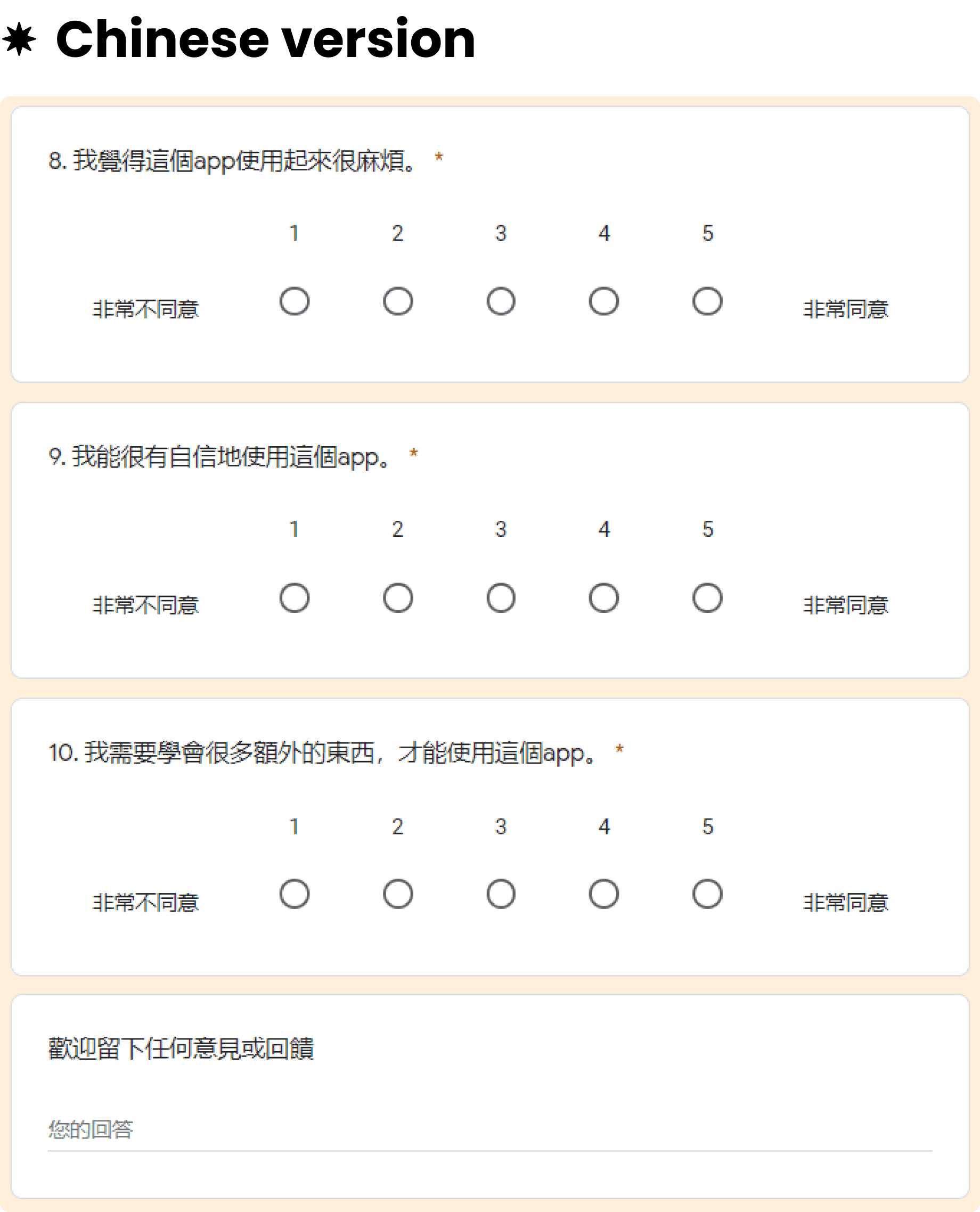
System usability scale
The System Usability Scale (SUS), created by John Brooke in 1986, is a 10-item questionnaire with five response options ranging from 1=Strongly disagree to 5=Strongly agree.
It provides a practical and reliable way to measure perceived ease of use, and can detect differences with smaller sample sizes than other tools. I used Google Forms to create SUS in English and Chinese, with scores above 68 considered above average and scores below 68 considered below average based on research.
Participants Recruitment
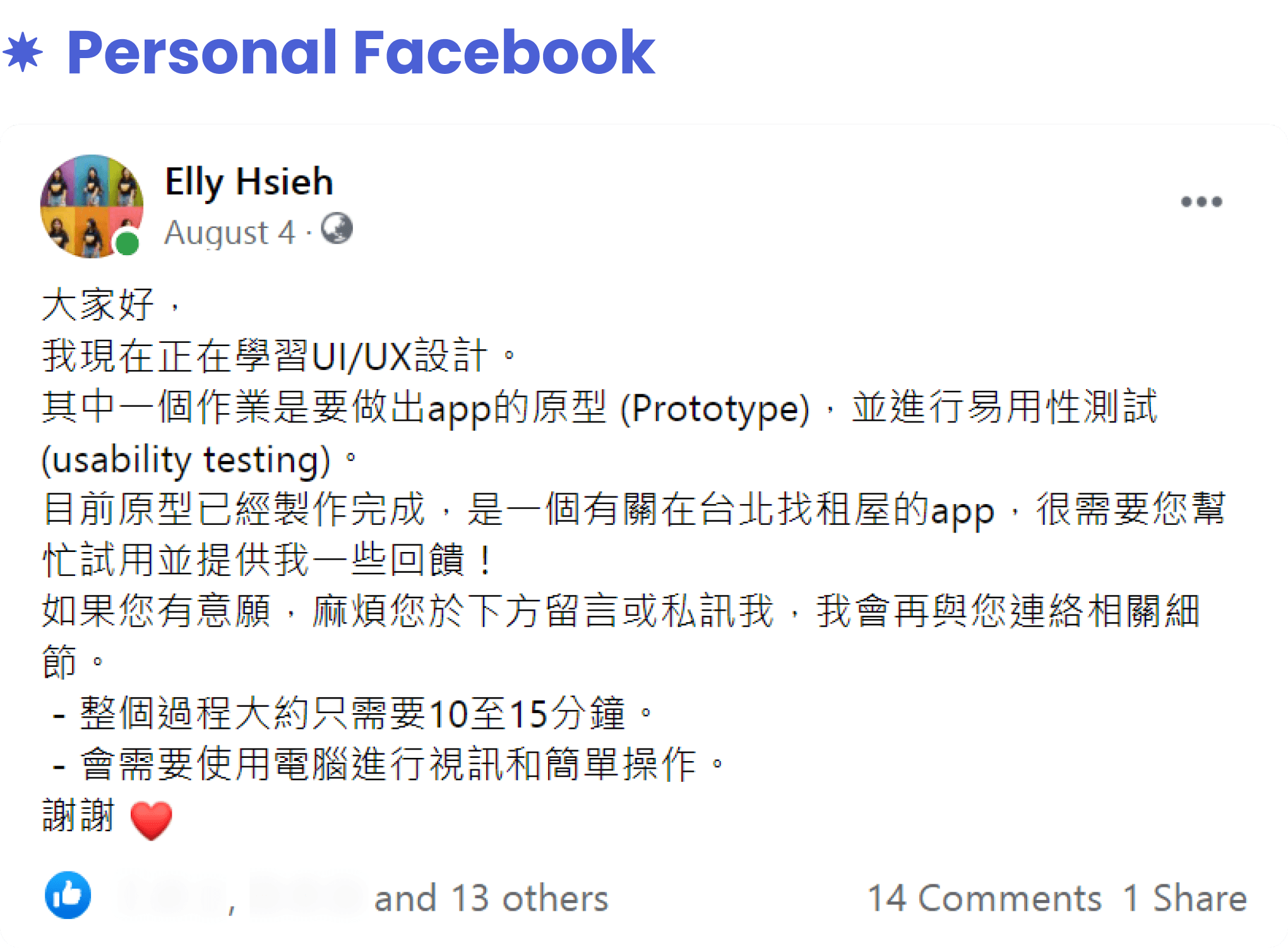
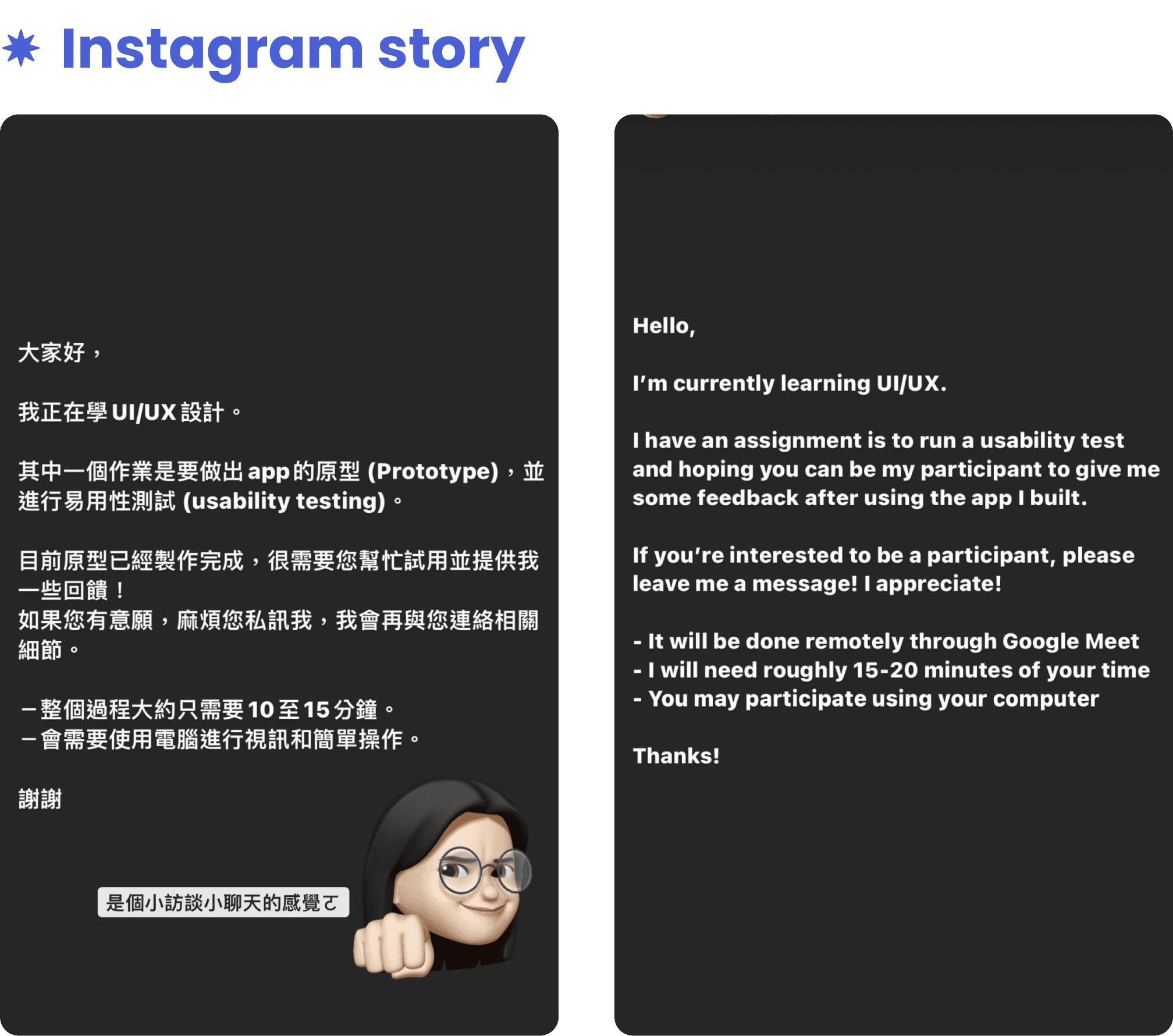
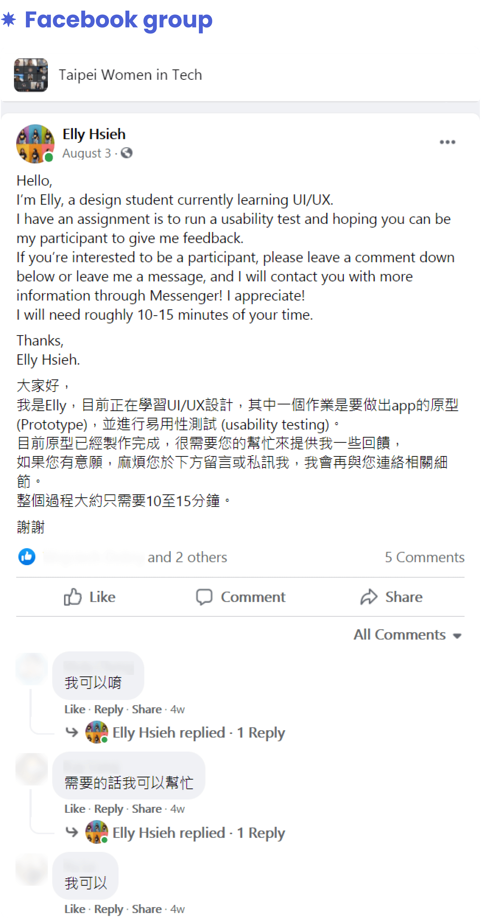
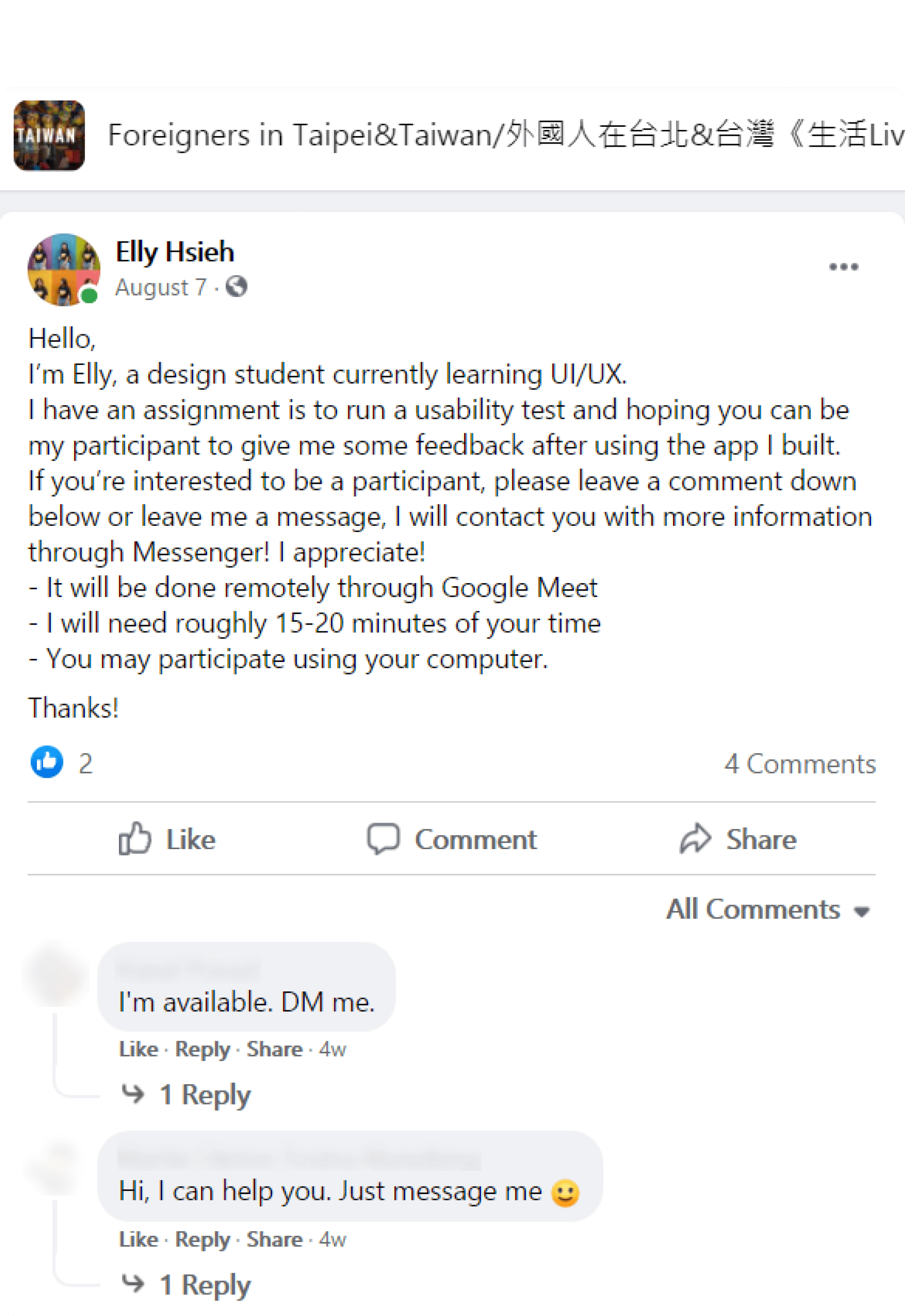
To recruit participants based on the personas created, Jakob Nielsen's (2000) research suggests that five participants can identify 80% of the usability problems, while Virzi's (1992) study indicates that the first few users are likely to detect the most significant usability problems. Hence, I recruit participants by posting a recruitment message on my personal Facebook, Instagram story, and Facebook groups with potential users.
Tests
Testing dates: August 8 - August 11 2021 Test duration: 15-20 minutes / participant
Let's finally move on to the actual testing!
In the beginning, I will make it clear that I'm testing the app, not them. After the participant felt comfortable talking, I started to run the usability testing with the script I prepared. Each session took around 15-20 minutes. At the end of the session, I sent them the SUS to fill out based on their experience they just had with the prototype. Here is how I set up the test:
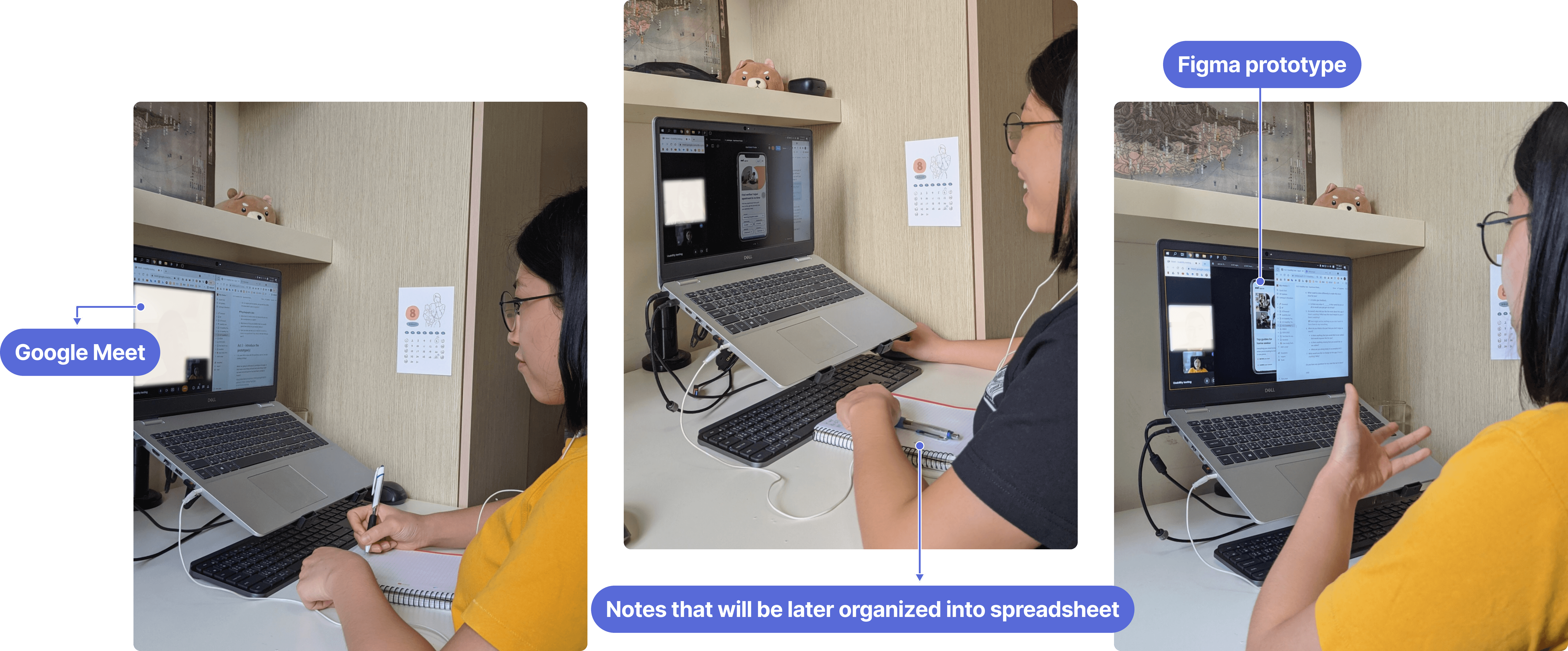
Google Meet
Tool for communicating with the participants. The chat is very useful for sending prototype links and the description of the task to the participant.
OBS (Open Broadcaster Software)
Tool for recording session, that includes the screen and conversation.
Figma prototype
Allow me to see a participant's screen without having to ask them to share it.
Spreadsheet
To take notes of the participants' struggles, comments, and behaviors I've observed.
Analyze the Findings
The combination of qualitative and quantitative data I collected guided me towards an ideal solution by providing a complete story that informed the problem-solving process. Qualitative research informs the design process; quantitative research provides a basis for benchmarking programs (Nielsen Norman Group, 2017).
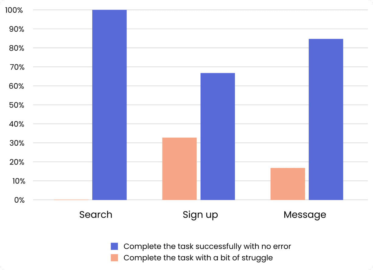
Task success rate
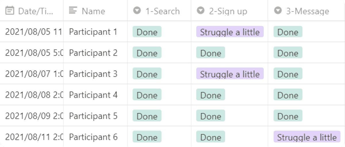
Using a spreadsheet was an efficient way for me to evaluate the success of my prototype.
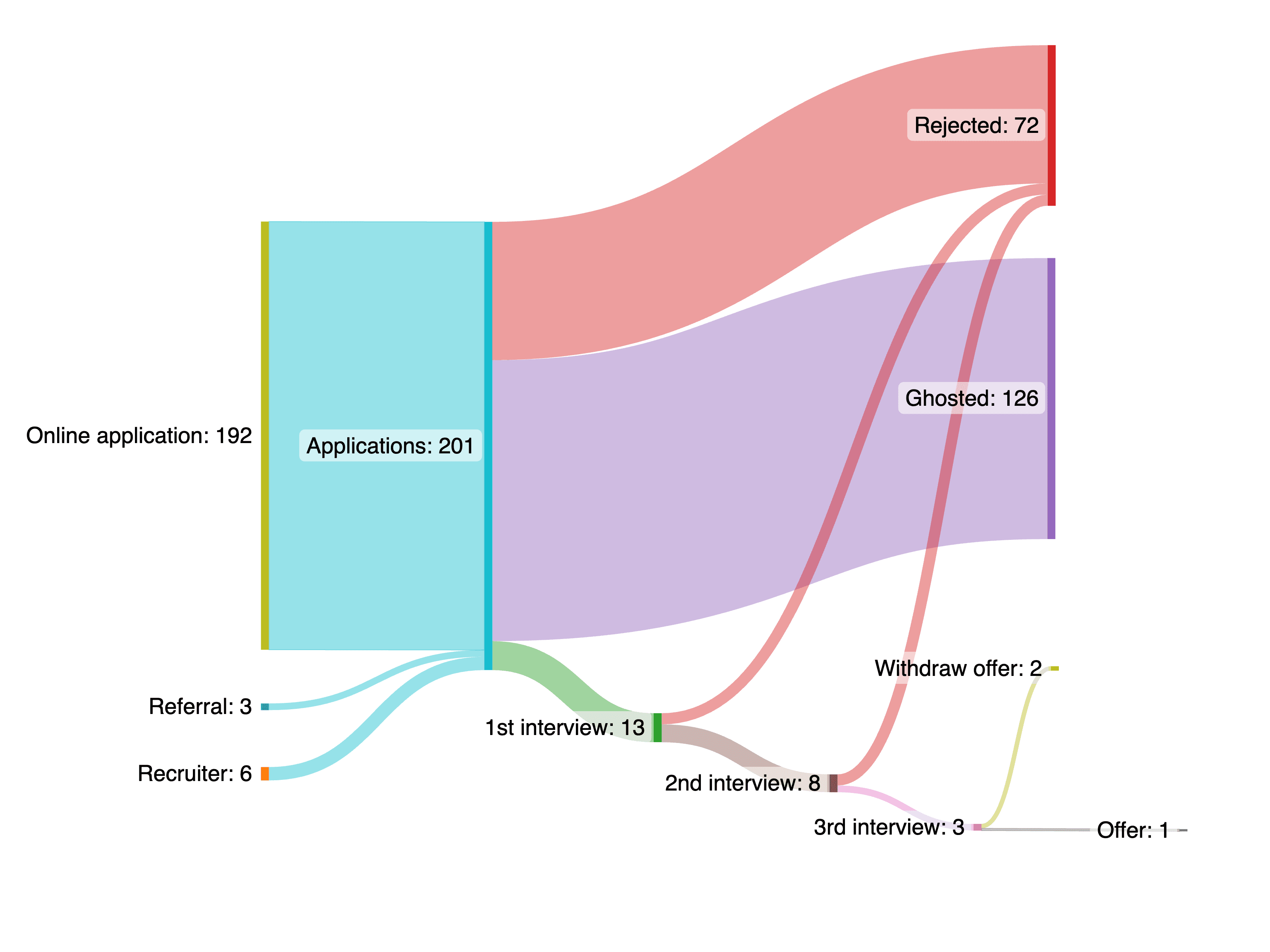
I have six participants to test three functions, which makes for 18 (6x3) tasks. The participants accomplish 15 tasks, resulting in an 83% task success rate.
On the first task, "search&browse," 100% (n=6) of the participants were able to complete the task successfully with no error.
On the second task, "signup," 66% (n=4) of the participants were able to complete the task successfully with no error; 33% (n=2) of the participants were able to complete the task but with just a bit of struggle.
On the third task, "direct message," 83% (n=5) of the participants were able to complete the task successfully with no error; 17% (n=1) of the participants were able to complete the task but with just a bit of struggle.
System usability scale
Before we start to interpret the SUS score, I export all responses to Excel and follow the steps below to calculate the SUS score for each of the respondents (Jeff Sauro, 2011) :
- For odd items: subtract 1 from the user response.
- For even-numbered items: subtract the user responses from 5
- Add up the converted responses for each user and multiply that total by 2.5. This converts the range of possible values from 0 to 100 instead of from 0 to 40.
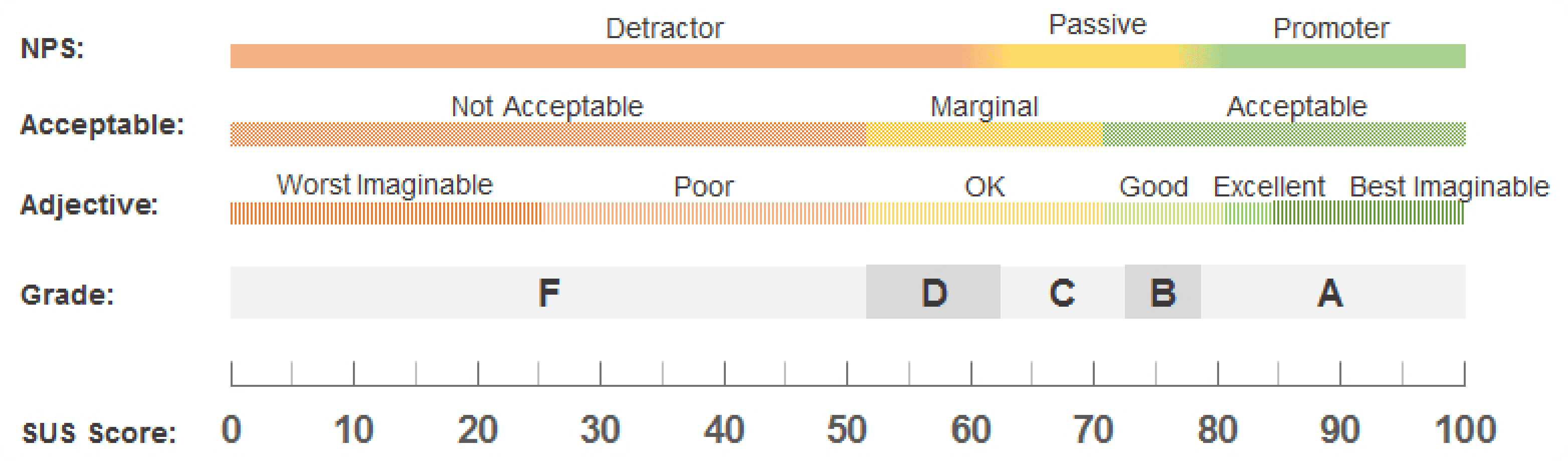
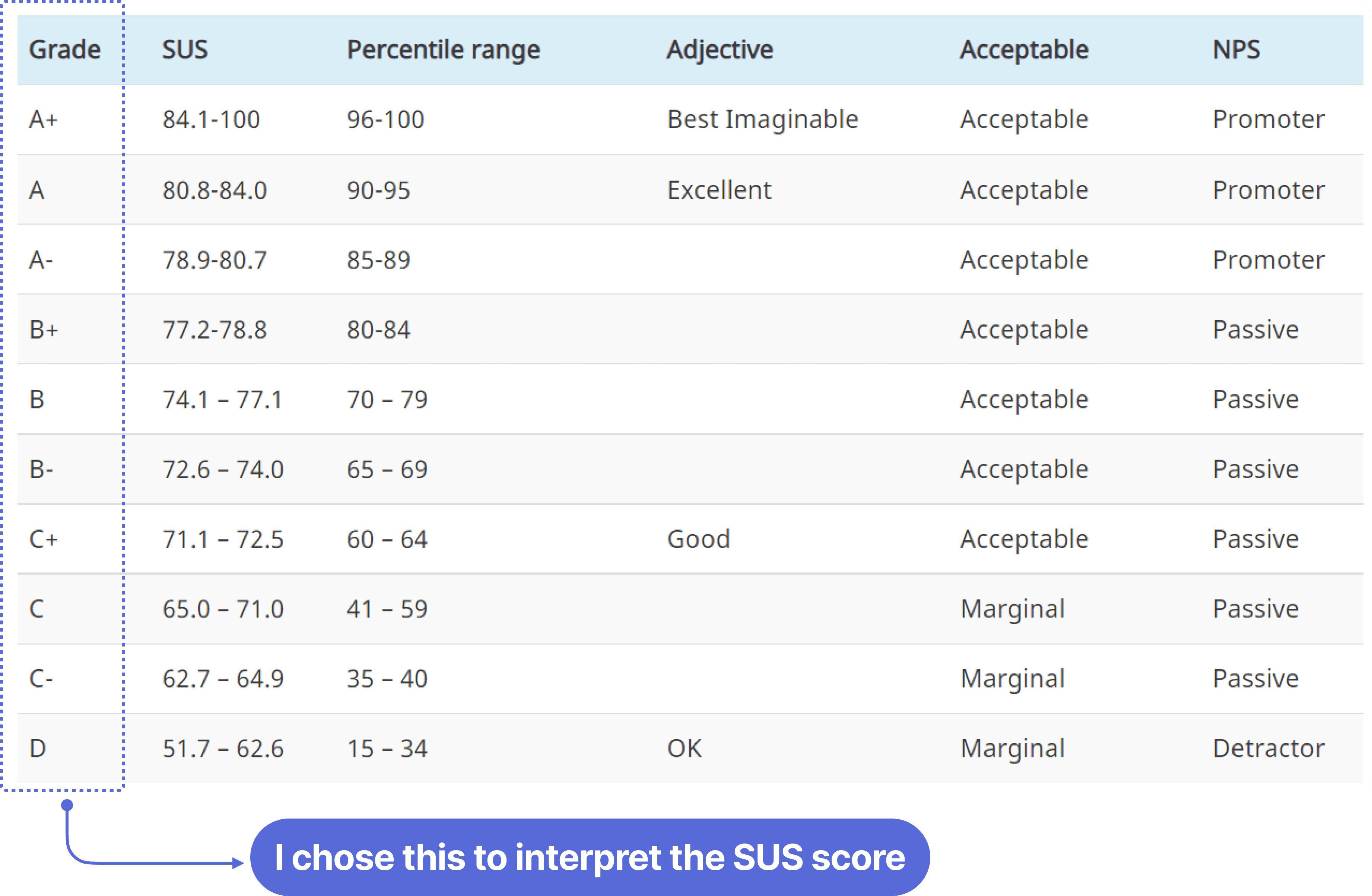
To make the score more meaningful, we can interpret the raw SUS scores in at least five ways: grades, adjectives, acceptability, and NPS (as the figure and table below)
For this project, I chose to interpret with "grades" since this's the grading system that people are most familiar with. Grades range from A, which indicates superior performance, to F (for failing performance), with C indicating "average."
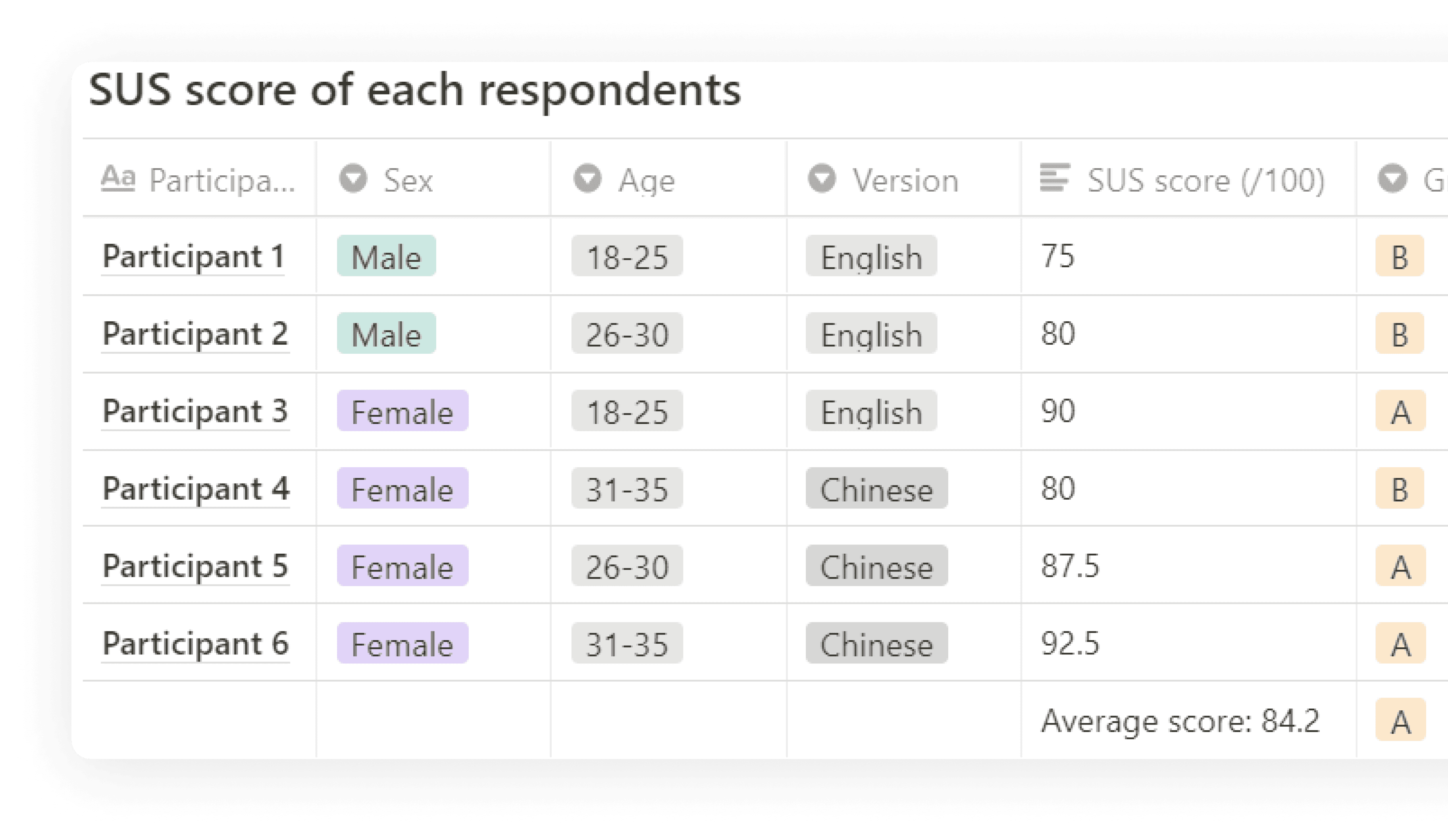
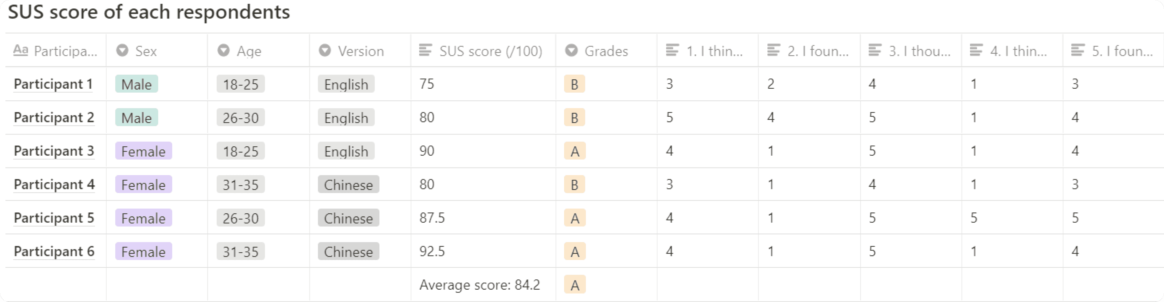
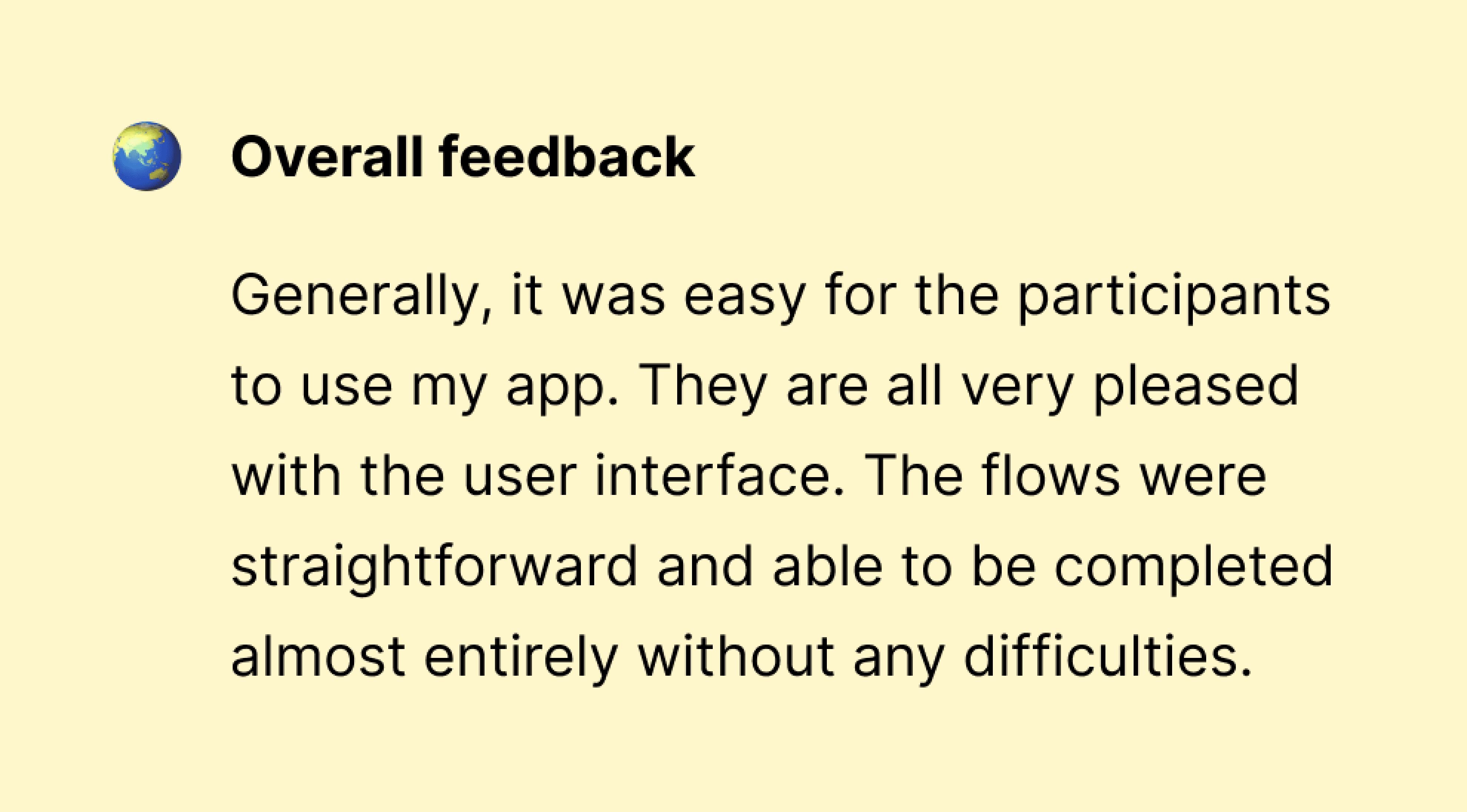
After calculating and interpreting, the overall average SUS score of apt.tw is 84.2 (grade A). You can see each respondent's responses at the table below:
Usability testing report
To improve the design, I followed a three-step process.
First, I organized the usability issues identified during testing into a spreadsheet. I grouped similar issues together and noted those that were mentioned by multiple participants, as well as issues that were worth addressing, even if only one participant reported them.
Second, I prioritized the issues based on their criticality, determining which needed immediate attention and which could be addressed later or treated as feature requests.
Finally, I created a list of key findings for design iterations. This allowed me to identify the most important areas to focus on for improving the user experience.
Iterations
With the feedback from usability testing in hand, it's time to iterate and improve the user experience.
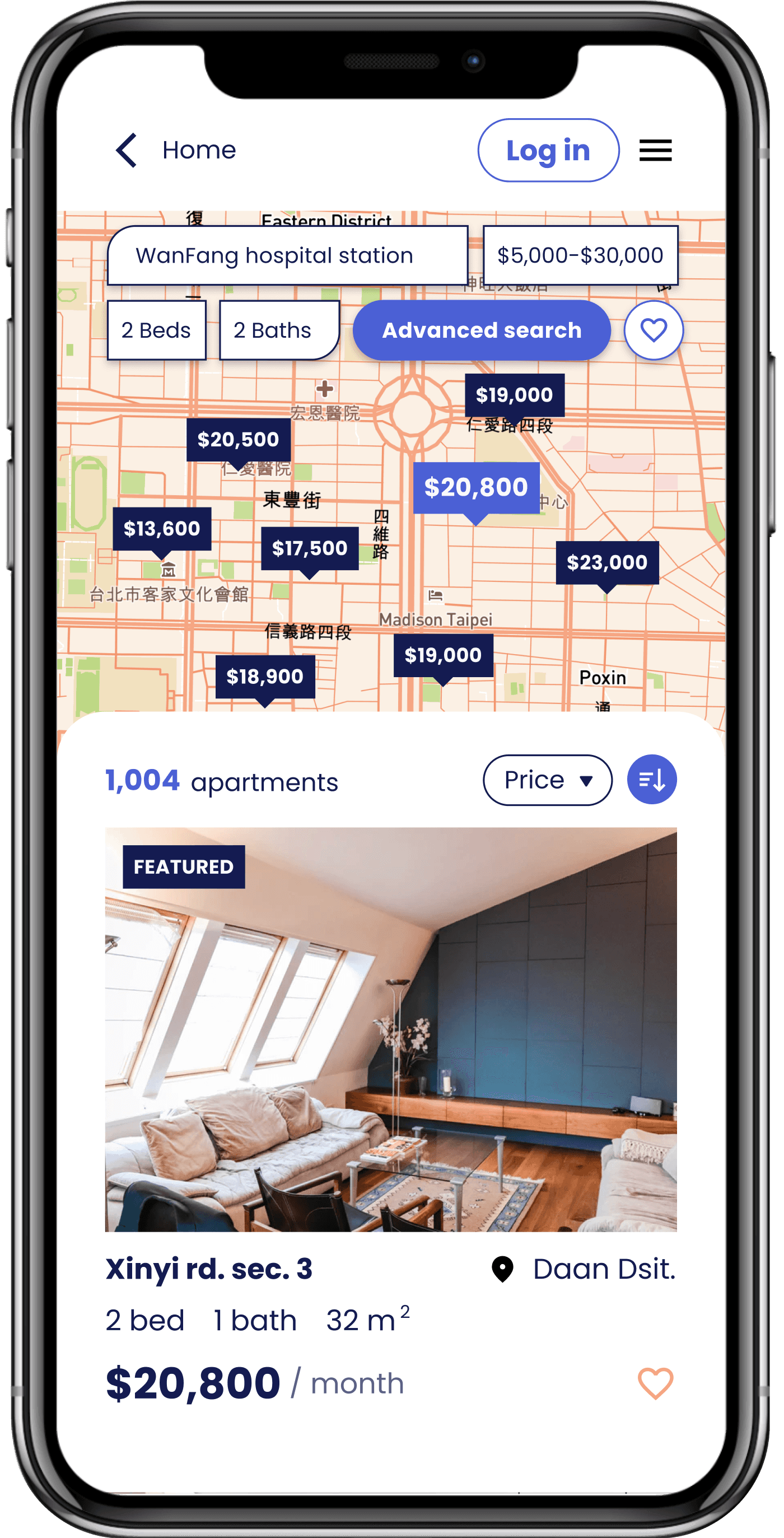
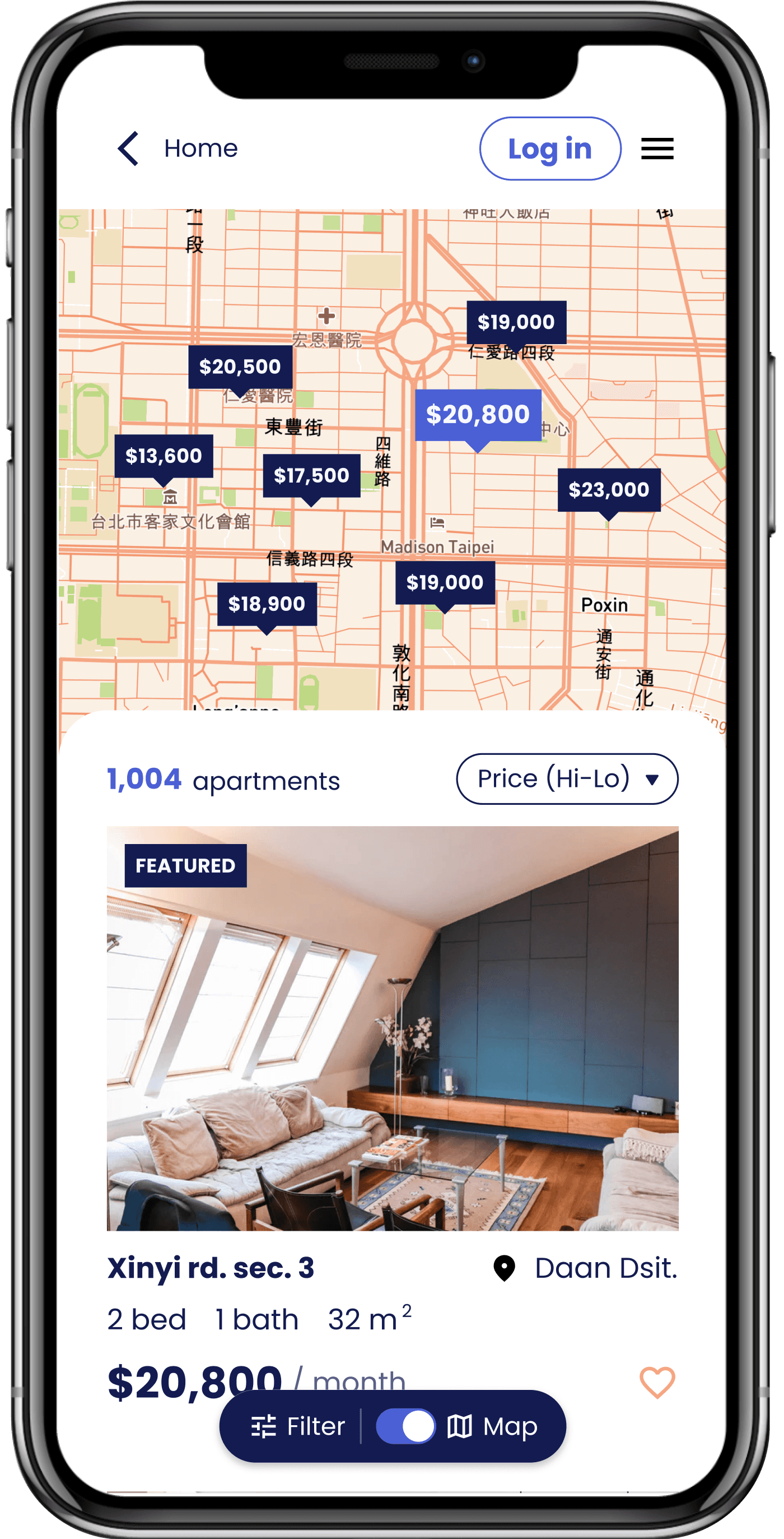
Map switch
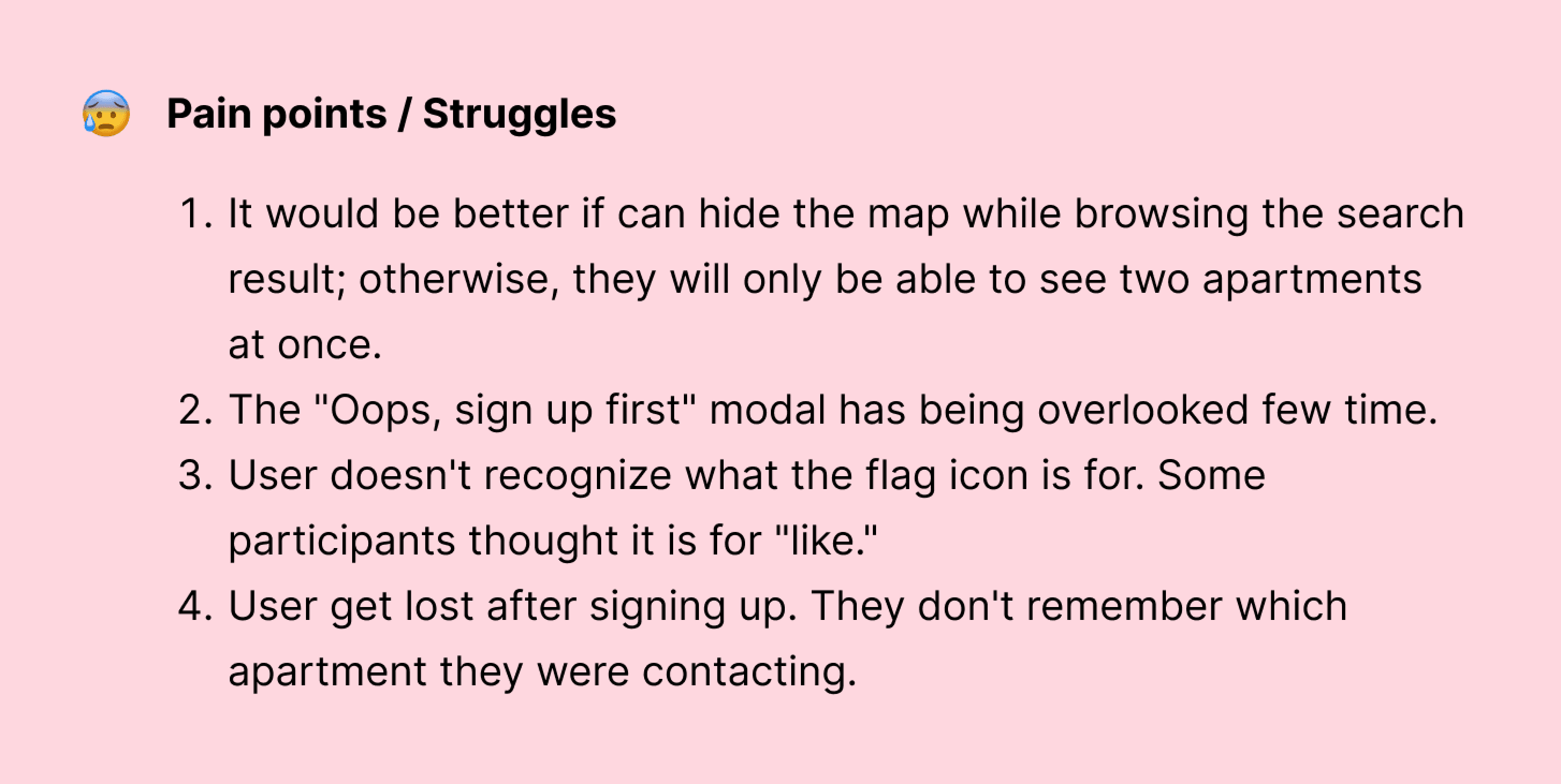
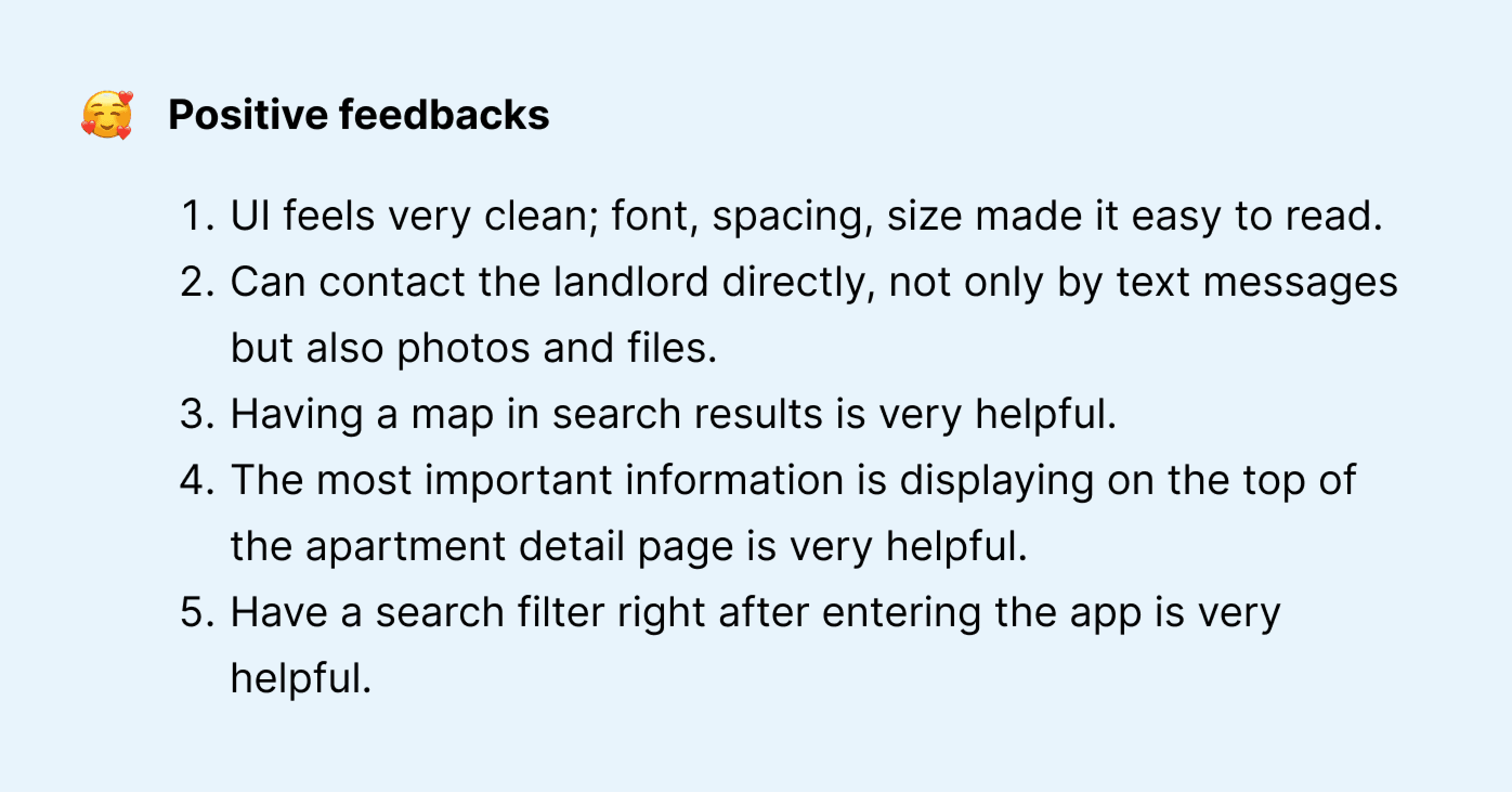
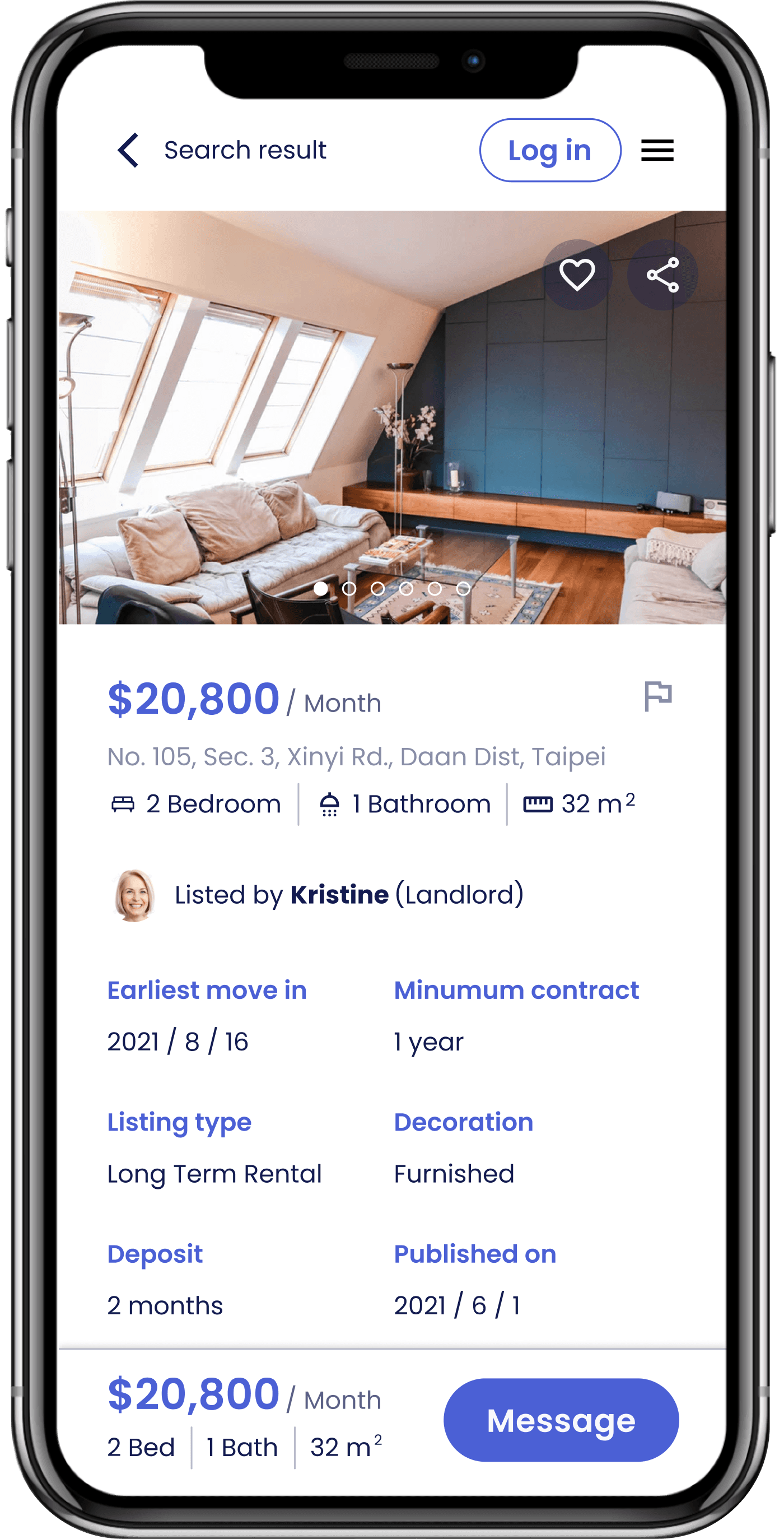
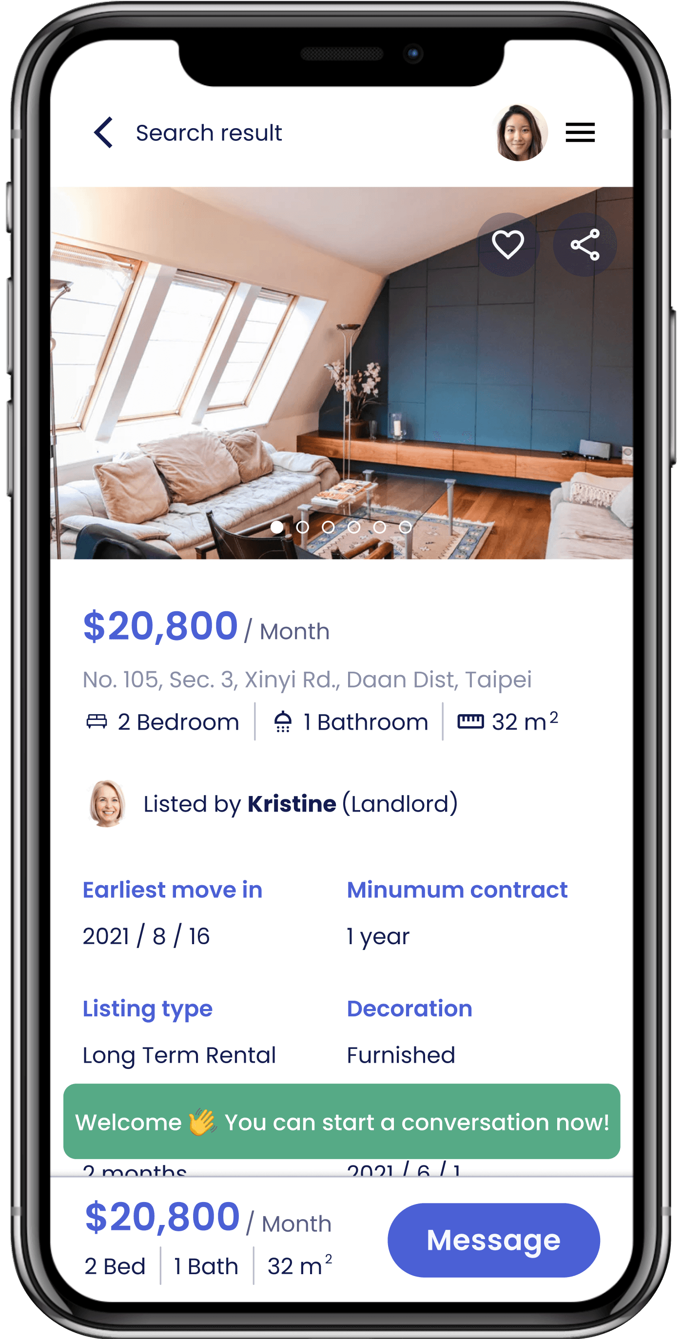
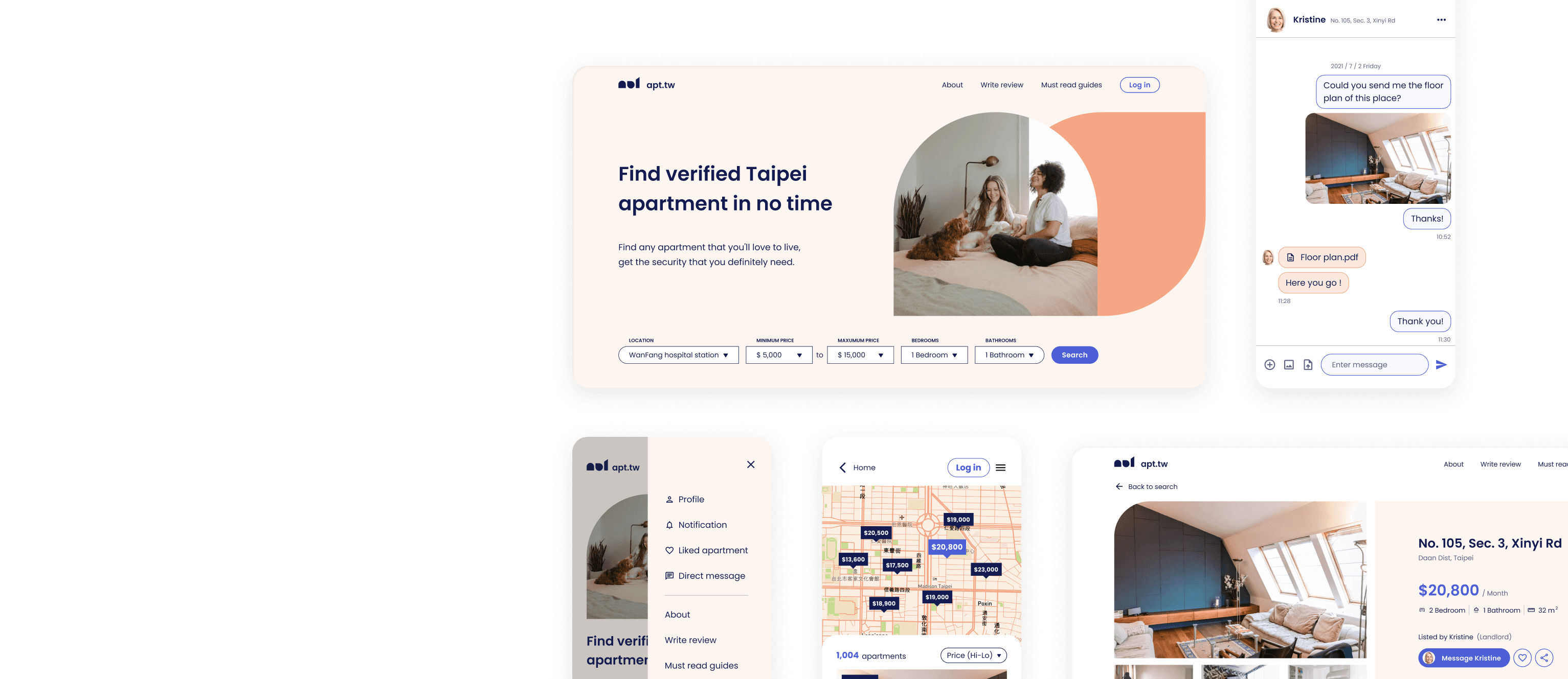
I redesigned the search result screen by incorporating a floating action button (FAB). This allows users to easily toggle the map on or off based on their preference. Additionally, I included a "filter" option that includes all of the search criteria to provide users with a more comprehensive view.
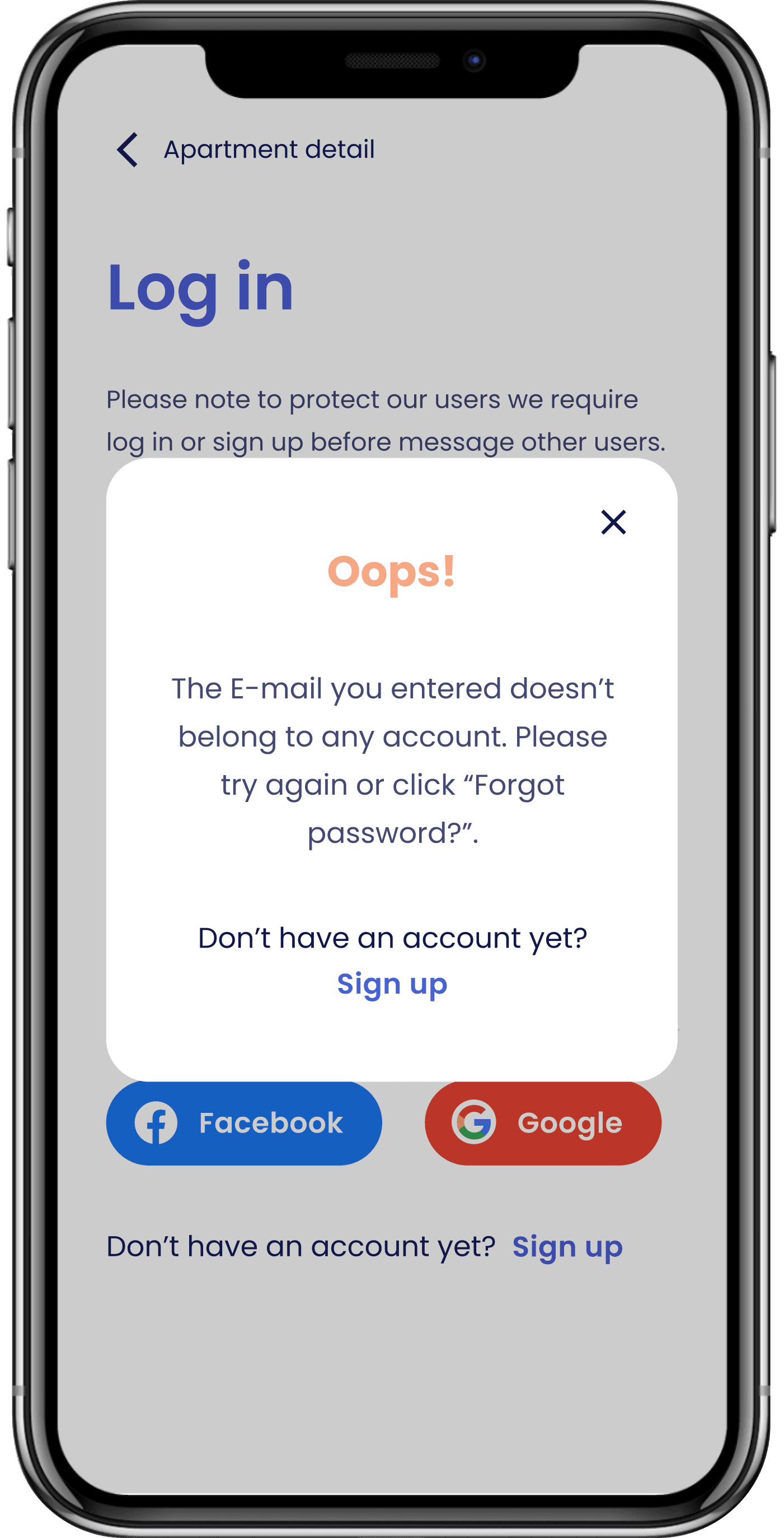
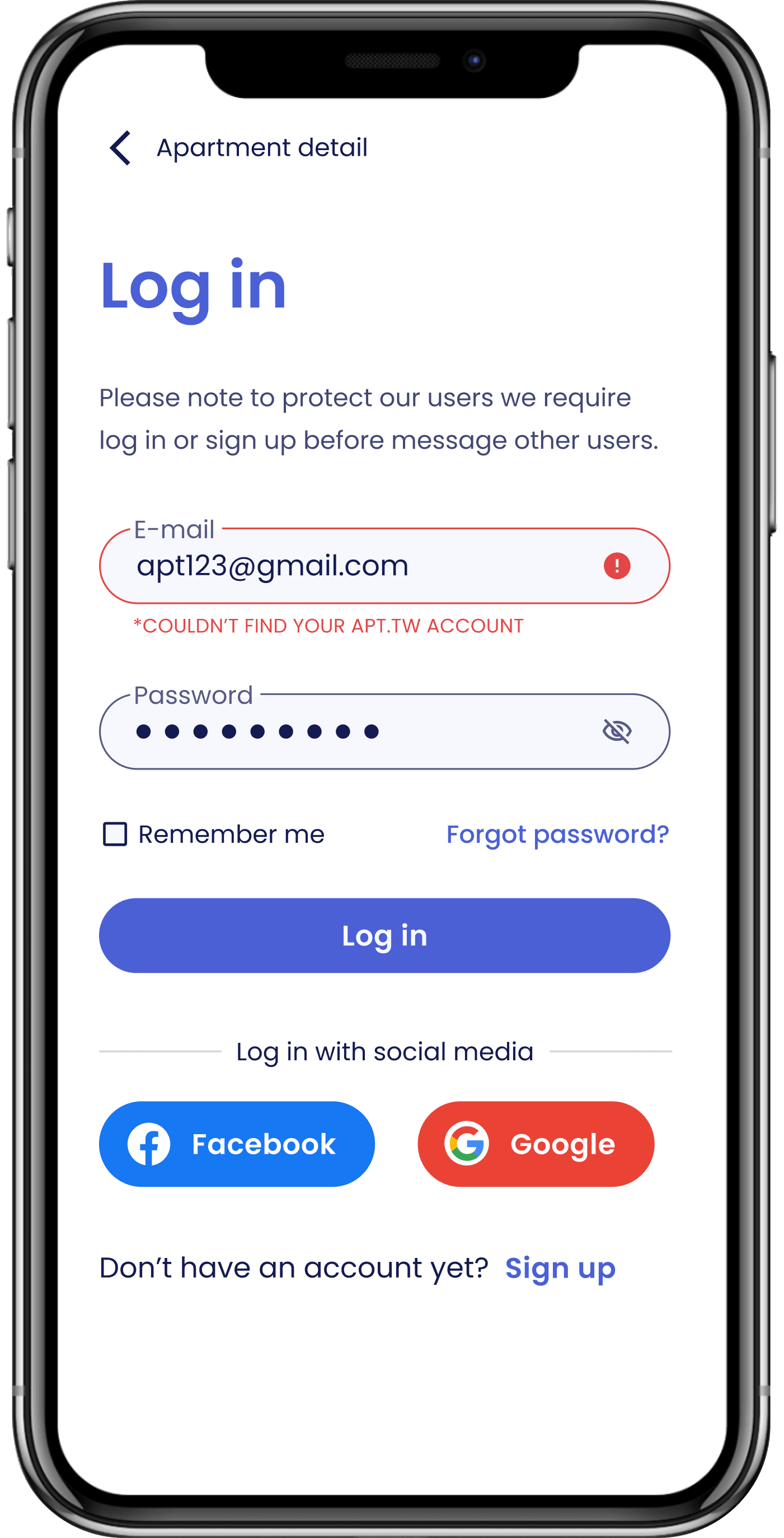
Error message
During usability testing, the error message modal was often overlooked. To improve the user experience, I changed it to inline validation. This allowed users to read the error message and field label together, making it easier for them to address any issues.
Report listing
Some participants in the usability testing found the flag icon confusing, as they interpreted it as an option to "add to like." To address this issue, I added text to explain the purpose of the flag icon and moved it to a less prominent location.
Lost their way after signing up
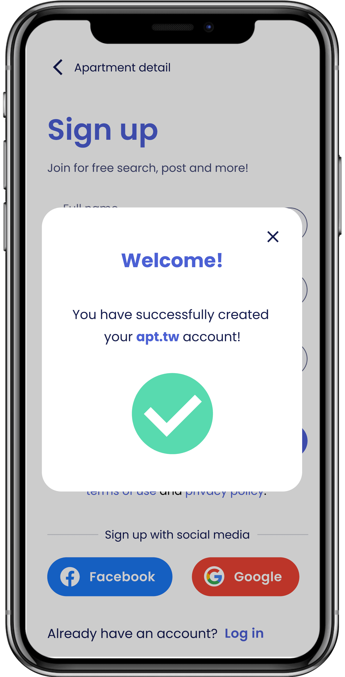
Some users mentioned that they no longer remember which apartment's landlord they initially contacted after going through the signup process.
Instead of directing users to the messaging feature immediately after sign up, I added a snack bar above the Message button to inform users that they have successfully signed up and are now able to message.

Suggestions
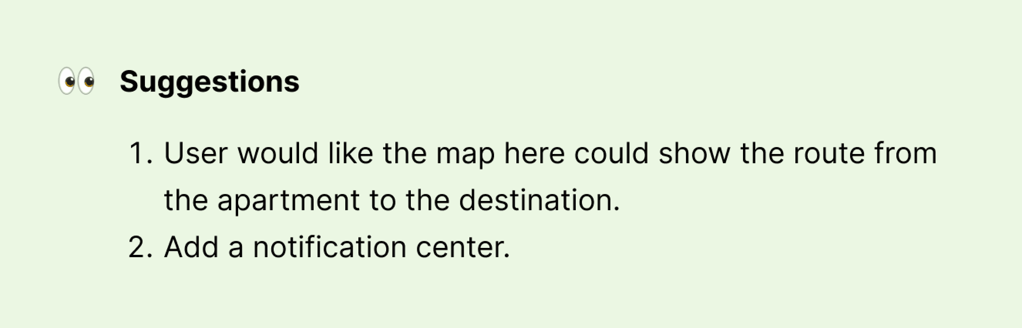
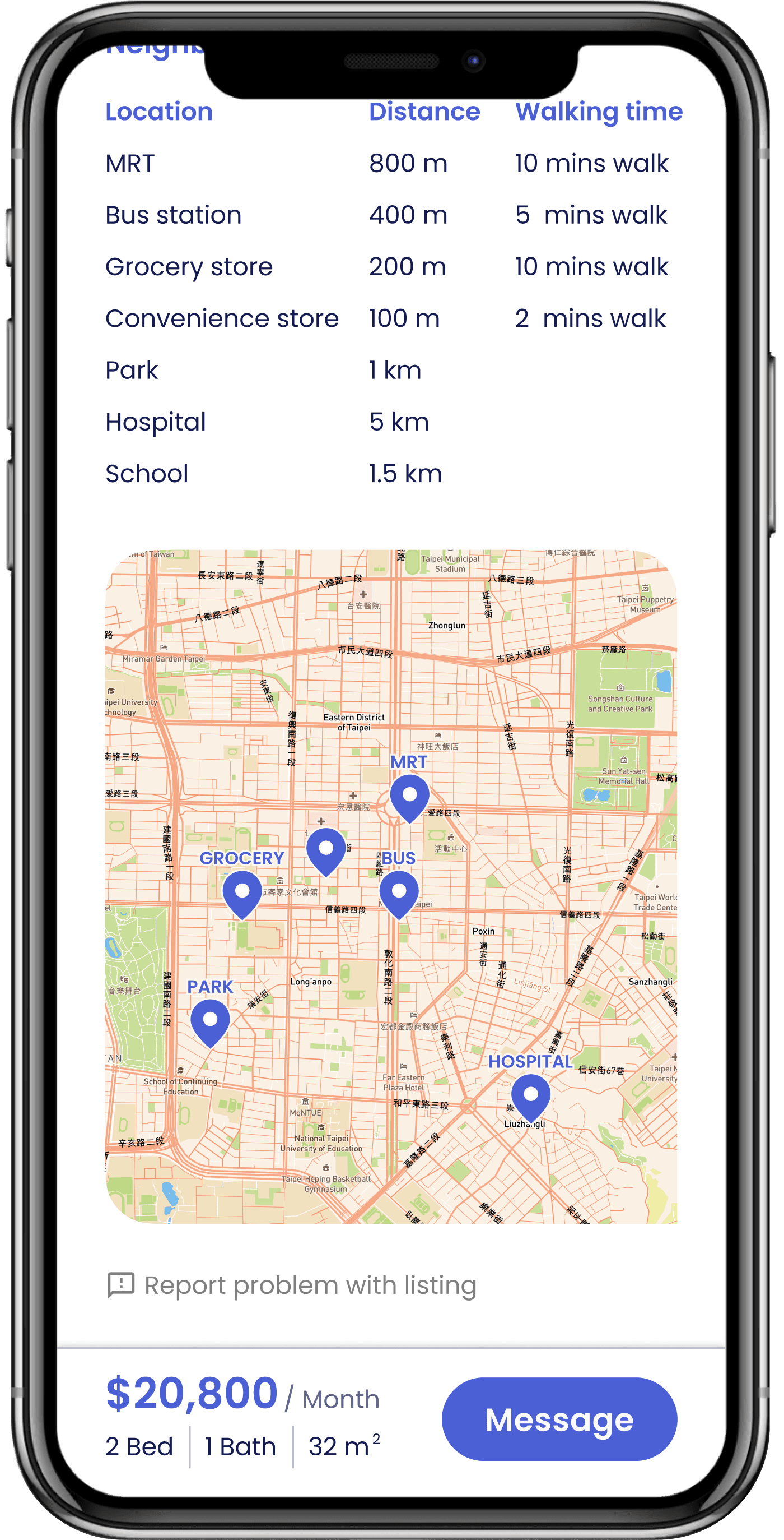
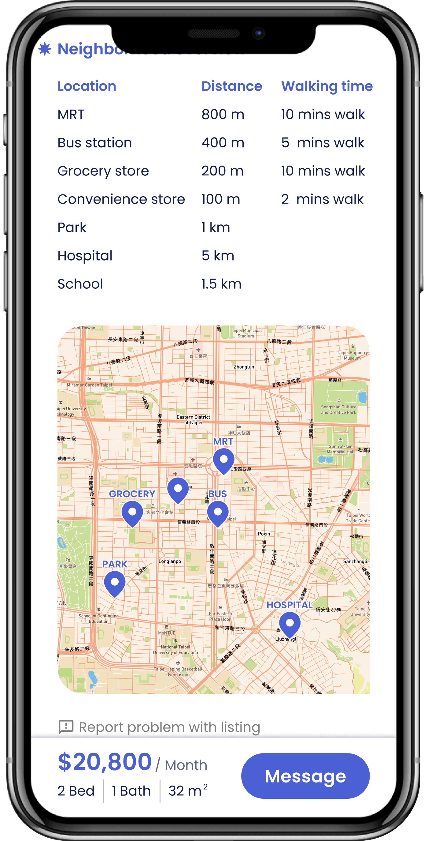
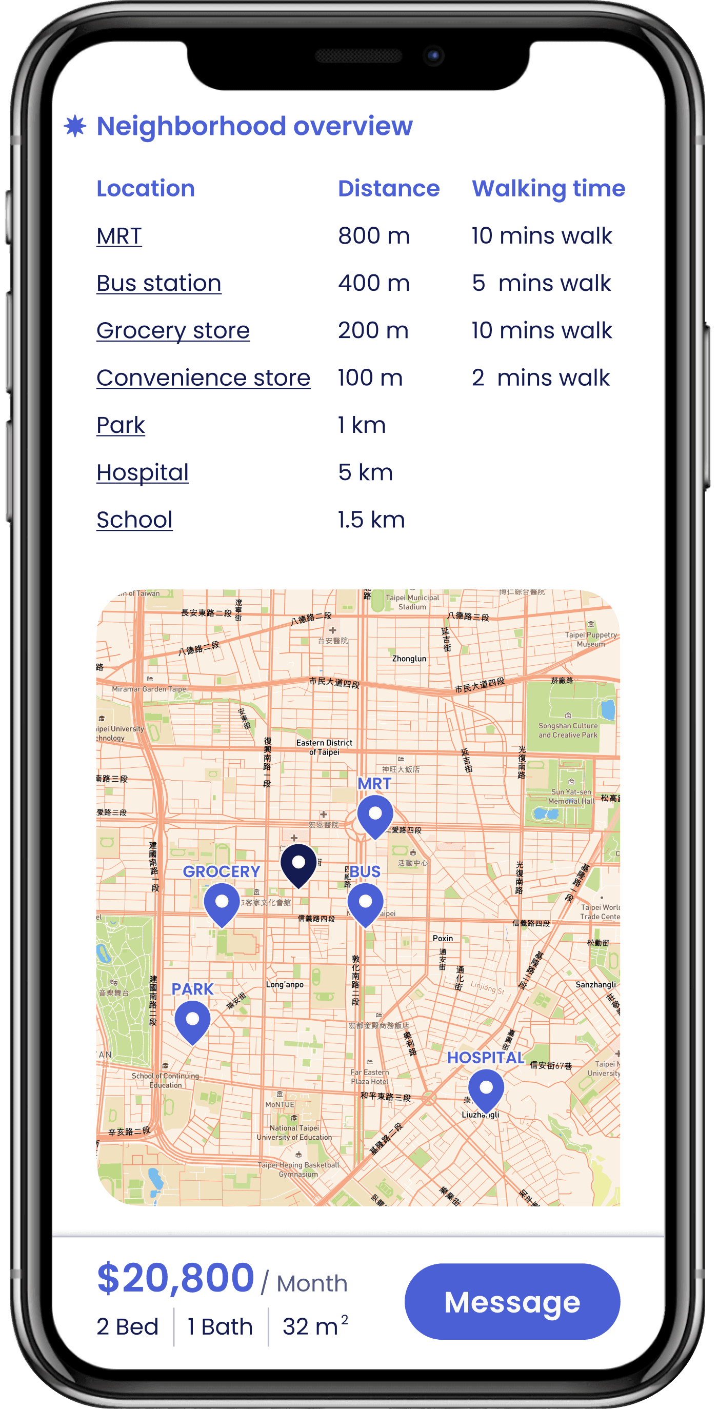
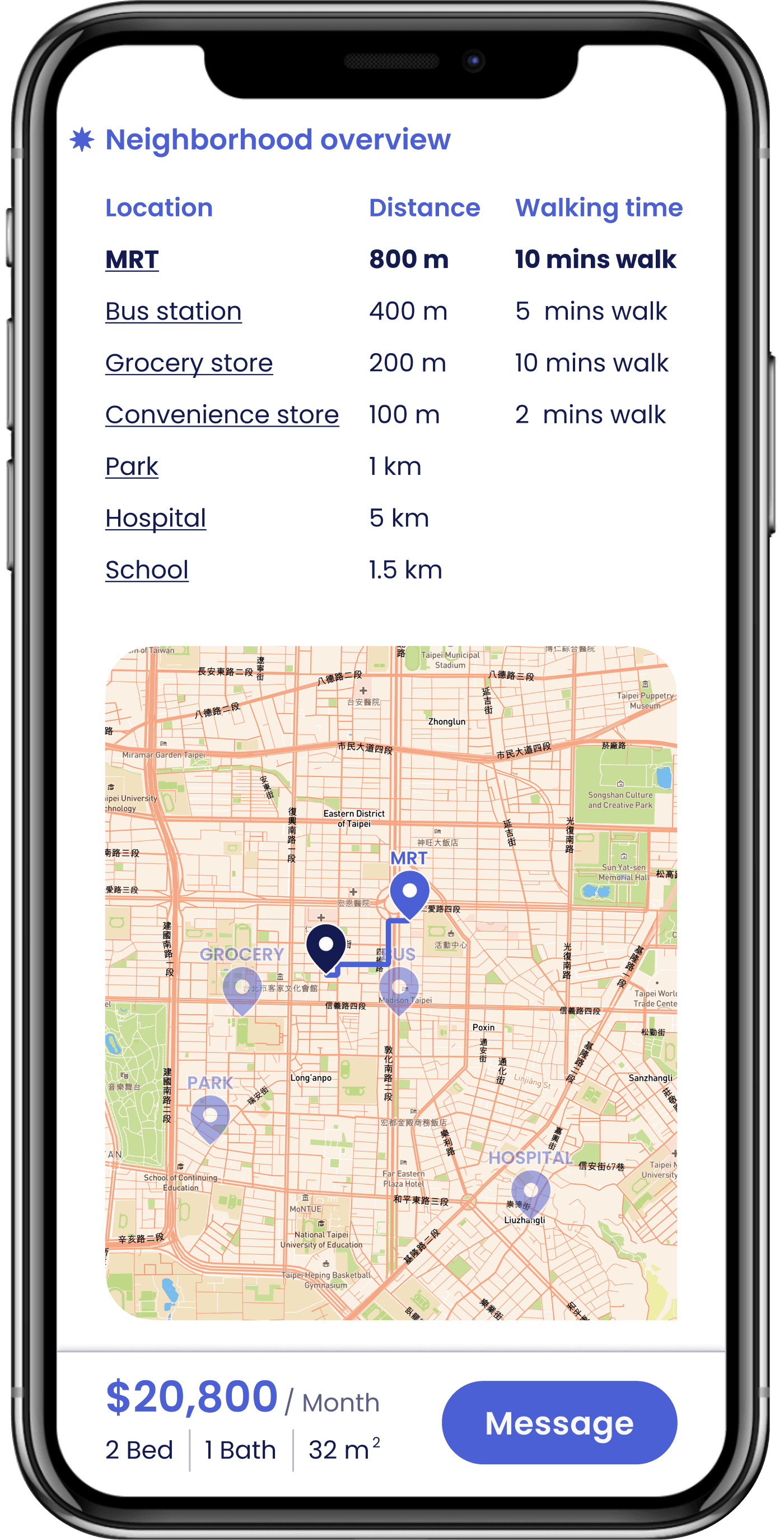
Display route on the map
It's always better to visually see the distance than having just numbers.
I implemented a feature on the neighborhood overview (apartment detail) that displays the route from the apartment to a location when the user clicks on it. This visual representation of distance is more intuitive than just showing numbers.
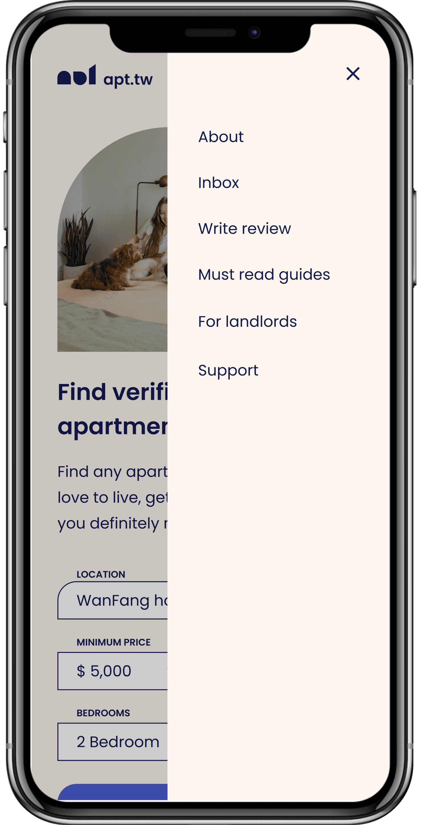
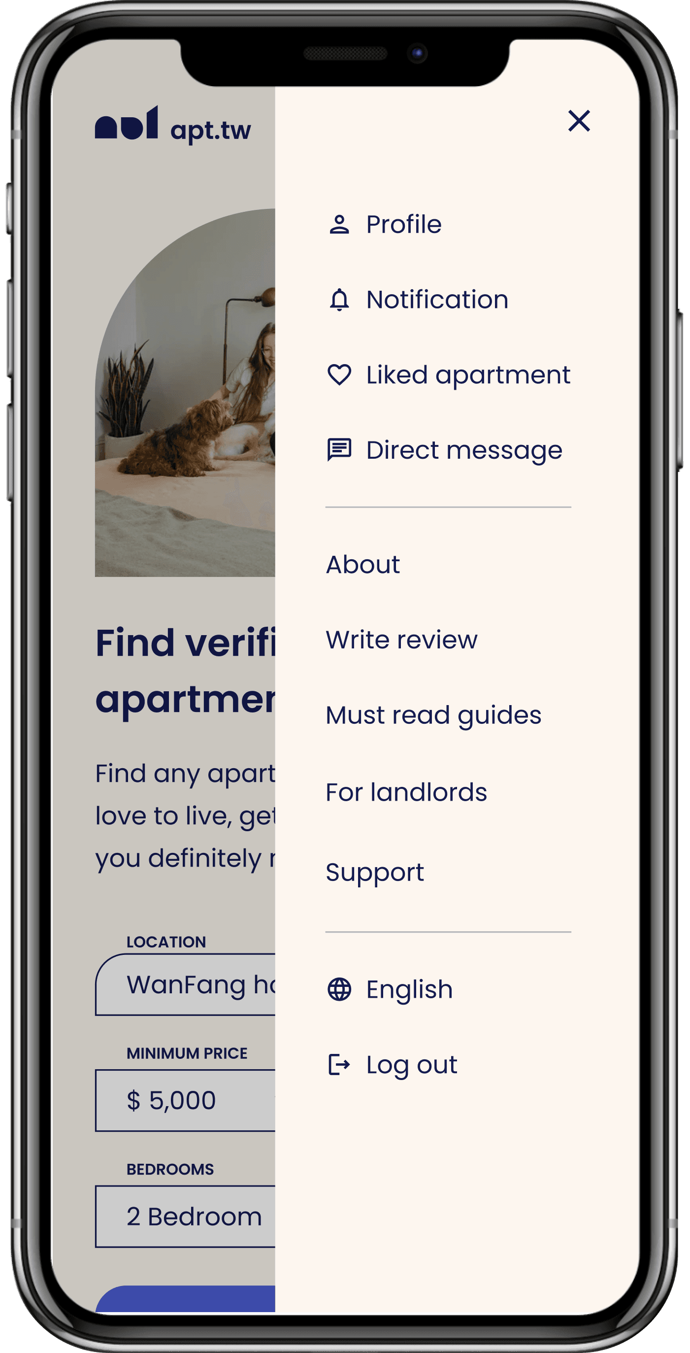
Menu
The user's suggestion of adding a notification center inspired me to rethink the menu design. I added new items such as profile, notification, liked apartments, direct messages, language switch, and quick logout, while also including dividers to group similar items together to improve visual clarity.
Conclusion
Overcome fear of the unknown
Initially, I was scared to run usability testing on my own. The thought of unknowns, questions, and fears overwhelmed me. However, I pushed myself to dive deep into the research phase and come up with a detailed plan. Once I acquired the necessary knowledge, my fears went away, and everything went smoothly.
Design for others
Through this self-directed learning project, I learned to empathize with users and understand their needs. It taught me that design is more than just aesthetics, but also about problem-solving and creating a positive experience. As a designer, I now recognize the importance of listening to feedback and observations in order to improve the design and user experience.
To be better
One thing to note is that getting comfortable with taking time is important. At the project's beginning, I rushed to "just do it," but this only caused chaos. I learned that gathering informations helps with design work.
This project helped me discover my passion for UX design and taught me many skills like creating personas, task flows, and usability testing. However, I still desperately want to learn more, such as user research, communication, and stakeholder management. Writing this case study is like a self-examination, it gave me a chance to look back at the decisions I made and how I can improve. Ultimately, it's about self-discipline and a growth mindset to keep learning and improving.
What’s next?
Currently, the primary focus of apt.tw is to assist users in finding apartments and sending messages to landlords. It is crucial to prioritize the core functionality before introducing additional features. Nonetheless, I plan to conduct further research to identify any areas I may have overlooked because design is an ongoing process. Here are some potential future developments for apt.tw:
- Onboarding
- Tenant & landlord profiles include reviewing and commenting.
- Post lease page
Accessibility
I built apt.tw with accessibility in mind, design for the diverse set of users who might be interacting with it. I have applied the following accessibility considerations:Onboarding:
- Color passed the WCAG's contrast guidelines.
- Text fields and forms have labels to tell the user the purpose of the field.
- Combine color, iconography, and text to convey information better.
- Using clearly defined boundaries for form fields helps people with mobility impairments or cognitive disabilities know the click target's location and size.
- Primary information is all visible without hovering.
More case studies and writings

Contractbook・Two-Factor Authentication
Implement 2FA to enhance user’s account security without sacrificing UX
Read More

Apartment Finder
An apartment finder app that act as the bridge between tenant and landlord to help them finish their task in ease
Read More
My 6-Month Tech Job Hunt Journey
Before the memories of those struggles fade away, I want to share some valuable lessons I've learned.
Read More
Say hi
ellyhsieh.work@gmail.com